You are using an out of date browser. It may not display this or other websites correctly.
You should upgrade or use an alternative browser.
You should upgrade or use an alternative browser.
Kingfisher 1770 1:48 POF [COMPLETED BUILD]
- Thread starter dockattner
- Start date
- Watchers 147
Hello Paul,
I'm a little surprised that you changed the first version. Yes, I understand your problem, there is something that bothers you and you want to change it. Personally, I really liked the first version, Peter's Photoshop version is also very good, it's almost unnoticeable, but it's still different.
I'm a little surprised that you changed the first version. Yes, I understand your problem, there is something that bothers you and you want to change it. Personally, I really liked the first version, Peter's Photoshop version is also very good, it's almost unnoticeable, but it's still different.
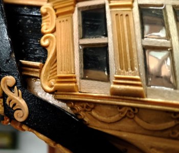
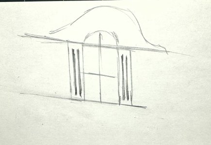
I am not sure if my suggestion will change the appearance, but if I suggested trying, I would do the columns as single pieces and cut the groves not to the top and the bottom to represent a freeze. Sorry, I am not proficient in Photoshop, so here is the sketch. Maybe Peter, @Peter Voogt can Photoshop my idea? 

Thanks, Tobias. I am very familiar with Ricci's work. His skills exceed mine --- and he is working at 1:36.I am sure you know these pictures and have studied them carefully, this column finish would fit very well.
View attachment 489861
View attachment 489862
Image source @Giampy65
I do like the more ornate blocks at the top and bottom of the columns. And the ball at the top could be removed and another added with something floral above it. Just throwing out ideas. 
Thanks, Dean. I'm going to resist the urge to add more fancy stuff until I see what the stern will look like. The quarter badge and the stern decorations need to have some consistency to them...I do like the more ornate blocks at the top and bottom of the columns. And the ball at the top could be removed and another added with something floral above it. Just throwing out ideas.
- Joined
- Jun 17, 2021
- Messages
- 2,696
- Points
- 588

While there is absolutely nothing wrong or dissatisfying with what you have wrought, I can certainly relate to a dissatisfaction arising from the desire to fulfill the concept of the model you envision. I which case I applaud your pursuit of it. 

Hi Paul,
its been a while since I checked in - your work (craftsmanship) is above my abilities along with you must be using some ultra quality wood and ultra quality tools.
its been a while since I checked in - your work (craftsmanship) is above my abilities along with you must be using some ultra quality wood and ultra quality tools.
Thanks, Peter. I trust I am not the only one who faces these sorts of challenges. Sometimes something just hits wrong, and it is impossible to ignore.While there is absolutely nothing wrong or dissatisfying with what you have wrought, I can certainly relate to a dissatisfaction arising from the desire to fulfill the concept of the model you envision. I which case I applaud your pursuit of it.
It is not lost on me that the 'final' version is not all that different from the original, but artistically speaking it is an improvement of sorts. The scale of the grooves and the blocks is now more in line with the scale of the quarter badge. The craftmanship failings cannot be denied - but at least it is no longer offensive.
I actually encounter this sort of thing all the time (not liking my work) - but I normally keep it to myself and fix it before I post for public consumption. I apologize to those following my work for dragging you into the murkier side of my personality and its flaws
Last edited:
Thanks, Donnie. The boxwood is a joy to work with!Hi Paul,
its been a while since I checked in - your work (craftsmanship) is above my abilities along with you must be using some ultra quality wood and ultra quality tools.
Hi Paul, I don't feel like I'm being dragged anywhere, more accurately I am on a learning journey and get to see some 'out of this world modeling'. Thank you for the ride!I apologize to those following my work for dragging you into the murkier side of my personality and its flaws.
- Joined
- Jan 9, 2020
- Messages
- 10,522
- Points
- 938

I am working through the logs in their order of posting and here I am, Paul! I think the biggest asset of this model is the learning curve that it had demanded from you - it has put you on a fast track to become one of the very best builders of model ships. What makes it so special to me is the natural aptitude you have shown towards acquiring the advanced skillset required to build this model. Kudos, my friend - you are in your element.
A very nice post Heinrich. You are very kind to stop by and share your encouraging words.I am working through the logs in their order of posting and here I am, Paul! I think the biggest asset of this model is the learning curve that it had demanded from you - it has put you on a fast track to become one of the very best builders of model ships. What makes it so special to me is the natural aptitude you have shown towards acquiring the advanced skillset required to build this model. Kudos, my friend - you are in your element.
- Joined
- Sep 3, 2021
- Messages
- 4,938
- Points
- 688

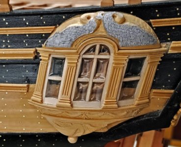
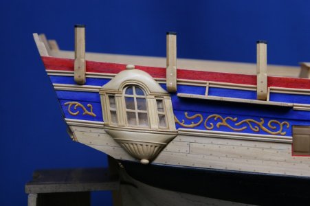
Paul, while having a great appreciation for the quality of your work, I'm afraid I have a remark to make to your latest addition. What I perceive are discontinuous lines from the columns to the window sills to the columns, etc, and also the alignment to the other ornaments, including the upper and lower domes, which appear to be slightly off. The upper dome appears to be tilting aft and the top doesn't align with the lines of the hull. This is also more or less applicable to the lower dome.Thanks for the engagement, guys. The visuals are quite tricky. I had another version where the blocks at the top and bottom of the column (I'll call them plinths even though they aren't) were beveled but that looked even worse:
View attachment 489793
I am constrained by the very narrow lip above and below the columns (I did have another version that featured a molded upper and lower plinth but that extended outside/beyond the lip and drew too much attention to itself). I have not tried Dean's suggestion to do the shaping subtractively. Maybe the sides and the tops and the bottoms of the plinth ALL need to be angled?
I have seen only two models (swan class builds) that get this right. At this point I am struggling seeing and producing the geometry at scale...
This would have me mulling it over for a couple of days, before committing to a redo.
Thanks for sharing your thoughts, Johan. I totally agree with you with regard to the columns. As for the domes - are you saying they should be more vertical or more skewed? If you mean more skewed, then I still agree with you.Paul, while having a great appreciation for the quality of your work, I'm afraid I have a remark to make to your latest addition. What I perceive are discontinuous lines from the columns to the window sills to the columns, etc, and also the alignment to the other ornaments, including the upper and lower domes, which appear to be slightly off. The upper dome appears to be tilting aft and the top doesn't align with the lines of the hull. This is also more or less applicable to the lower dome.
This would have me mulling it over for a couple of days, before committing to a redo.
- Joined
- Sep 3, 2021
- Messages
- 4,938
- Points
- 688

My view on the domes is that the axis should be more perpendicular to the upper curves of the hull, so more skewered, in your words. I feel that would esthetically be the most pleasing, but might be historical incorrect.Thanks for sharing your thoughts, Johan. I totally agree with you with regard to the columns. As for the domes - are you saying they should be more vertical or more skewed? If you mean more skewed, then I still agree with you.
correct...but might be historical incorrect.
Now moving on from the quarter badge (for now, or forever, remains to be seen).
Some time ago I committed to installing a cap rail (planksheer) on both sides of the ship. That is the natural choice for the 'finished' side but unusual for the side left in frames. The motivation to do this on the 'frames' side is complicated - but suffice it to say that I reasoned this would give a better result than leaving the over-faired top timbers.
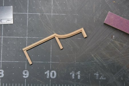
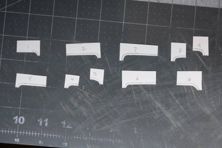
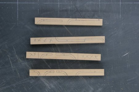
One of the challenges in creating the cap rails is that there are 10 places (5 per side) where there is a curved vertical step in the rail. I doubted I could steam and bend these steps, so I created patterns and made them from thicker stock.
Patterns:
Traced onto leftover boxwood stock:
The concave face was then sanded on an oscillating spindle sander:
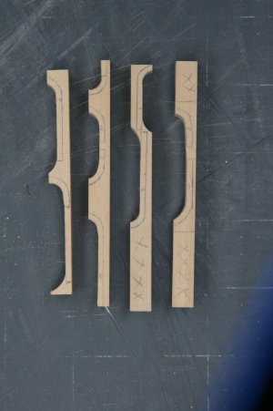
And then the upper face was sanded to shape on a disc sander:
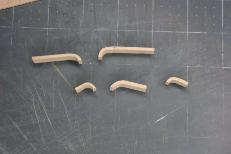
Obviously, these are still 'rough' pending final fit and adjustment for final thickness (1.4 mm rails).
On the 'finished' side I tinted the cap rails black. They were left natural on the 'frames' side.
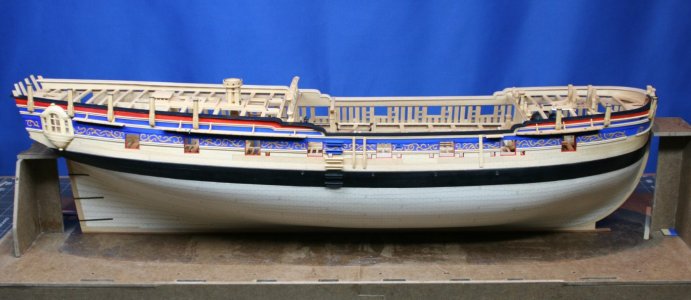
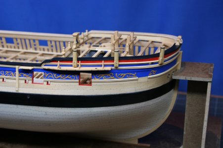
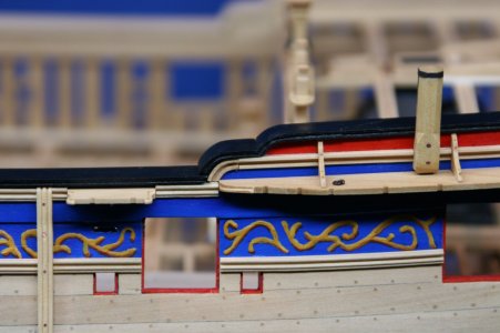
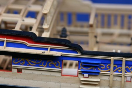
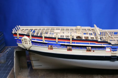
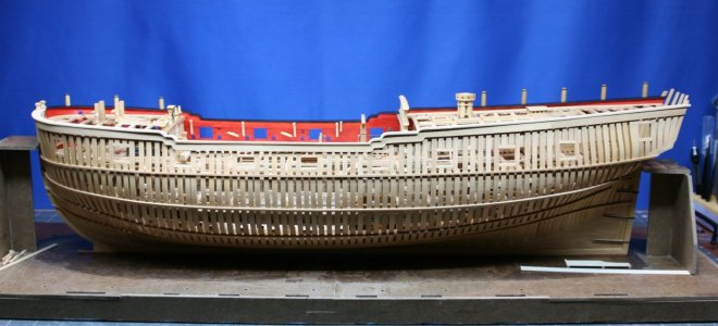
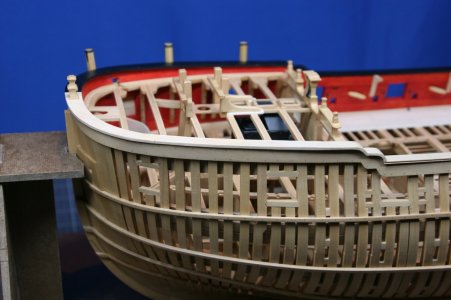
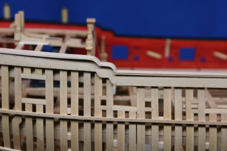
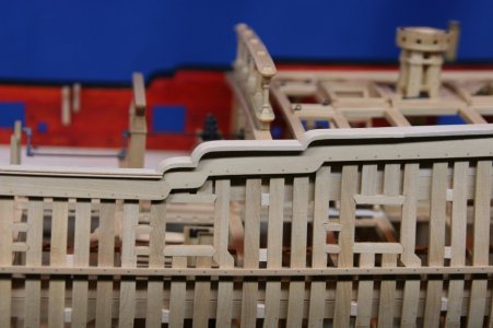
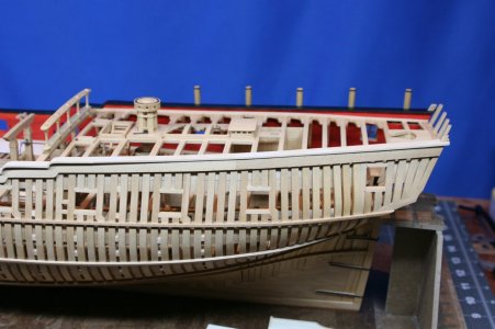
I will be adding unshaped timberheads to the 'frames' side and shaped timberheads on the 'finished' side. These will obviously be faux timberheads since I cut off the top timbers more than a year ago...
Thanks for the visit!
Some time ago I committed to installing a cap rail (planksheer) on both sides of the ship. That is the natural choice for the 'finished' side but unusual for the side left in frames. The motivation to do this on the 'frames' side is complicated - but suffice it to say that I reasoned this would give a better result than leaving the over-faired top timbers.
One of the challenges in creating the cap rails is that there are 10 places (5 per side) where there is a curved vertical step in the rail. I doubted I could steam and bend these steps, so I created patterns and made them from thicker stock.
Patterns:

Traced onto leftover boxwood stock:

The concave face was then sanded on an oscillating spindle sander:

And then the upper face was sanded to shape on a disc sander:

Obviously, these are still 'rough' pending final fit and adjustment for final thickness (1.4 mm rails).
On the 'finished' side I tinted the cap rails black. They were left natural on the 'frames' side.


I will be adding unshaped timberheads to the 'frames' side and shaped timberheads on the 'finished' side. These will obviously be faux timberheads since I cut off the top timbers more than a year ago...
Thanks for the visit!


