"Flying Cloud " by Mamoli - kit bash

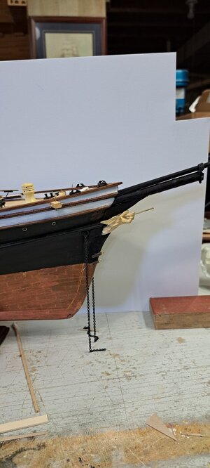
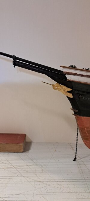
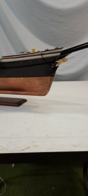
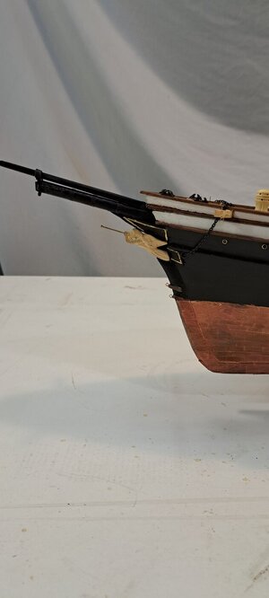
I added the naval hoods and the figurehead. I tried extending the stem, raising the figurehead closer to the underside of the bowsprit. But the whole thing looked disproportionate and forced. I got six thumbs up and (and a little love) for the mockup, so I went with that arrangement. My hands are too shaky for the filigree, so I just outlined the naval hoods. I'm not sure I like that as opposed to all black and20240701_141823.jpg20240701_142009.jpg20240701_171658.jpg20240701_171601.jpg allowing the figurehead to stand alone for the decorative element. I kind of like all black. To me the gold looks like an afterthought. Opinions?
 
Last edited:
I added the naval hoods and the figurehead. I tried extending the stem, raising the figurehead closer to the underside of the bowsprit. But the whole thing looked disproportionate and forced. I got six thumbs up and (and a little love) for the mockup, so I went with that arrangement. My hands are too shaky for the filigree, so I just outlined the naval hoods. I'm not sure I like that as opposed to all black andView attachment 456883View attachment 456884View attachment 456885View attachment 456886 allowing the figurehead to stand alone for the decorative element. I kind of like all black. To me the gold looks like an afterthought. Opinions?
Good morning Peter. It looks good to me. Maybe a little aging on the gold will make it blend in some more. Cheers Grant
 
@Peter Gutterman
On Glory of the Seas there is no verticle gold trim, either on naval hoods or cutwaters. Eliminating that on your model will enhance the beauty of your bow. Your prow is already looking sleeker with the addition of those pesky naval hoods. Your angel figurehead is a really beautiful piece too. On Flying Cloud, she would be mounted further out just at the tip of the naval hoods. That's where the cutwaters come in. There's a substantial bar that runs into the back of Glory's figurehead Athene. I've seen that in person. If there's a way for you to use some sort of pin to attach yours, you might be able to advance your figurehead further forward. That would then create space for the curving cutwaters which end at the bow. Finally, the angel figurehead would have been all white with gold leafed trumpet and gold highlights on her gown and wings. Probably easiest to just paint the trumpet gold and figurehead white. Of course, if you're happy with how she looks now, you don't have to do any other adjustments.
 
Last edited:
I'll adjust the paint. I tried to move the figurehead a bit farther forward adding to the cutwater, but the results (probably owing to the figurehead being slightly oversize) looked dis-proportionate. The Bluejacket figurehead I have is a bit shorter but not very attractive by comparison and ill-suited for mounting as it was designed without taking the existence of naval hoods into consideration and would (IMHO) require some serious modification. So, for the sake of not overworking the area in question (It's getting a little fragile) I think I'll leave it as is. I will adjust the color of the figurehead, giving It a wash of antique white, (to leave a little patina) and paint the trumpet gold. there are plenty of similar inaccuracies and conjectures with my model already that I've become resigned to live with. I'm hoping that Bill M. will profit from my mistakes if he puts his toe in this water.

Thanks for all your efforts on my behalf to improve my model. I very much appreciate your caring enough contribute your input. Please feel free to continue to do so. This, I believe is a good example of the best possible use of this forum.

Pete
 
Peter,
I applaud your hard efforts to revise your model in light of new evidence. I agree too that sometimes overworking an area can make things worse. One last suggestion which should be easy to do after blacking out all verticle gold lines is to extend the horizontal gold lines on the naval hoods to just above the anchor hawse hole which is how they appear on Glory of the Seas. I've attached a few more historic pieces which, while somewhat rudimentary do show these elusive, misunderstood nautical devices.

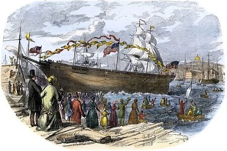
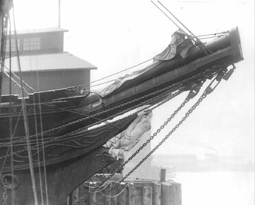
(1) an 1851 color woodcut of the East Boston launch of Flying Cloud. Enlarge the pic, look carefully at the bow just above the angel figurehead you'll see a triangular shape representing her naval hood. The area underneath behind the angel is her cutwater. There's no gold leaf yet which probably would have been added later.

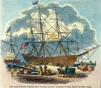
(2) another 1851 color woodcut by John C Wade of Flying Cloud, at a NY wharf loading for her maiden voyage. Gold embellishment is now obvious on her bow.

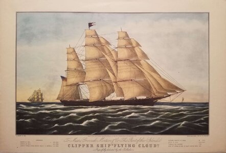
(3) famous 1852 Nathaniel Currier Flying Cloud lithograph based on an apparent James E Buttersworth painting. Gold embellished bow with white angel is illustrated.

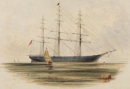
(4) a June 1854 watercolor sketch by Edward Meyer Kern, likely study for a future painting on site of Flying Cloud laying off Whampoa. Boston Museum of Fine Arts.

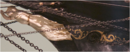
(5) extreme close up of the 1913 Boucher model figurehead. While they did some gold embellished highlights, clearly all references to her original naval hoods or cutwaters no longer exist. Even the original wings of the angel are gone.

20240702_121901.jpg

20240702_121955.jpg

4006_6A.jpg

20240702_114950.jpg

image002.png
 
Last edited:
Peter,
Wow! A dramatic improvement. I love the gold trumpet which now stands out even more dramatically against the distinctive, lovely antique white angel. One last repeat suggestion, gold naval hood lines extend just above her anchor hawse hole. I think you'll see a more symmetrical bow by doing these simple last steps. Believe it or not, from the viewpoint of historical accuracy, your bow is now the closest approximation of how Flying Cloud really appeared. Congratulations!
 
Looking at the three lithos and the paintings the positioning of figurehead appears interpretive. The lithos are, all after all, illustrations subject to the eyes of the beholders and are essentially advertisements. The Currier-Buttersworth and the watercolor I believe were meant to be taken as the most faithful representations, yet still subject the artists eye and sense of how things "should" look as opposed to photographic reality. They all differ enough in the relative size and location of the figurehead and proportions of the bow to leave me a lot of wiggle room. I do confess that due to my own efforts to reconcile everything in light of the introduction of the new information late in the game, that the position of my figurehead is a little low by comparison. I wish I had a steadier hand with the filigree, I like it. I will extend the gold as you suggest.
And WOW! What a fast and concerted effort on your part. Again, I deeply appreciate your caring efforts and contributions! I feel honored! Please continue to make suggestions and constructive criticism. I am coming to depend on you for that. I really like the co-operative effort and am definitely on board! I feel my work is so much the better for it.
Thanks, Pete
 
Pete,
Your welcome. I always walk a fine line between trying to be helpful and being a pain in the ass ;-) While your sense of these contemporary illustrations having some artistic interpretation. Consider this too. No cameras where in wide use, so accurate artistic illustrations were used instead. Remember too, Flying Cloud was a sensational vessel, being then the largest merchant vessel in the world. So logically more popular demand existed for accurate images of her. As an artist myself, I can tell you trying to get accurate images of complex curves of a Clipper ship can be very challenging too.
Since you mention doing the filigree is a challenge I have another suggestion which might make this fix simpler. Black out the top line representing the cutwater tops. Instead just use the lower molding above the hawse hole to extend the lower line of the naval hoods. It should be simpler and give a more unified look.
 
While you were typing I was having my own flight of fancy and came up with this. Trying to stay within the bounds of taste in the Victorian Era.20240702_134714.jpg20240702_134422.jpg
 
Peter,
Nice! See how your Flying Cloud is now already appearing more elegant? This arrangement makes so much more nautical engineering sense, since now the figurehead isn't just tacked on haphazardly. She's supported above by naval hoods and at her base resting on the cutwater. I still remember seeing a 2/3rds large Flying Cloud replica docked at Boston in the early '70s. Her lofty rig was impressive as was her long, low sleek hull. However her trumpet bearing winged angel was awkwardly tacked on to the base of the bowsprit above and it just looked off...
I was shocked decades later when I read Duncan McLean's in-depth description of those mysteriously missing hoods and cutwaters. That's why I am so happy that you're doing your best to add these features to your model. Now if you can just extend that single top gold line to go above the hawse hole, that you complete your bow.
 
I added the naval hoods and the figurehead. I tried extending the stem, raising the figurehead closer to the underside of the bowsprit. But the whole thing looked disproportionate and forced. I got six thumbs up and (and a little love) for the mockup, so I went with that arrangement. My hands are too shaky for the filigree, so I just outlined the naval hoods. I'm not sure I like that as opposed to all black andView attachment 456883View attachment 456884View attachment 456885View attachment 456886 allowing the figurehead to stand alone for the decorative element. I kind of like all black. To me the gold looks like an afterthought. Opinions?
If you don't mind, let me add my 2 cents. I live near Mystic Seaport Museum, which includes a museum of figureheads. I have toured many times and have never seen a gold or black figurehead. They tend to be painted in "life-like" colors. Have you considered this approach?

Bill
 
Peter,
I don't know how to use photoshop to illustrate on a computer, so I'll describe it instead.
There are three gold lines. The lowest is the cutwater. The second is the upper line of the cutwater combined with lower line of the naval hood. The uppermost line, representing the upper edge of the Naval hood, just below the bowsprit and the brown molding now ends at the tip of the angel's wings. That highest gold line would look better if it extends to just above the anchor hawse hole, where the anchor chain exits. By doing that, you'll give the impression of a longer naval hood which will make the large size of the figurehead appear to be smaller. It will enhance the symmetry of the entire bow. Once again, if you look at this starboard Glory of the Seas bow pic, it might help you to visualize this arrangement.

20240625_202549.jpg
 
If you don't mind, let me add my 2 cents. I live near Mystic Seaport Museum, which includes a museum of figureheads. I have toured many times and have never seen a gold or black figurehead. They tend to be painted in "life-like" colors. Have you considered this approach?

Bill
@WilliamM Bill, Mystic Seaport used to have a fascinating world class art Gallery which is now unfortunately closed. The original curator who began this gallery is a great guy named J Russell Jinishian. I met him once a few years ago at his new Maritime Art Gallery in Stonington, just a short distance beyond Mystic.
You're right about many figureheads being painted to appear natural but there are multiple illustrations of the clipper which appear to show her angel figurehead was white. Donald McKay liked to embellish with gold leaf, (according to Duncan McLean's description of McKay's Inaugural clipper Stag Hound her leaping dog figurehead was embellished in pure gold leaf. So it's quite likely his Flying Cloud figurehead while being mainly white was highlighted with some gold leaf trim.
 
Peter,
I don't know how to use photoshop to illustrate on a computer, so I'll describe it instead.
There are three gold lines. The lowest is the cutwater. The second is the upper line of the cutwater combined with lower line of the naval hood. The uppermost line, representing the upper edge of the Naval hood, just below the bowsprit and the brown molding now ends at the tip of the angel's wings. That highest gold line would look better if it extends to just above the anchor hawse hole, where the anchor chain exits. By doing that, you'll give the impression of a longer naval hood which will make the large size of the figurehead appear to be smaller. It will enhance the symmetry of the entire bow. Once again, if you look at this starboard Glory of the Seas bow pic, it might help you to visualize this arrangement.

View attachment 457028
The molding terminating at the angel's wingtip is the leading edge of the plank shear. Is this where you mean paint the gold pinstripe? the seam where the molding joins the adjoining plank would best line up with the stripe coming down from above the angel on the bottom edge of the naval hood above her. I can paint it, take a picture and you can give me Thumbsup orThumbsdown.;)
 
Back
Top