Thanks for posting this. These old eyes cannot make out the information on the bottom of the frame. Is this depicting HMS Victory at one of the two battles of Ushant?HMS victory - well at 1790 at least if this helps?
Allan
 |
The beloved Ships in Scale Magazine is back and charting a new course for 2026! Discover new skills, new techniques, and new inspirations in every issue. NOTE THAT OUR NEXT ISSUE WILL BE MARCH/APRIL 2026 |
 |
 |
As a way to introduce our brass coins to the community, we will raffle off a free coin during the month of August. Follow link ABOVE for instructions for entering. |
 |
Thanks for posting this. These old eyes cannot make out the information on the bottom of the frame. Is this depicting HMS Victory at one of the two battles of Ushant?HMS victory - well at 1790 at least if this helps?


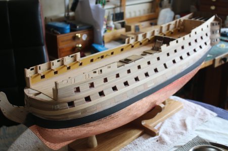
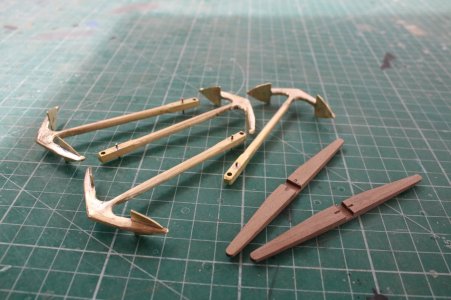
Grant, here's my Vic with the lower ports closed, & scratch built brass anchors - the kit 'monkey-metal' ones are like liquorice; they're not straight & bend if you s much as look at 'em. I would say the hardware on the port lids were black.Hi Everyone, love this discussion as I too am build my Caldercraft Victory. From a few paintings I looked at it I too believe the gun port lids were also the yellow ochre (whatever shade that might be).
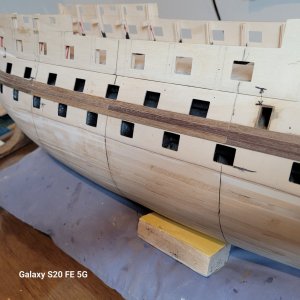
I will put paint the gunports yellow ochre and have them closed. I like the closed look, maybe just on the port side. Question, would the gunport lids hardware be black or would they too be painted yellow ochre.
Any thoughts?
Thanks Grant
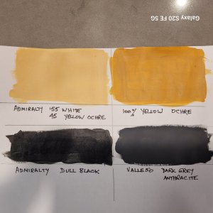
Great pictures - all new ones to me. Looking at the 'yellow' in these pictures, it appears to be somewhat near to that of my 'mix' for Vic.Hey Guys,
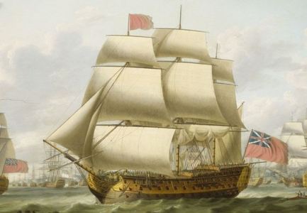
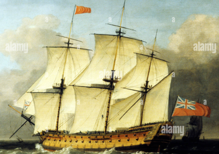
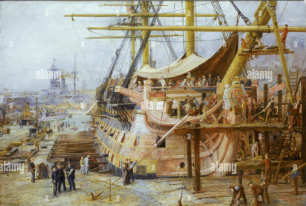
I always think the discussion is great. But you shouldn't forget the circumstances that played a role in the colour scheme. It was simply a question of cost. Since the Victory is so famous, there is also a lot of interpretation by the so-called artists. Whether this is true (as Tayler said: "I only paint what I see..."), I strongly doubt. I think we have to say goodbye to the great colour scheme of the Victory. Not because of science, but because of use and weather conditions. The war also played an important role. I have posted a few photos that roughly reflect the Victory's colour scheme. Firstly the Victory when she first sailed, ca. 1765-1770, then a picture on the high seas: HMS Victory 1793 by Swaine and what I consider to be the most realistic, as this shows a snapshot of the repairs in Portsmouth: the Victory undergoing repairs in William Lionel Wyllie's dry dock. Here I would be in favour of these being coherent, as all the layers of paint have been roughly accounted for. The renewal of the bow also shows the colour of the new wood. The artist had the good fortune here to work his way through all the colours. He therefore did not have to use his own artistic judgement. Here we can see all the colours. How you finish them is up to you. I'm sure it will be great. I'm really looking forward to your pictures ...
Cheers, Günther
View attachment 536268 View attachment 536269
View attachment 536270


Hey Spree,These paintings are very interesting. The first 2 are remarkably consistent with my painting, previously posted, by Capt. Elliot RN in 1790. The last picture in the Dockyard, from the style of dress etc. and identity of the painter is more likely the 1923 restoration. So historically the earlier pictures are better - but it is the modeller and his/her friends who will look at it day in day out so a bit of artistic license can always be allowed.


Hey Stuart,Grant, here's my Vic with the lower ports closed, & scratch built brass anchors - the kit 'monkey-metal' ones are like liquorice; they're not straight & bend if you s much as look at 'em. I would say the hardware on the port lids were black.
Stuart
View attachment 536281
View attachment 536282

Love the anchors! It is so nice to see the extra effort to make high quality pieces rather than settling for poor quality parts.scratch built brass anchors
As would the settings , time of day of the video in the attachment. I like the more yellow version but the ship atm is far from that to the naked eye.As long as you are looking at only photos there is no way to determine the color of the ship in Portsmouth. You don’t know the camera settings and photos of the same part of the ship will differ depending on time of day, white balance, cloud conditions.
Looking at this video it does not look very pink.
Don't think I said he was.I had no idea Turner was at the battle of Trafalgar
Survivors of Trafalgar who saw this painting when it was completed in 1824, 20 years after the battle were not happy at all. At least one critic explains how it is closer to a rendition of the painting The Raft of Medusa with the Victory thrown into the background.
Allan
Added to the evidence are many contemporary paintings by those who actually saw her, I'll take their word over any revised coloring. ( Painting by the renowned Turner, who said he "only painted what he saw")
Sorry for any confusion Enjay, I took Turner's comment, not anything you wrote, that he "only painted what he saw" to mean he was there. As that was not the case, the painting may not be accurate. An example are the forestays either in the wrong place or missing, it is hard to tell.Don't think I said he was.
That's alright, Allen. No he wan't there, but he did see her on her return. From Royal Museums, "he did an unusual amount of research" and "the painting provoked court criticism for its non-chronological approach to Nelson’s victory". Guess we'll never know for certain!Sorry for any confusion Enjay, I took Turner's comment, not anything you wrote, that he "only painted what he saw" to mean he was there. As that was not the case, the painting may not be accurate. An example are the forestays either in the wrong place or missing, it is hard to tell.
Allan
