-
Win a Free Custom Engraved Brass Coin!!!
As a way to introduce our brass coins to the community, we will raffle off a free coin during the month of August. Follow link ABOVE for instructions for entering.
-

SUBSCRIBE TO SHIPS IN SCALE TODAY!
The beloved Ships in Scale Magazine is back and charting a new course for 2026!
Discover new skills, new techniques, and new inspirations in every issue.
NOTE THAT OUR NEXT ISSUE WILL BE MARCH/APRIL 2026
You are using an out of date browser. It may not display this or other websites correctly.
You should upgrade or use an alternative browser.
You should upgrade or use an alternative browser.
NORSKE LOVE - Billing Boats 1:75 scale
- Thread starter Dean62
- Start date
- Watchers 75
-
- Tags
- billing boats norske lowe
Looking great Dean.
Thanks Bryian!Looking great Dean.
A set of beautiful 'subtle' flowers, Dean. And you know what the advantage is? It takes the focus of the window frames and now divides the attention over the entire part! Which makes the windows look neat and stylish.I decided to see how the flowers between the windows is going to look. I kept it simple at this scale and just did a flower and stem…
View attachment 483045
View attachment 483046
Regards, Peter
- Joined
- Sep 3, 2021
- Messages
- 5,199
- Points
- 738

Agree.That is the problem with 'continuous lines'. Like now with the horizontal bars in the windows. If that line deviates even a little, then that is immediately disturbing. That is now especially the case with the middle of the 11 windows. Your beautiful woodcarving deserves better. And a window should have glass. Otherwise it's a shutter or a grille.
So, I know a bit how it works in your brain, Dean.Time for a better option for this eye-catcher that will draw attention. .
Regards, Peter
You do nice work, Dean!
That’s why I wanted to add some, to verify that. Above the windows will be a carved railing, columns and other carvings. I think your eyes are automatically drawn to the ornate stuff and tend to skip the plain things, like windows. Hence the term “eye Candy”.A set of beautiful 'subtle' flowers, Dean. And you know what the advantage is? It takes the focus of the window frames and now divides the attention over the entire part! Which makes the windows look neat and stylish.
Regards, Peter
Last edited:
Thank you!Wow! What a difference a little carving makes. That’s impressive.
Thanks Paul!You do nice work, Dean!
The long stem flowers add an eye pleasing touch Dean, I would only add that they do make the window presentation a bit top heavy, will you add anything similar to the bottom of the windows?
This is the sister ship, and the decorations are located in the same places…The long stem flowers add an eye pleasing touch Dean, I would only add that they do make the window presentation a bit top heavy, will you add anything similar to the bottom of the windows?
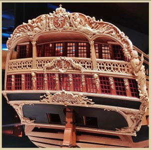
Everyone should keep in mind the big picture…I am only working on the lower gallery at the moment. The upper gallery with the balcony is the main focal point. But I have a lot of work ahead before moving to that area. That’s the pitfall of showing every step along the way.
Last edited:
Ah yes, I see what you mean. What you have now makes perfect sense and looks good.This is the sister ship, and the decorations are located in the same places…
View attachment 483084
Everyone should keep in mind the big picture…I am only working on the lower gallery at the moment. The upper gallery with the balcony is the main focal point. But I have a lot of work before moving to that area. That’s the pitfall of showing every step along the way.
Thanks Daniel. I only wish the small scale didn’t prohibit my ability to add more detail to the carvings. But I am trying my best to get as much detail into what is going on the ship. I may actually add another smaller flower on the stem.Ah yes, I see what you mean. What you have now makes perfect sense and looks good.
But for now it’s back to the tedious and often boring task of making window frames for the lower gallery.
Made another window…
I start out by laying out the window panes and using my Proxxon rotary to make an opening in each one to facilitate cutting out with an xacto knife.
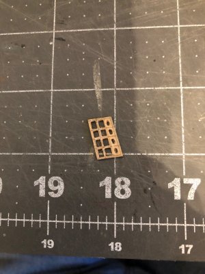
Then I use a small triangular file to square everything up and get it ready for paint.
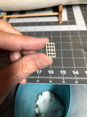
Then I paint one coat and see if any of the grain raises, and then I file that and put the last coat on.
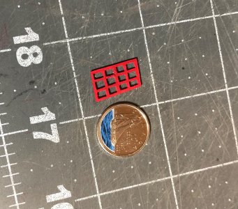
Next it’s time to glue into the galley wall. Tip - do not put glue on the border of the frame and put in the window opening or the glue can push out onto the frame. Instead put the glue in the border of the window opening so when you put the window in, any squeeze out will be pushed behind the window.
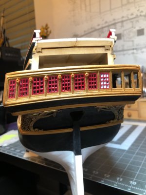
After gluing in the frame, I added the glass using the Micro Krystal Klear.
This was 2-1/2 hrs of work start to finish. But I’m actually getting better at this! It’s the 8th one…3 more to go in this wall!
The reason I decided to make a window frame out of one piece is two fold. First, it’s the cutout from the wall, this ensures it fits perfectly! Second, trying to glue and accurately locate all the boards at this scale would be maddening, and I can’t say it would look any better.
So, this is method I will continue to use.
I start out by laying out the window panes and using my Proxxon rotary to make an opening in each one to facilitate cutting out with an xacto knife.

Then I use a small triangular file to square everything up and get it ready for paint.

Then I paint one coat and see if any of the grain raises, and then I file that and put the last coat on.

Next it’s time to glue into the galley wall. Tip - do not put glue on the border of the frame and put in the window opening or the glue can push out onto the frame. Instead put the glue in the border of the window opening so when you put the window in, any squeeze out will be pushed behind the window.

After gluing in the frame, I added the glass using the Micro Krystal Klear.
This was 2-1/2 hrs of work start to finish. But I’m actually getting better at this! It’s the 8th one…3 more to go in this wall!
The reason I decided to make a window frame out of one piece is two fold. First, it’s the cutout from the wall, this ensures it fits perfectly! Second, trying to glue and accurately locate all the boards at this scale would be maddening, and I can’t say it would look any better.
So, this is method I will continue to use.
A watched pot never boils - and watched glue never dries...As the glue dries…love this stuff!
View attachment 483246
Not sitting there watching it, just checking in on it!A watched pot never boils - and watched glue never dries...


