Good day ( or evening

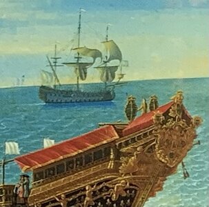
) This is what I have found and wrote about in my document; In the springof 1671 when Dassie saw the Soleil Royal finished and being prepared for a trip in Charente, he wrote this amongst his whole document about the event. ''...le noir, le blanc, le bleu et le ventre de biche........Ses listons d'or et le rouge vif de ses sabords, c'est un vaisseau magnifique.'' He would write another comment about the decors being more sober but of very fine taste. From a itness, this is as close as you get to have some clues on the initial appearance of the ship.
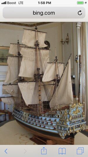
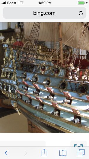
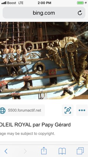
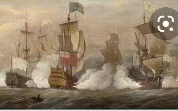
I have made several interpretations of what the ship could have looked like in my document, bringing examles and reasons why I chose those scenarios. As for the blue, all artists who made paintings relied on whatever information they found, not knowing in which period those informations depicted. So, here is a VERY quick resume of what is the most likely:
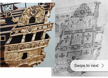
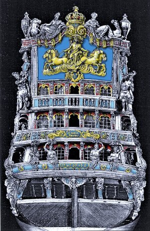
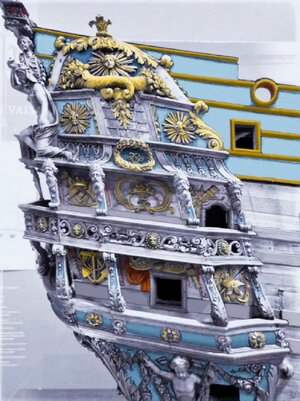
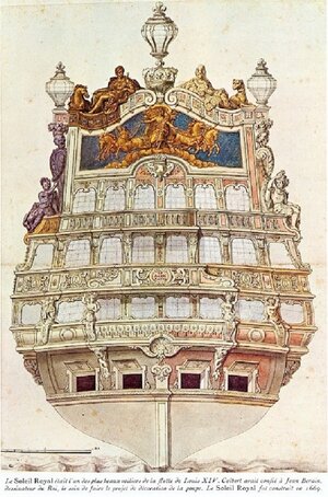
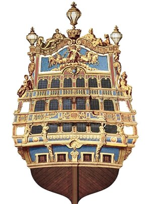
1671..... The ship could have been mainly white because it was one of two ''hors classe'' ships, the other being the Royal Louis of 1668; so if we refer to Dassie's comment, the black is the waterline, of rather the protection above the yukky white stuff painted at the waterline. it envelops the two bottom strakes(?) or, in French préceintes, then the hull would be white, as with the Royal Louis, up to the top of the upper main battery. There can be a lot of interpretations for the ''listons d'or, or the golden moldings which were running the lenght of the hull. Next comes the blue color which covers the paneling from the forecastle and quarterdeck and all the way up to the top of the side. The rest is more obscure sincethere are no details; however, there might have been some ocre red in the inserts of the decor inside the galleries and around the back windows. The stern and side galleries would be a mix of mainly blue and some yellow-gold, the gold paint beng reserved for the royal symbols, the main backboard relief, the crown at the top, and the decorations inside; this being because that paint was horribly expensive, as was the blue color. The two pics show where the gold color woud have been applied; the blue in those examples is azurite blue for the darker blue, and a lighter and cheaper, though still expensive color made from a mix of copper/bronze oxide and sullphur oxide.
1688... The ship is being rebuilt, lowered and the stern slightly widen; the decor, a new variation from the first one is now a Berain product, the original had been a redesign of Puget from the original Le Brun drawing.
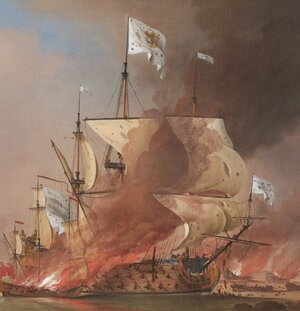
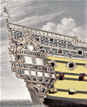
What you see in the aquarelle from Vary is a propositon for decor on the refit ship, which may, or may not have been approved; why? because blue was still quite expensive and in 1686 the king ordered that no ship would have expensive paint applied to them; as with the king's rules, there were always some ''flexibility'' and it is why the refit ship would have had SOME blue, but not the whole hull. Berain himself sent a proposition to the king which laid out in one drawing several possibilities...but no blue (see pic). So, in answer to your inquiry, the blue color was used on a very limited basis because of its cost. Blue only became affordable early in the 18th century, when the ''prussian blue'' was discovered... the two last pics depict an avenue for the decor's color
And no, the Tanneron at the museum is not blue.... The hull is ocre yellow with black and different wood tinits as the hull is only a vehicle for the remarkable bow and stern sculptings
Lastly, if any of you reading this want a copy of my document, you're welcomed to ask for one
 View attachment 344463
View attachment 344464
View attachment 344465
View attachment 344466
View attachment 344467
