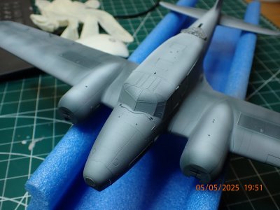
If yesterday was priming then today was underpainting.

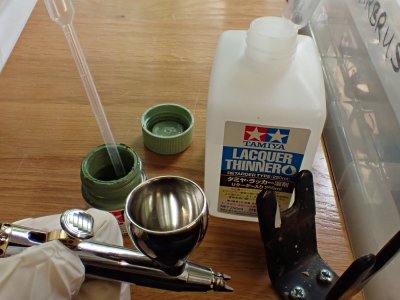
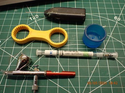
Same tools. The ring spanner and the rubber cup are for removing the lids from Tamiya and Gunze paint jars which sometimes stick fast as paint dries in the lid threads.
The cappuccino frother is a paint mixer when the end is modified. Cost a pound at Ikea years ago. I've seen exactly the same 'professional paint stirrers' on sale for twenty times as much.

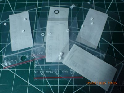
I've always liked to keep a full range of seals for the airbrush. Tonight I replaced two of them, which is the first time in a decade such maintenance has been required.

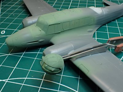
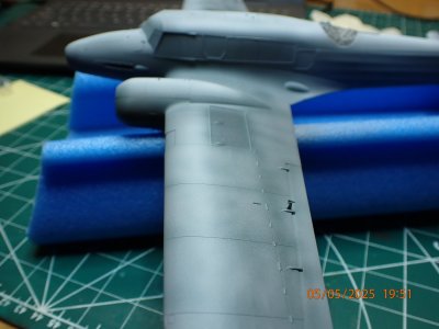
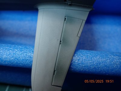
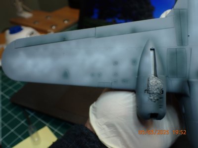
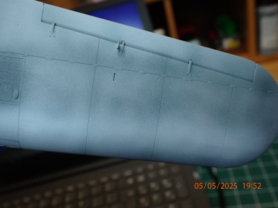
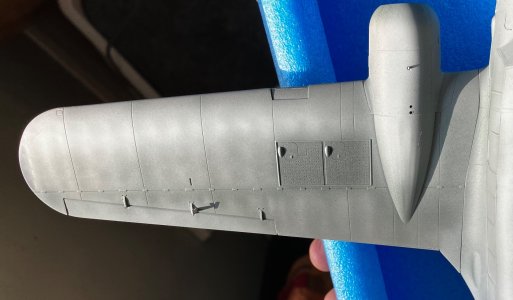
This is zenithal highlighting at the underpainting stage. If it works it's easier than doing it with the top coat. I've sprayed a whiteish layer of Tamiya paint downwards onto the tops of all the upward curving surfaces. These surfaces would reflect light from above and appear lighter. I've done the opposite with a very dark green paint sprayed from below for the shadows. I've also darkened the 'armpits' where wings and tail meet engine fairings and fuselage.

The idea of this is to make my topcoat colours vary in shade according to the effects of light on a 3D form without me having to change paint colours. All I need do is use acrylic paint's great advantage by spraying thin translucent coats so that the underpainting shows through.
Being out of practice and hamfisted it's likely that I'll just cover all of this lot up but if I can hack it, it can look really good. Models are just too small to cast shadows and highlights like the full sized objects - so they need a little help. When it's done well, the observer sees that the model looks more 'solid' and 'real' but won't know why.

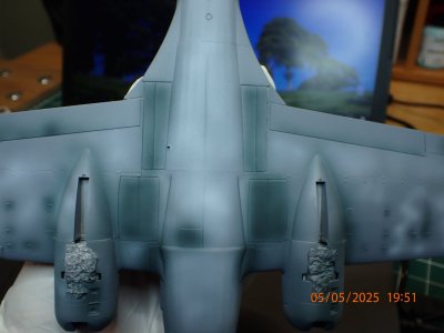
As well as the shading/highlighting I've deliberately broken up the large flat areas with marbling and suggested some muck and grime. It looks overdone now but when the top colours are on, they will be suitably modulated like the real things.

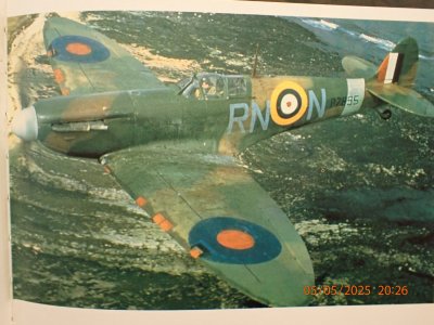
1940s paint was not durable and never looked like a smooth and even sheet of colour. This is an original colour photo - not colorized! This Spitfire was a worn out Battle of Britain aircraft, relegated to the industrial North of England as a trainer. It's an extreme example of the king of finish I strive for.

A few months in the bright UV light at altitude and the salt air at sea turned the paint on this Warwick into something between chalk and coal dust. Theres no trace of the demarcation between green and grey that existed when it was new painted. It's interesting to see the groundcrew footprints!

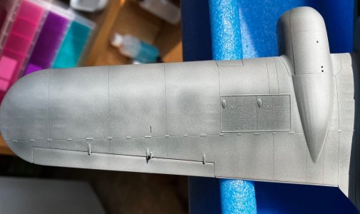
Silver paint isn't great for this preshading/modulating technique because it's so opaque. I'll have a go though and back it up by using different colours of metallic for different areas. The 'silver' was silver dope over canvas in some areas, silver dope over aluminium alloy in others, and occasionally bare metal.

I'm also modulating the silver, mostly as an experiment to see how effective this all is.

That's the modulation on the upper wing where it might be too faint. I'm out of practice remember.
 Top Tip # 7
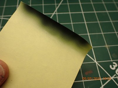
 Post it notes are great for quick, simple masking jobs.
I aim to spray the green and brown on the top surfaces in the next session. In view of the delicacy required, I'll wait for daylight.

