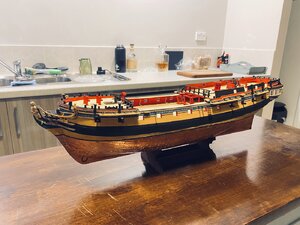
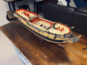
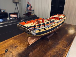
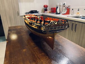
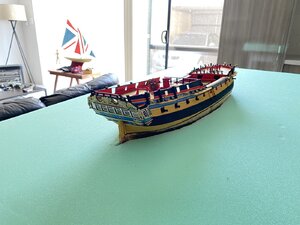
HMS Mercury 1/72, Shipyard models

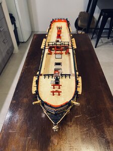
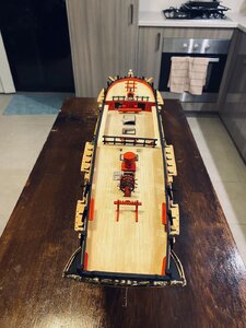
This now brings me to where she sits today. So far I have a month invested into this amazing little kit with so much more to go. For my first ever card model I’m very pleased with my efforts so far. Happy for any criticisms and questions.

Of note, I’m trying to find information on the stern decorations and the figurehead. Whether they where painted in realistic colours as some models of Bellona for example and other contemporary models show, or, the golden yellow paint.

Another question I have is the colour between the wale and the waterline. In the AOTS Diana book, the yellow painting of the upper hull above the waterline with a black wake is mentioned. When you look at AOTS Pandora, a much more similar vessel to Mercury, the planking under the wale was tarred giving a dirty brown/black appearance. HMS Bounty also seems to have had this practice though without the yellow was on the upper hull.

While I do like the appearance of her at present, especially with the frieze work, I can’t help but want to have the accuracy if the hull below the wale was tarred.

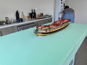
So for the last pictures of how she appears tonight.E223D57E-F538-4102-9F85-4DF9E601A4B1.jpegDB1C4B3C-5F5A-4207-BA77-78431AC78121.jpegD151C598-DED7-4AAD-8CA7-72A84E8DF8C4.jpeg460ACAD9-6F2C-42C8-BF22-0A4FCF97DB61.jpeg5E7EF99D-F4BB-4AA9-BFB9-88EF20A82D99.jpegDBFE694D-6249-4F93-BCB0-F380ED6A3891.jpeg
 
Excellent workmanship! Every time I see a new build log from a cardboard my palms itch to start mine! I am not sure when this will happen until then I will enjoy watching your build!! Please keep updates coming :)
 
Thanks everyone. And I haven’t rushed the build either, literally just a couple hours a day but yes unlike wood, the planking is very quick as the planks are pre cut to fit. Building my last wooden hull model took a few months to finish the final planking stage. Work has been crazy this last year so it’s been a nice distraction the last month and a good help to unwind.
 
Hallo @Atamini ,
a warm welcome here on board of our forum - and many thanks for sharing with us your new card-board experience.
Very good looking model
 
BTW: our member @Bonden is sharing his build of the Mercury in another building log
Maybe interesting for you
 
Hello @Atamini,

I am very happy that I am finally no longer alone in building a Mercury.
Your ship already looks fantastic - and in such a short time, respect! Thumbsup
As you can see, I decided on a slightly different color scheme. I dressed the blue and gold stripes on the side in a friendly black. In an old Royal Navy naval regulation from this period it is analogous that one should do without excessive pomp and colors on smaller ships. That's where my decision comes from. But the yard models at NMM in Greenwich also have this colorful trim. And none of us was there at the time and took photos - but also bad luck.

And if that reads something strange for you now, what I'm writing here - sorry, but that is the fault of the Google translator. ;)
I will continue to read your construction report carefully and am very excited about your next steps.

many Greetings

Bonden
 
Hi Bonden, you have an amazing build also! I’ve yet to comment there but am meaning to have a proper read from the start. I worked on the Endeavour replica for a number of years and keep with the colours used on her upper works regarding the blue, red and bright yellow for the trim work. Endeavour is tarred however on the upper hull between the wale and trim rather than painted yellow. This is most likely as she was a small ship and the decorations and paint was usually subsidised by the captain. Cook wasn’t the wealthiest of men at this time so it would have been unnecessary to paint her upper works yellow.

I have to admit the NMM models have affected my choice with including the frieze on Mercury as well as the painting of the model of HMS Enterprise the lead and name ship of the class
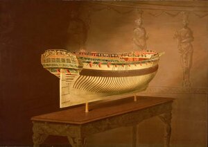
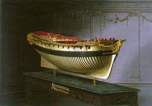
17C13F87-D9FD-451A-88C4-CB783BAF0592.jpeg
BDD1C784-35F2-4026-8ECC-766E0CC2B603.jpeg

It’s most likely though if Mercury has any frieze world painted it would have purely been at time of launch and painted over with the blue in fashion.

Paint was used more widely to decorate vessels in the 18th century than in any previous age. The raw materials necessary were available in sufficient quantities to allow the preservative properties of paint to be put to good use and they were usually mixed on the spot from the component pigments, oil, and thinner. English dockyards commonly used white lead, vermilion, red ochre, spruce (Prussian ochre), English ochre, verdigris (used for greens), calcined smalt (a cobalt compound used in blues) and blue-black. Gold leaf was also used, though sparingly, as were red lead, Venetian red, and Indian red. The Venetian and Indian reds would have been used for small decoration rather than mass coverage. A drab paint was made by mixing the leftovers together and was known, appropriately, as ‘sad colour’. It was used on the bottoms of boats, in the bilges, and on the faces of joints. In the 1780s whitewash began to be used on the interior parts of ships and its application gradually increased until it had, to a large extent, replaced the traditional red (Howard 1979:194) I’ve opted like in the Endeavour replica for these parts to be red and white wash only in the great cabin.

According to an Admiralty Order of 1715, the sides of ships were to be ‘painted of the usual colour yellow, and the ground black, and that both inside and out to be of a plain color ... except such parts of the head, stern, and galleries as are usually friezed...’ The ‘usual colour yellow’ implies a well-established tradition, and there is evidence that the Order was obeyed. Many contemporary pictures and models do not agree with what is stated in the Order, as they depict the sides ‘bright’, which means that they have been treated with turpentine or tar. Varnish and salt air and sea water for that matter, do not agree with each other especially for a ships side. I sailed a number of voyages on the Duyfken replica around Australia and further afield, and one job we always had was to scrape off the varnish that was applied when the replica was built and to be tarred over. You never wore any fancy clothes living on Duyfken as you would either end up covered in Stockholm tar or tallow! Haha

The upperworks of some models are a soft, light blue on which scrollwork and heraldic designs are painted in gilt, and others, although conforming to the Admiralty Order about plain colors, nevertheless have scrollwork in gilt along their topsides. This divergence from the official scheme suggests for certain that the artists took some amount of “artist’s license’ when decorating the contemporary models we see at NMM and the Science Museum. After 1740, there is no doubt about individual variations in ships’ paintwork, for there are references to ships with all-black sides (which would make them look smaller and, so it was hoped, induce the enemy to attack) and to others with the lowest wale and the topside black but the portions in between painted red.

The history of ship painting for the years 1740-1780 has never been investigated in detail but enough information has come to light to prove that the appearance of a fleet then was far from uniform. Official recognition of this fact was given in an Admiralty Order of 1780 that allowed ships to be painted black or yellow, and from then until some years after Trafalgar a fairly wide variety of styles was to be seen. A record of the appearance of the British ships at the Battle of the Nile in 1798, made by Col. Fawkes, who was present at the battle, is indicative of this “mottled” fleet (Howard 1979:193):

1. Plain yellow sides: Alexander, Audacious, Bellerophon, Defence, Orion, Mutine

2. Yellow sides with a black strake between the upper and lower rows of gunports:
Goliath, Leander, Majestic, Theseus, Swiftsure, Vanguard

3. Yellow sides with two narrow black strakes between the upper and lower rows of gunports: Culloden

4. Red sides with a small yellow stripe: Zealous

5. Red sides with a black strake between the upper and lower rows of gunports:
Minotaur

Eventually the realisation that heavily ornamented warships were a handicap in sea battles must have hastened the steady reduction in the amount of artistic embellishment which had characterized the appearance of warships after 1700. Figures gradually gave way to merely ornamental patterns. More stress was laid on beadings, friezes, emblems, and cartouches. Figures were confined to smaller sculptures of dolphins, masks, and cherubs, while the only larger ones were those of the figurehead and coat of arms. This development was parallel to and linked with a reduction in the size of the after-castle, which naturally reduced the size of the surface on which ornaments could be applied. The process of elimination continued through the 18th century until all that was left in the way of ornamentation was the figurehead, coat of arms, and name symbols (Hanson 1968:122).

So from my little research into the history, I’ve opted my route but again I just find that frieze captivating. I’m still on the fence as to whether to stain the lower planks - between the copper and the wale - in a tarred brownish black as found on the Pandora and some other ships of the period.

Oh and Bonden, I understand completely what you mean so don’t be put off by your translation.
 
Last edited by a moderator:
Also while doing paint research, I was trying to decide as to how to present the figurehead. Either gilded or painted in more natural colours.
The figureheads were usually gilded or ‘gilt painted’ until about the 1760s, when the fashion was to paint them in colour- which lasted until the very end of the sailing ship era- came into vogue. The rest of the head – the knee, the cheeks, the head timbers, and the rails – was painted in accordance with the Order of 1703, carved work being limited to giving the rails mouldings. The stem knee, like the lowest wales, was painted black, but there was a good deal of variety about the painting of the rest of the head (Howard 1979:193).

So once again it isn’t completely clear, though I’m leaning to paining Mercury in natural more life like colours. The figurehead of mercury in the kit is also unusual as it doesn’t look so much like a Greco Roman god that it is named after and is missing the snake septre Mercury would carry in the right hand, with globe in left. The figurehead appears contemporary 18th century dress... and trying to find any reference to the detail of Mercury’s figurehead is next to nothing, so it would be interesting to see where the producer and kit designer got their reference from.
 
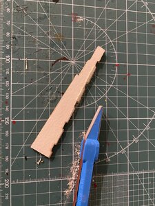
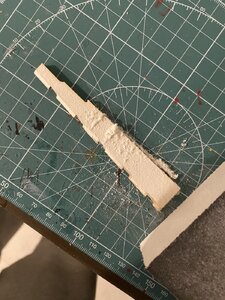
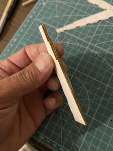
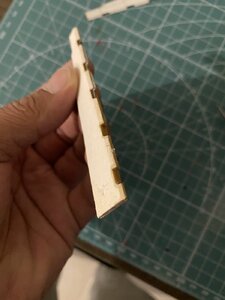
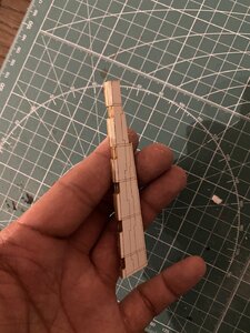
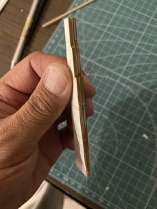
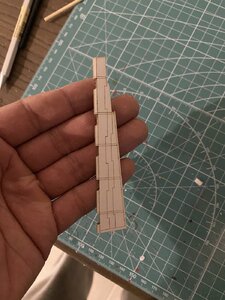
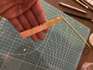
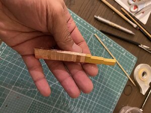
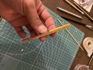
It’s been a slow week so far with building, however have made up the base of the rudder. The rudder itself is made up of four large pieces sandwiched together. Two thick wood fibre/card material skinned with thin laser cut or grooved card for either sides. The laser cuts on the card imitate the major pieces of the actual rudders.

I glued the first two inner thick pieces together with a slip of thinner card between them - only the upper half. Once set,I sanded down the rudder thick at the top and thining down towards the foot of the rudder. The wedges which are notched for the pintels, where also shaped.
A58DBCD9-AB66-4256-94A1-5D3DE48DA244.jpeg
E528AB16-64D8-4E4E-ABE7-1444A0C25C8C.jpeg
Once I was happy with the shape, the card for the outer skin was folded at the laser cuts and attached to the rudder base.
04CB4371-364E-4518-B31C-0CF0D31A580A.jpeg32114F0C-4634-4D88-A6BD-2DC92580932B.jpeg57CF8393-39F0-4DE1-95B2-3CF21CB18D74.jpegCF9ECC9C-2640-4589-A858-F16F2C9FD2AC.jpegCEC14D49-6ABF-4462-9431-51D7B1D1F5DF.jpeg
Quite happy with the tapered shape of the rudder now. The instructions don’t explain the construction of the rudder or mention the taper that they had. The parts are quite straight forward however. Next to copper, paint and add the ‘iron’ eyes and brackets.
 
22072856-48EA-4C57-992B-2EFE1B50CF63.jpeg
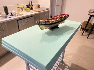
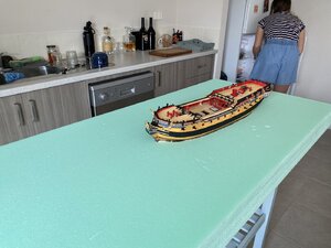
Not a build update as such, but I’ve bought my foam boards which I’m planning to use to create the sea base. I’m not 100% on how I want to display the model but I’d love to bring it alive by setting it into a diorama sea scape. The foam boards will be laminated together, a hole cut out for the hull to sit in and then carved to create the larger swell.
045CBAD1-FC93-46FB-A7CD-C04FB8403F33.jpeg
7F89AE5E-C440-401A-9964-E0FD8B7BC2A5.jpeg
873FCEC8-38DE-411A-AD6E-1091933848A2.jpeg45A4845E-2EF9-4590-B35D-30EFE687A61E.jpeg
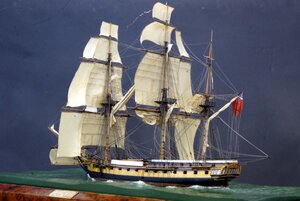
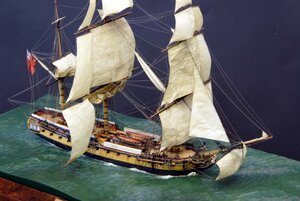
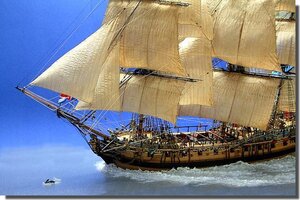
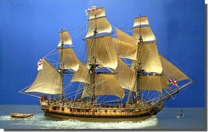
these two models, the first Diana at 1/150 and the second the Pandora at 1/64 Are my inspiration for the seascape.
 
A39F6511-37F6-4603-B721-C044C0C3B3EB.jpeg2298556B-5239-4EFB-B6C6-2A04AB0C1674.jpeg8F06BD13-B732-4B0A-9B96-89EAF713DD5B.jpeg
The first cut out made. This cut out is only the top two layers. Next I’ll carve out the rough swell before taking the hull cut out into the third base layer. The hull will be set on a slight lean to port with the wind coming over the STBD quarter.

Unlike my smaller dioramas, because of the size of the model, I find it easier to create the base and sea now as the hull is easier to handle. The masts will be stepped and rigging commenced once the seascape has been created.
 
Thanks for leading us into your kitchen and to this status of your build.

Yes I like these dioramas - but does the foam plates not do desintegrate over the tome as the railbed from foam does do, too? Or infecting your copper surface?
 
Back
Top