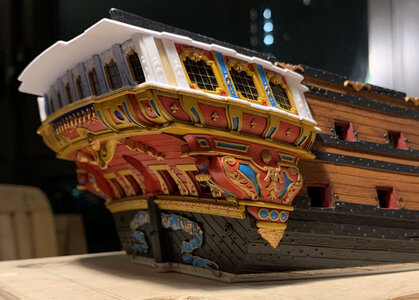
Soleil Royal by Heller - an Extensive Modification and Partial Scratch-Build by Hubac’s Historian

Hy Marc at the very end you may be forced to add some bronze toilett paper holder for rolled silk if you do add such beautifull details onto details onto details.

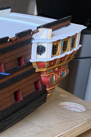
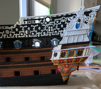
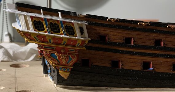
The side gallery is really growing organically on the side and it is a great moment to see the world's most decorated toilets - no oil sheikh has such a restroom with all his wealth than the king of france added to his flagship. Beautfull done.

The idea of building these gunwhales and thwards in one pice I genial and takes away a barrel full of fiddling fumbling proportioning and heavy waler's cursing I do hope.
 
Last edited:
It was a good week, tying up loose ends on the starboard side QG.

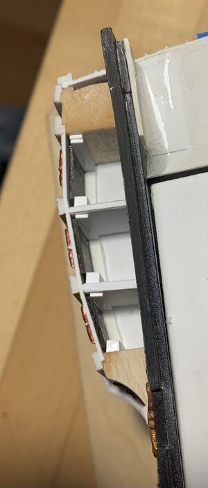
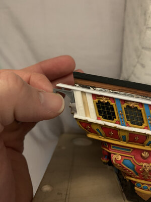
The windows are tacked in place with a little cyano before gluing-in the window plate. As I did for the stern lights, I took a little extra care to back the window panes with stops; in the event that the cyano fails, at some point in the future, at least the stops will keep the windows in place, mechanically. Empty eye-sockets are daunting repairs.
8C5997C6-AAD2-46F5-A1B0-2CCE258A766E.jpeg

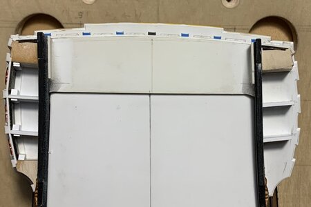
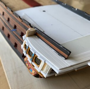
This overhead shot gives a sense for the multiplicity of rebates that were cut into the aft blocks - particularly, clearance had to be cut for the aft window pane, itself, effectively making a window stop of the block.
24616457-1985-48A9-9CC0-2E7BDD18A0AA.jpeg

One can also get a sense for the asymmetry of the transom, which I described in earlier posts; this reality has made coping the whole thing together more challenging, but the variance is not apparent from the outside. It is fortunate that the wrapping stern balcony happens at this level, rather than above, where this variance will increase, somewhat.

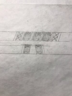
Having learned my lesson, I pre-painted the window plate, off the model. The reality of what ends up being constructed is sometimes at odds with the one-dimensional plan I drew. Initially, I thought I would book-end the three windows with these diamond-hatch motifs:

A6C530A9-6A46-4662-9529-59F25F131E8A.jpeg

It looks well on paper, but in reality - the coved forward block feels too expansive for this to look good, while the space between pilasters, on the aft block, turned out to be much more narrow than I expected:
47A482A5-453D-491D-BEE2-E43AB7714167.jpeg

I’ll mock up the aft diamond-hatch in card, just to be sure, but I think it will look too cramped. For the forward block, I decided to extract the radiant fleurs from the upper finishing of the stock QG plate:
47E9C23B-F4D1-4E78-BD87-545109EE6BEF.jpeg

I had to make these a little more oval, than round, to fit the available space. When I paint these, I will pick out the rays in gold, silver and white, which I think will create the right impression, while mirroring a similar treatment to the backdrop of Apollo’s horse-drawn chariot on the tafferal.

Having worked out all of the problems on the starboard side, the port side is moving along much more quickly:
76B61586-587F-4AB3-A681-23A603B9D8A8.jpeg

Soon, I’ll be coping together the base walkways of the wrapping balcony, which will then enable me to pattern and make all the pieces of the balcony railings. At this level, these are very involved and will be time-consuming to make well.

So far, so good - a reasonable facsimile, up to this point:
4B2C8168-D030-4375-AF36-745577B6B0F6.jpeg
6BE4BDFA-96F9-47A9-A784-BAB70DC99BD9.jpeg

Thank you all for the likes, and your gracious comments!
 
Last edited:
A sudden rush of “affordable” housing opportunity has slowed me down considerably, this past week, but I have managed to make some progress.

EF9B983F-F5DA-477C-8AC3-DE4F683D3259.jpeg

I’ve closed-in the port side quarter gallery. In the process, I left a small CA fingerprint on one of my glass panes. It isn’t terrible, but its presence annoys me. I haven’t tried acetone for fear that it will mar the acetate. Isopropyl had no effect after a half-hour of effort. Does anyone have any experience with using this product from BSI on plastic?

https://www.amazon.com/Bob-Smith-In...ocphy=9067609&hvtargid=pla-379516931894&psc=1

If need be, I can live with the blemish, but I would rather remove it. Any other ideas?

Otherwise, I’ve been coping together the parts for the wrapping balcony:

63CB23FF-36C7-4A48-A200-4FCD9908DB95.jpeg
7E4D4234-D591-43C9-ACF3-14286CBC598D.jpeg
6955B46C-91A7-4E96-9B7C-268D09C90E7E.jpeg

After I secure these, there are planking overlays that complete the illusion, while also providing a glue-lip for the balcony rail.

2373E38C-BB3D-4EF1-A982-449807D8A354.jpeg

As they are really quite good, I still plan to use the stock Four Seasons figures:

4ACD01BC-3761-4BED-AF2E-DC0FE1C85315.jpeg

They will require some delicate chiropractic surgery in order to reach the new geometric relationship between the lower false balcony and the wrapping middle balcony.

C80DE88F-E17C-464E-85E4-6B80C0B186CE.jpeg

I’m not sure yet how I will go about this, but I have a spare set, in case I mess up.

I am debating placing corbel support beneath the outermost extension of the walk. It doesn’t make sense to me that there wouldn’t be additional support, here.

My walk is not quite as deep as the stock kit part; I recognized that there would be limitations to how far I could stretch the Four Seasons figures, so I made the walk a little more shallow. The unintended result of that, though, is that even the smaller of the stock corbels are too big for here:

0BB8372C-D0C3-44C5-A292-B5B13E8D1D0D.jpeg

It is not a big deal, though, as I would only have to make one pair from scratch.

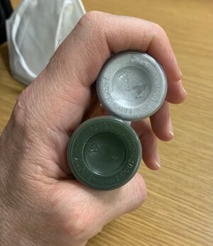
Today, I was near the WarHammer shop, so I picked up a vibrant silver metallic and a plant-green wash coat.

49937205-3029-4CED-BFA0-F8EBF23CF54B.jpeg

My idea is to incorporate silver leaf into the build, in select spaces, and to even use a faint green over-wash, on top of the silver. One possible application for this might be the acanthus-flanked monogram escutcheons between the main deck guns; I’ll experiment with greened silver on the acanthus branches. Maybe it will look terrible, but it might be interesting. I took the idea from the elaborately painted and gilt interior of St. Francis de Sales church on East 96th Street.

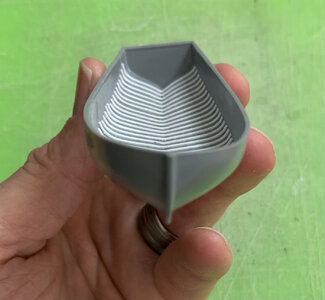
In other activities, I picked up what is actually the Grand Chaloupe from my father’s house, this past weekend. It is significantly larger than the one I did earlier. I am detailing as I did before:

7F4E9F5C-E2CD-4A66-8372-7B974C09B530.jpeg

There is a significant warp in the hull, but the thwart insert piece straightens this out, for the most part.

Well, that’s where things stand, for now. Thank you for the likes, comments and for stopping in.
 
A sudden rush of “affordable” housing opportunity has slowed me down considerably, this past week, but I have managed to make some progress.

View attachment 220535

I’ve closed-in the port side quarter gallery. In the process, I left a small CA fingerprint on one of my glass panes. It isn’t terrible, but its presence annoys me. I haven’t tried acetone for fear that it will mar the acetate. Isopropyl had no effect after a half-hour of effort. Does anyone have any experience with using this product from BSI on plastic?

https://www.amazon.com/Bob-Smith-In...ocphy=9067609&hvtargid=pla-379516931894&psc=1

If need be, I can live with the blemish, but I would rather remove it. Any other ideas?

Otherwise, I’ve been coping together the parts for the wrapping balcony:

View attachment 220538
View attachment 220542
View attachment 220541

After I secure these, there are planking overlays that complete the illusion, while also providing a glue-lip for the balcony rail.

View attachment 220536

As they are really quite good, I still plan to use the stock Four Seasons figures:

View attachment 220537

They will require some delicate chiropractic surgery in order to reach the new geometric relationship between the lower false balcony and the wrapping middle balcony.

View attachment 220534

I’m not sure yet how I will go about this, but I have a spare set, in case I mess up.

I am debating placing corbel support beneath the outermost extension of the walk. It doesn’t make sense to me that there wouldn’t be additional support, here.

My walk is not quite as deep as the stock kit part; I recognized that there would be limitations to how far I could stretch the Four Seasons figures, so I made the walk a little more shallow. The unintended result of that, though, is that even the smaller of the stock corbels are too big for here:

View attachment 220532

It is not a big deal, though, as I would only have to make one pair from scratch.

Today, I was near the WarHammer shop, so I picked up a vibrant silver metallic and a plant-green wash coat.

View attachment 220531

My idea is to incorporate silver leaf into the build, in select spaces, and to even use a faint green over-wash, on top of the silver. One possible application for this might be the acanthus-flanked monogram escutcheons between the main deck guns; I’ll experiment with greened silver on the acanthus branches. Maybe it will look terrible, but it might be interesting. I took the idea from the elaborately painted and gilt interior of St. Francis de Sales church on East 96th Street.

In other activities, I picked up what is actually the Grand Chaloupe from my father’s house, this past weekend. It is significantly larger than the one I did earlier. I am detailing as I did before:

View attachment 220533

There is a significant warp in the hull, but the thwart insert piece straightens this out, for the most part.

Well, that’s where things stand, for now. Thank you for the likes, comments and for stopping in.
Hi Marc,

Lovely work as usual.
I couldn't see the unwanted finger print and I have no experience with the product you have listed. Depending on excess to the blemish I would use fine wet & dry sandpaper on a stick to remove most of the offending finger print then finishing off with Tamiya polish starting with course and finishing with fine. I have done similar things on model aircraft canopy's in the past.
Hopefully this is of help, though I guess I am telling you something you already know.

Cheers,
Stephen.
 
Thank you, Stephen. I did not photograph the blemish, but it is accessible. Your idea is a good one, and I may experiment with polishing compounds if the BSI release agent doesn’t work. Thanks for the suggestion!
 
I’ve been slowly working through the problems of this one, small, critical piece. I’ve reached the transition from the lower hull to the upper bulwarks. The railing of the open walk is that transition line, and the forward terminus of that railing has some tricky navigation to plot, in order to avoid interference with the aft-most main deck gun. Here is the problematic rendering by Berain:

C84F26B6-6EBD-441D-B368-A5491BE9CABC.jpeg

Even though the Heller kit was not directy based on this drawing, the problem still exists. What I drew, in my revision drawing, doesn’t exactly match the reality of my build, and so, it became necessary to design on the fly. This turned out to be one of the more complicated parts to work out its shape; it has to extend far enough aft to clear the gunport, but still fay forward into the hull with something of a sweeping arc, so that the cap rail doesn’t return to the hull at an awkward right angle, while also not encroaching on the port opening.

Here is the basic shape that I arrived at, complete with compound angles:

56E132D2-6565-4C6C-ACFA-B659ACE51749.jpeg

The material for this part is the off-cut of the return just below. This was handy because the compound angle was already approximately sawn, and it only took a little sanding to fair the surfaces:

CA72815E-6EE1-4F05-91BD-D23F28705848.jpeg

It occurred to me that I would be better served to not try and let this part into the wales. Instead, I faired a styrene filler that keys-in between the wales.

The awkward bit is the weird triangular flat that you see just aft of the forward rounding. I was highly skeptical about how this would resolve, on the model, but I knew that there had to be a smooth continuous surface, on which to mount the carving.

In the end, the carving draws your eye, and the remainder of the lower port enhancement partially overshadows this weird triangle:

18C37B52-8176-48AC-9DB0-C382635C1DE7.jpeg

Ultimately, I will probably blacken the interspace between the hull and the carving, in a little bit of theater carpentry, aka Trompe Loiel. A brief montage that shows how all the parts fit together:

165D1B4D-2D26-4635-8EC4-20EC3DFD59CF.jpeg
4272FB45-9157-493A-8156-2FF1A436FB65.jpeg
86C880F5-92D7-427D-9381-878CE1B50A92.jpeg

The gap between the block and the upper bulwarks will be filled by the caprail. Next, I will complete the starboard side block, and then I can begin designing the railing upright, itself. After I make the starboard block, though, It may make more sense to focus on editing the Four Seasons figures, so that I can mask their mounting places and bring the paint fully up to the gallery level. I am reminded of SJSoane, right now, and the order of operations problems that he is currently dealing with on his magnificent Bellona. I will say that I am really happy that I resisted the temptation to mount the beakhead bulkhead, way back when. If I had done so, I would have had tremendous difficulty painting as I go.

I also ordered a bottle of the BSI debonder. Even if it doesn’t solve my current problem, it seems like a great product to have on hand, in general.

Thanks for the likes, your comments and for stopping by!
 
Thank you all for your kind compliments and for continuing to support the project. I know I spend a lot of time on the minutia, but that is where I find the greatest satisfaction and continued investment in the project. It is gratifying that such a good number of you enjoy that level of detail. I may only be guessing a lot of the time, but I try and do things that make practical sense.

One such example is interior support for the quarter gallery rail. Although, I do not see specific reference to this in Lemineur’s monograph for the SP - or anywhere else, for that matter - it only seems sensible that such a light construction would have additional support. So, that is what I have endeavored to do:

0E1B5A4E-2897-405C-AA70-25E7C937CF5E.jpeg
3E2255E0-1EF8-4370-AAFB-33E8CF6F342B.jpeg
14D4F0EB-1F8B-4C91-AED0-0AE002351554.jpeg
FFC3CCFA-8542-48C2-BACE-B39B3FAD44E9.jpeg

A wooden ship is full of knees, buttressing and distributing loads. The channels have knees. The deck railings have knees. The stern and quarter galleries are particularly vulnerable to rough and battering seas, so I think this makes sense.

There is the added advantage, of course, of having additional glue surface for the railing upright, and these supports will help the part conform to the gentle contour of the gallery.

I received my BSI de-bonder. The bottle says that the product mars most plastics; perhaps not acetate, though. I will experiment. I will also soon be painting again, so that I can install all of these walk parts.

All the best,

Marc
 
It has been a bit of a hectic week, as I consider moving my family, yet again, in the never-ending quest for a reasonable three-bedroom apartment in NYC.

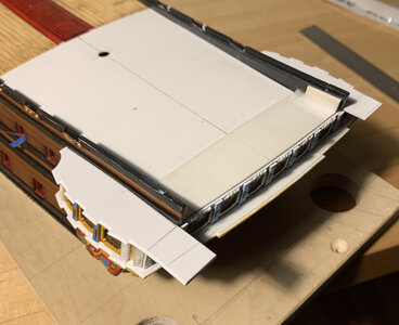
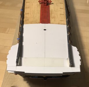
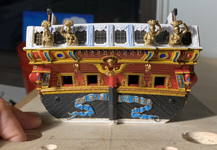
Slowly, I have been assembling the QG open walk and painting the stern. It is fiendishly difficult to get into the recesses of this stern window plate, and I really wish I had painted it off of the model. Slowly, though, we are getting there:

E83003E8-A4AA-4E91-B015-4C521ABA1DF1.jpeg
C148F144-83D6-428A-8346-781CF5957943.jpeg
I’ve masked with blue tape, the footprints of the Four Seasons figures. I also decided to extract as much recyclable detail from the two extra stern plates that members of this community have so generously donated.

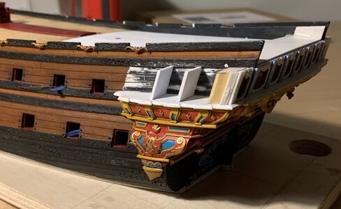
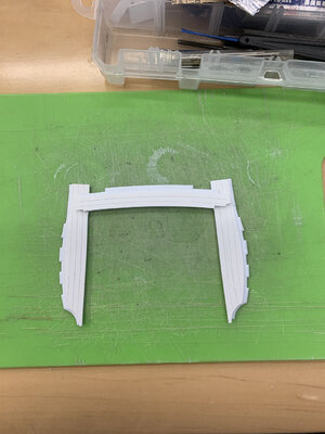
On the forward end of the open walk, I thought that block could do with a little finishing, so I extracted the paneling detail from that same corresponding area on the stern-plate, turned it sideways, and now that looks a little nicer.

The bombastic form of this block, which I may or may not be interpreting correctly, is very curious to me:
1952E57F-C200-48F5-85D5-9E78C7A2DD9A.jpeg

I wonder how such a thing would actually have been made on the real ship. would they have sheathed a light framework with thin deal planks, or would they have shaped a solid balk of lightweight timber, much like I have for the model?

The other interesting discovery, this past week, was Ronald Portanier’s dissertation on the evolution of French marine sculpture throughout the Ancien Regime. He has a number of interesting insights into decorative styles, color and the use of Trompe L’oeil. It is quite lengthy, but well worth the look.

There are a few gems in the Appendices, also, including a super detailed port quarter view of the Monarque/RL’s stern - something I was just asking Chapman about, recently. There is also a fascinating unfinished rough sketch for the stern of an early First Marine, first-rate ship. If that weren’t enough, there are also several insightful LeBrun portraits that give a good sense for the colors that might be used to accentuate the ship’s carved figures. Check the link below for a look-see:

https://spectrum.library.concordia.ca/984742/1/Portanier_PhD_S2019.pdf

As a side note, the BSI debonder does an excellent job of sloughing away the finished surface of acetate. I think I will just live with the blemish. It is small.
 
Agreed, Gerin! What I like so much about the dissertation is that he spends plenty of time talking about the ships, themselves. In dealing with the First Marine, so many authors focus on the peripherals of the shipyard, for which more complete documentation survives.
 
Painting of the stern continues at a snail’s pace. It is all crisply done, though, so the time is well spent.

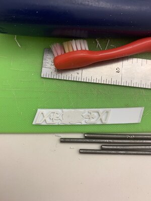
I’ve been making the port and starboard gallery bulwark lattices. My technique has improved since the making of the trailboard, so I am no longer breaking these delicate lattice pieces as I go.

Rather than mostly trying to file these delicate pieces into shape - which fatigues the plastic in the narrowest sections of the design - I have learned to pare to my lines with a razor sharpe no. 11 blade. I’ve also learned my lesson about how to scribe part blanks for the bulwarks around an angled, curving surface:
DF4E8C20-B541-4F3D-AAC6-7AF35AB010FF.jpeg
The trick to this sort of multi-level relief is to use styrene sheet of varying thickness. The bulwark uprights are cut from .030 sheet, while the lattice relief is .020.
6743F740-0352-4A77-B1F0-1967E8F69BB6.jpeg
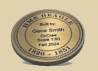
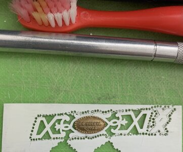
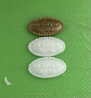
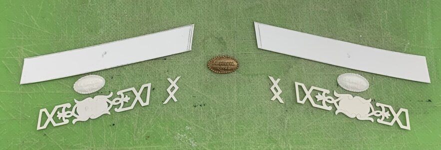
From the stock middle balcony rail, I extracted the ship name plate
AAA5FE56-6BC5-4A9B-ADEE-8E3B8397DC66.jpeg
I will have to offer the bulwark blank up to its place on the QG, so that I can mark out the exact pilaster locations from the level below. Then, I can glue the lattice to the bulwark, and secure the pilasters and the diamond lattice detail. The pilasters will be cut from .030 sheet, and will sit just a little proud of the lattice, thus creating the desired depth effect.
CCC107AE-FF6F-40A3-B55B-6D4B440C5569.jpeg
I made rubber moulds of the nameplate, so that I could duplicate it and have the name on both the stern and quarters.
1031BF52-9DE5-4948-80D7-E595B1551CE8.jpeg
There is a significant investment in time just to get to this:
4FBF164D-4767-4B5F-A9A4-14D59CDE7CD5.jpeg
I will also surface mount smaller resin scroll ornaments around the name plates, as well as diamond flower ornaments to the lattice.

In other musings, I have been in contact with Mr. Portanier. He has been helpful in sharing several of his sources. Among those were several key articles from the French nautical journal Neptunia, published by Les Amis Des Musees de la Marine.

In a separate posting, site members directed me to the following resources for finding back issues:

https://www.aamm.fr/neptunia/recherche_articles

The above links to an index of every issue and article that Neptunia has ever published. The index spans 75 years and over 300 issues. I am indebted to all of you who have been so helpful to me and this project.

A listing of issues in print that are available for sale can be found here:

https://boutique.aamm.fr/neptunia

In going through the index, I discovered around 25 articles that are specific to my time period and/or subject. A number of additional articles, based on the abstract description, seem like they may he helpful. For 5 euros, per older issue, that seems well worth the gamble.

A number of issues that I would really like to have, like a multi-part series by Bernard Frolich on the development of his model of L’Ambiteaux, are currently unavailable in print. Courtesy of Mr. Francis Graviou, I can contact the site administrator to see about obtaining those issues digitally, perhaps:

contact@aamm.fr

I think, perhaps, the greatest value of a substantial piece of research, like Mr. Portanier’s dissertation, is where else it may lead you to keep searching for answers. His cited works are extensive, and I can assure you that there is often great value in the reading of footnotes.

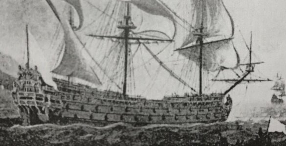
I may never find the portrait of my gilded ghost ship:
D539EACD-9912-4688-9D95-CD937182F7B3.jpeg

But I do, now, know where to look for the following:
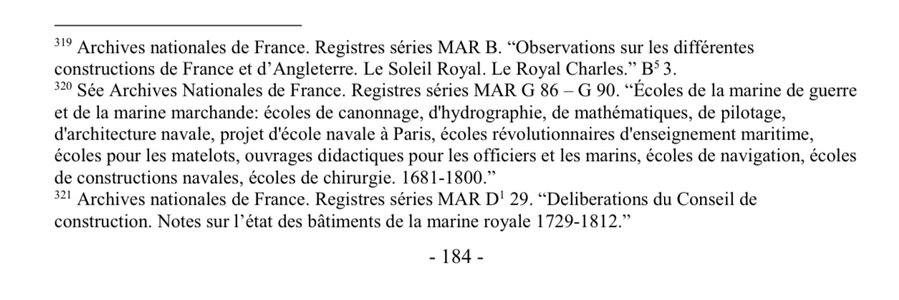
799898C1-0BC7-45EB-AF15-0C42E01A839A.jpeg

E3088230-0A56-48DE-948D-1FA84479F13A.jpeg

Now, I merely need to figure out how to contact the national archives and obtain a copy of these documents.

I am not expecting the expansive detail that Hyatt provides in his description of the RL, but it would be reasonable to expect to glean some key information about Soleil Royal’s original structure and appearance. That could go a long way toward fleshing out a portrait of her appearance between the years 1670 and 1685.

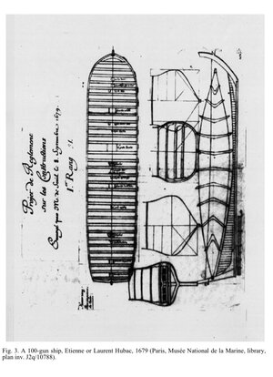
I also stumbled across this:
17D0C0F5-9DBB-45DD-89FA-D6CDA52D5DFA.jpeg
From a time when the lead architects like Laurent Hubac were being continually nudged by Colbert’s administration to conform to a codified prescription of dimensions, this I would say, is a pretty good insight into the design modality of, perhaps, the most intractable of the arsenal shipwrights. Laurent Hubac liked a broad-beamed ship, and that is exactly what this drawing indicates.

Also, if one makes a very close examination of the starboard side of this drawing, they will discover a series of regularly spaced hash marks. This drawing is of the broadest, lower main battery deck. I believe that these hash marks represent port piercings. There are 15 broadside hashmarks, with what appears to be one more “hunting” port hash mark, near the hawse entry. In other words, something very like this closeup of La Reine’s port bow:

0B632757-2826-4238-8080-2F58AF4D7B81.jpegphoto, courtesy of Chapman

There were only two Hubac-built ships, that I know off, that were pierced for 16; La Reine and Soleil Royal. Very interesting, indeed!

As always, stay well, and more is to follow...
 
Last edited:
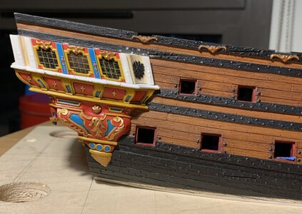
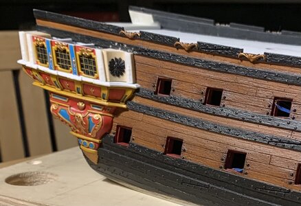
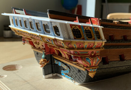
Painting continues. Although the following pics don’t reflect it, all the yellow ocher is done and the walnut ink distress wash has been applied. I’ve begun the gilt work, and am making my way around the gallery.

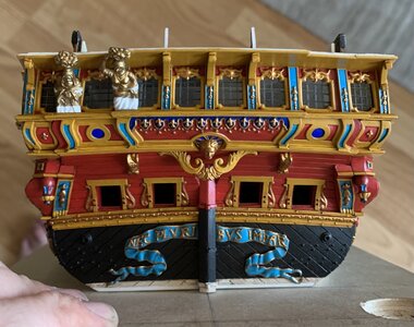
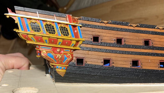
The purpose of these photos is to illustrate the middle balcony tier, supporting corbels. The middle three are stock kit parts. The outer two were scratch-made because even the secondary kit corbels that are more shallow, in depth, still extended beyond my balcony edge; I had made a conscious decision to reduce the depth of my middle balcony because I knew there were limits to how far I could stretch the Four Seasons figures - more on them, in a moment.
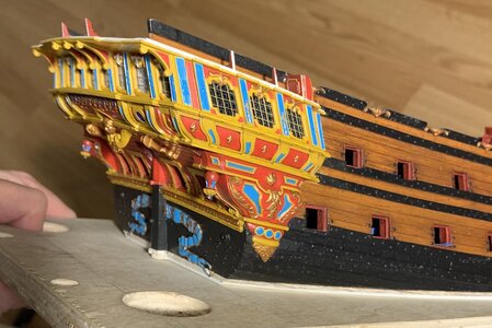
9FE44CCB-7946-44B2-BA8F-0321548A27A1.jpeg
211400C8-6A1C-4F1D-938D-7A3A0B27B452.jpeg
Among the myriad tiny considerations is the fact that the corbels must align with the tilting angle towards the centerline, as delineated by the pilasters, but they must also account for the secondary angle introduced by the round-up. These were very fiddly to fit.

As is my practice, I had masked-off strips on the underside of the balcony to ensure a welded styrene bond. Naturally, this necessitated a certain amount of re-touching to the yellow. The Vallejo paint I’m using is not model-specific, but from their artist’s line, instead. It thins beautifully, but requires numerous passes to achieve good color saturation with a brush. The paint also remains rather soft for a number of weeks after application. For my tastes, these are worthwhile trade-offs for the ease of application and a smooth painted surface.

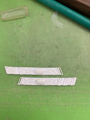
The middle gallery side bulwarks are rounding into form. I made and fit the pilaster pieces, and carved the port side lattice:
A1DEF762-9226-4C45-A558-9FD2732AC712.jpeg
Not surprisingly these pieces became significantly more stiff when I CA-glued the resin name badges. I will have to heat-form these, before painting and installation, with a hairdryer so that they take the curve of the gallery without introducing stress.

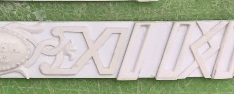
As I did for the upper bulwark frieze, I cut hard shoulders and shallow reliefs to suggest an intertwining of the frieze banding:
23766FB0-3D64-4637-A34D-98BF34CD2267.jpeg
This may seem hard, but it really is not and can be accomplished with nothing more than a #11 blade to cut the shoulders, and a narrow, curved blade to sneak in and cut the reliefs.

I was going to add resin scrolls around the name plate, but the flexibility issue, together with the fact that I’d have to relieve these resin scrolls too far into the nameplates, changed my course; I decided, instead, to simply model and define the scroll shapes surrounding the nameplates. I still have yet to add the diamond flower ornaments to the Xs on either side of the nameplates.

By far, the most enjoyable phases of this project are those times when I discover an opportunity to re-incorporate stock parts of the kit to my new architecture. Adding the bow extension pieces was the first formidable challenge of this kind. The Four Seasons figures present a similarly challenging attempt at plastic surgery.

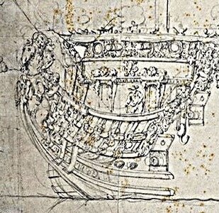
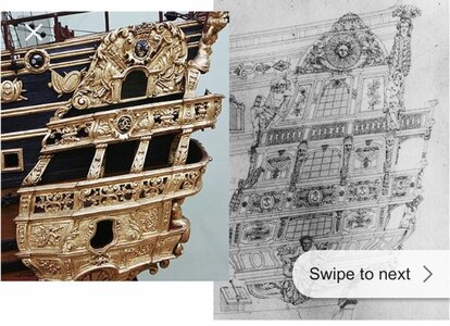
Tanneron most likely drew inspiration from this later drawing of what I believe is SR1693:
17D143F3-E5F3-4002-A52E-A840A97D7AAE.jpeg
As such, there is a projecting lower stern balcony, and the Four Seasons figures have a more upright posture, in supporting the balcony above. The Heller kit reflects this same architecture.

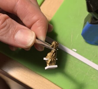
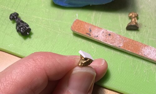
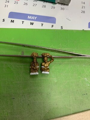
In closing-in this lower stern balcony, I have also brought it in, closer to the stern. Consequently, if I want to use the stock figures, I realized I would have to alter their posture and lengthen them. Starting with the outer two male figures of Winter and Autumn, where the overhang is less extreme, this is what I have done:
4F544BBB-5B80-453C-B9EA-F4270751E7D9.jpeg
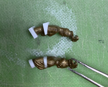
The magic entry for cutting these figures is through the back, just above the elbow, and stopping the cut before breaking through just above the hand. This weird gold plastic is more brittle than the black stuff, and I snapped the first figure, Winter, just above the hand. This was not a problem, though.

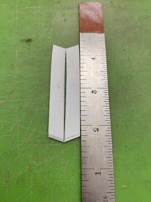
I then took a piece of 1/16” styrene strip, double-stuck it to the edge of a piece of scrapwood, and then filed a taper ranging from the thickness of the kerf (about a 1/32”) to the full 1/16”, at back.

I am always emboldened, in these surgeries, when I have a fall-back set of parts. The difference in posture is slight, but it is just enough to help these side figures conform:
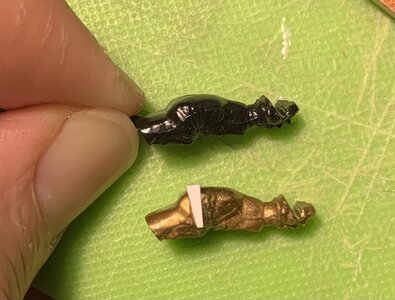
D71B4AB1-47E2-4E8A-8E86-219BD8955590.jpeg
I then added a piece of 1/16” styrene to the bottom, so that I can simultaneously increase the height of the figures, as necessary, to meet the underside of the balcony, while simultaneously adjusting the outboard angle. Here is how these two outboard figures took shape:
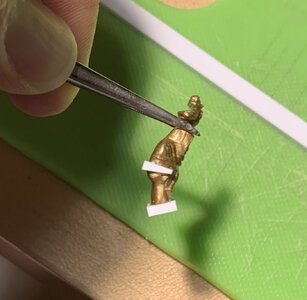
3E176C3E-BAB6-4D14-987D-4C9A8F80833F.jpeg
BEF7887A-6541-4F03-8EBD-C3DF2BCDBADC.jpeg
It may seem difficult, but modeling the new plastic to appear like a seamless continuation of the clothed figures really isn’t that hard:
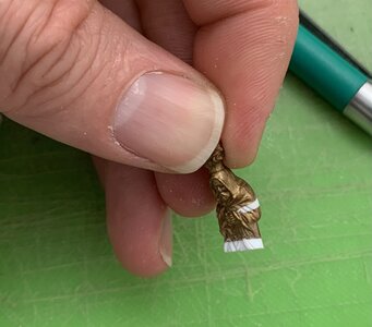
69139551-1947-4653-8677-F2AEFC7406E5.jpeg
The road map of where you need to cut in and continue lines is already there for you. Also, draping clothing is fairly forgiving:
https://modelshipworld.com/uploads/monthly_2021_04/image.jpg.5a205c67cff9628da8f0dc8ca358dd18.jpg1619531711729.jpeg
Autumn (right) really made out well, in the deal, with some additional bicep definition! It makes me wonder how well my own living body might respond to a little styrene enhancement. I haven’t been to the gym much, lately.

That is all well and good for the outer figures. I will still need to add another 1/32” at bottom, and fettle the top joint to the balcony, but I should be able to fit these without much trouble.

The middle figures required a little more extreme hunching of their posture, because the balcony above steps out, away from the stern, by about an additional 1/16”. It seemed reasonable to laminate two different thicknesses of styrene strip (1/16”&1/32”), for my torso wedge. Here is how that is taking shape:
DE50886F-4A3E-4DFC-8B95-EE688FE84C5E.jpeg
As can be seen next to the Autumn figure, now the arching of the female backs is notably more pronounced. I will probably need to add some extra plastic to the top edge of the bouquet and model it so that it appears to cope neatly around the bottom moulded edge of the balcony above. All of this may seem like a lot of fiddling about with these figures, but I can assure you that the investment in time is far less than making them from scratch. Besides, Heller did too nice a job of modeling them to believe I could do any better on my own.

So, that’s where things stand as of today. In the coming weeks, I will likely have to take a break from Soleil Royal, as my wife and I have made the difficult decision to move, yet again. We barely got to know Brooklyn, and certainly the Pandemic robbed our neighborhood of much of its charm. Nevertheless, an “affordable” 3-bedroom apartment is a unicorn worth chasing. I will periodically still post updates as small workprogresses.

As always, stay well, and thank you for stopping by.
 
It was a good week, tying up loose ends on the starboard side QG.

The windows are tacked in place with a little cyano before gluing-in the window plate. As I did for the stern lights, I took a little extra care to back the window panes with stops; in the event that the cyano fails, at some point in the future, at least the stops will keep the windows in place, mechanically. Empty eye-sockets are daunting repairs.
View attachment 215953

This overhead shot gives a sense for the multiplicity of rebates that were cut into the aft blocks - particularly, clearance had to be cut for the aft window pane, itself, effectively making a window stop of the block.
View attachment 215952

One can also get a sense for the asymmetry of the transom, which I described in earlier posts; this reality has made coping the whole thing together more challenging, but the variance is not apparent from the outside. It is fortunate that the wrapping stern balcony happens at this level, rather than above, where this variance will increase, somewhat.

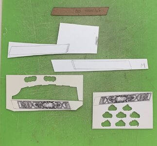
Having learned my lesson, I pre-painted the window plate, off the model. The reality of what ends up being constructed is sometimes at odds with the one-dimensional plan I drew. Initially, I thought I would book-end the three windows with these diamond-hatch motifs:

View attachment 215957

It looks well on paper, but in reality - the coved forward block feels too expansive for this to look good, while the space between pilasters, on the aft block, turned out to be much more narrow than I expected:
View attachment 215954

I’ll mock up the aft diamond-hatch in card, just to be sure, but I think it will look too cramped. For the forward block, I decided to extract the radiant fleurs from the upper finishing of the stock QG plate:
View attachment 215955

I had to make these a little more oval, than round, to fit the available space. When I paint these, I will pick out the rays in gold, silver and white, which I think will create the right impression, while mirroring a similar treatment to the backdrop of Apollo’s horse-drawn chariot on the tafferal.

Having worked out all of the problems on the starboard side, the port side is moving along much more quickly:
View attachment 215951

Soon, I’ll be coping together the base walkways of the wrapping balcony, which will then enable me to pattern and make all the pieces of the balcony railings. At this level, these are very involved and will be time-consuming to make well.

So far, so good - a reasonable facsimile, up to this point:
View attachment 215956
View attachment 215950

Thank you all for the likes, and your gracious comments!
Great modification. We all seem to have our personal niche when it comes to this artform; and I must say that your attention to detail and color-balance is worthy to all of us. Most speak of my tedious work, but you've defined the word as I observe the process.

Most impressive...
 
Short update; two fitted and two to go:
449B1C77-BF11-4F2A-902C-B8945D00DE4B.jpeg
This has been a little bit of a guessing game. I had to add significantly more new plastic to the bases of the two middle figures (Spring and Summer) because of the more pronounced arching back posture that the extra overhang of the balcony necessitated; I literally had to stretch these figures to their max.

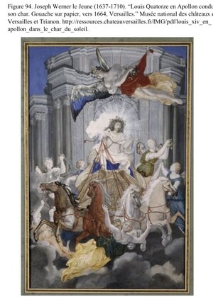
Some careful filing of the base angles aligned the figures with the inboard pitch of the window pilasters. After establishing the base angle/joint, it was necessary to add back some plastic to the top mounting surfaces, in order to make a good plastic to plastic bond. I promise that painting of these figures will be interesting, and I will be taking cues from this portrait:
FE672CAE-0001-4D1B-A32C-415628D079C4.jpeg
As is intrinsic to this kind of reverse-engineering kit-bash, it is impossible to truly capture the original; the figures obscure more of the windows than I would like, but this is an acceptable compromise.
3DE460AD-A97D-4002-804D-B6336F1CF9BB.jpeg

I always appreciate your support, your likes, kind compliments, and even your criticisms. Enjoy the weekend!
 
Last edited:
Marc, when we talk about your model, we are talking about an item at the very highest level. In this case, criticism always has something of a superfluous know-it-all. On the other hand, we owe your work the highest level of honesty. I'll keep it short: I think the figures are too wide. They take up too much space from the windows and thus reduce the impression of the transom.
Of course you can leave it as it is and it's still great. But I think you can make better and more suitable figures by scratch.
Schmidt
 
Back
Top