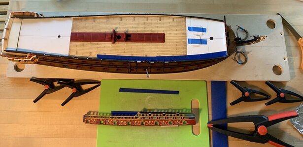
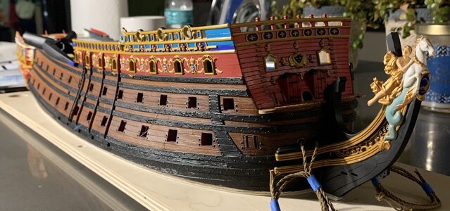
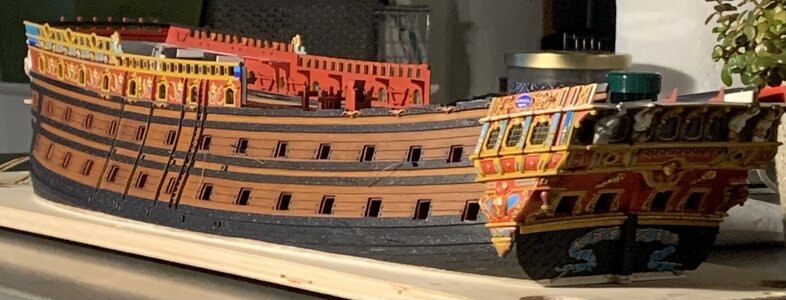
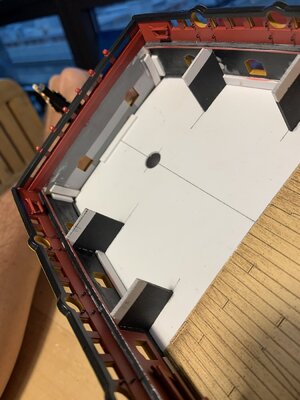
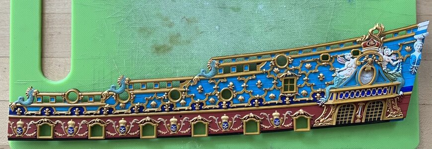
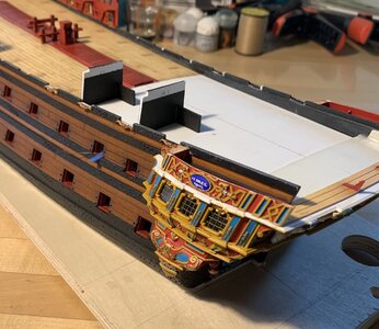
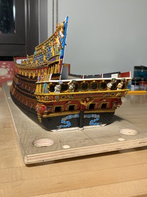
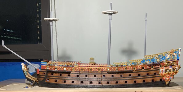
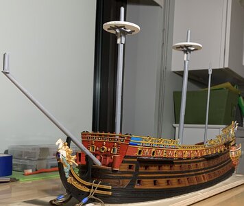
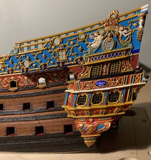
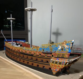
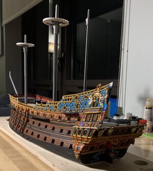
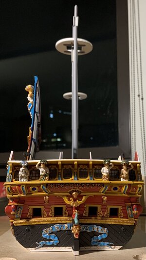
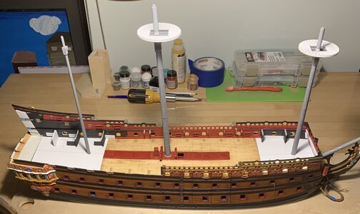
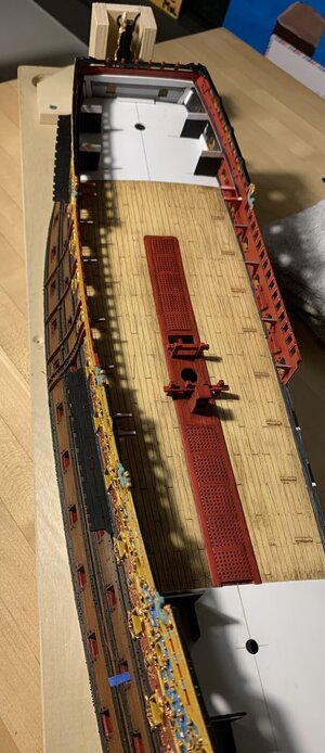
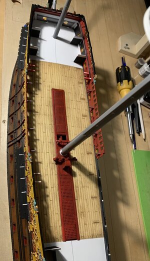
I managed to get the red sprayed before leaving for the Cape. We had a wonderful week in Hampton Bays with lot’s of family fun, good dinners, and plenty of medicinal scotch. I also managed to have a productive week laying down all of the primary colors:

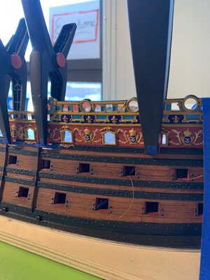
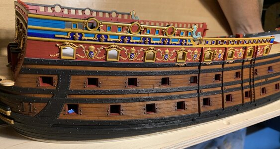
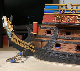
Unfortunately, in my haste, I forgot to mask off the monogramed escutcheons between the main deck guns. The centers, which will be painted ultra-marine really require a white undercoat for the color to come out right. This now necessitated hand-priming of these little ovals.
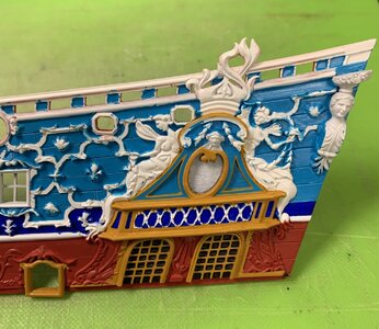
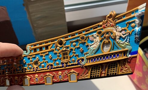
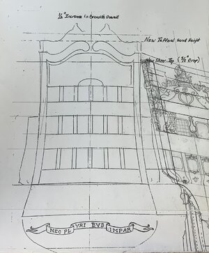
I deliberated, from the start of this whole project, whether the red should extend up into the amortisement. Ultimately, I decided that it made more sense to follow a continuous, banded approach to each of the three primary colors, with the yellow ocher serving as a unifier.
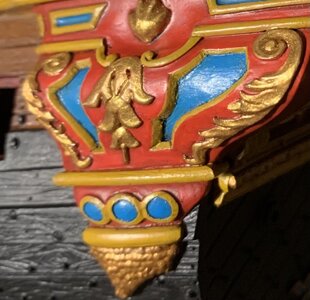
The impression of the amortisement is a bit skewed, at the moment, because I have yet to pick out the supporting dolphins in gold and silver. I took great care to hand-paint subtle edge borders, in yellow ocher, around the triangular panels of the upper section.
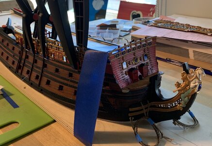
From here, it is the long, steady march of careful cutting-in, followed by rounds of re-touching:
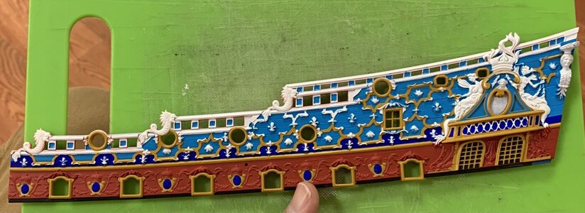
Perhaps, above, it is more apparent how my idea to use ultra-marine along the lower band of fleurs, accentuates the scalloped design of the frieze. This is probably more ultra-marine than would have actually been applied, owing to the expense, nonetheless it is an artistic choice that highlights the effort of making the whole thing.
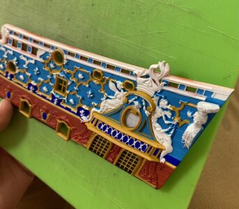
Slowly and surely, we are getting there! As ever, thank you for looking in.

Unfortunately, in my haste, I forgot to mask off the monogramed escutcheons between the main deck guns. The centers, which will be painted ultra-marine really require a white undercoat for the color to come out right. This now necessitated hand-priming of these little ovals.

I deliberated, from the start of this whole project, whether the red should extend up into the amortisement. Ultimately, I decided that it made more sense to follow a continuous, banded approach to each of the three primary colors, with the yellow ocher serving as a unifier.
The impression of the amortisement is a bit skewed, at the moment, because I have yet to pick out the supporting dolphins in gold and silver. I took great care to hand-paint subtle edge borders, in yellow ocher, around the triangular panels of the upper section.
From here, it is the long, steady march of careful cutting-in, followed by rounds of re-touching:

Perhaps, above, it is more apparent how my idea to use ultra-marine along the lower band of fleurs, accentuates the scalloped design of the frieze. This is probably more ultra-marine than would have actually been applied, owing to the expense, nonetheless it is an artistic choice that highlights the effort of making the whole thing.

Slowly and surely, we are getting there! As ever, thank you for looking in.

