- Joined
- Apr 19, 2020
- Messages
- 185
- Points
- 213

устроили тут...

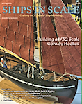 |
The beloved Ships in Scale Magazine is back and charting a new course for 2026! Discover new skills, new techniques, and new inspirations in every issue. NOTE THAT OUR NEXT ISSUE WILL BE July/August 2026 |
|
 |
As a way to introduce our brass coins to the community, we will raffle off a free coin during the month of August. Follow link ABOVE for instructions for entering. |
|


Thank you very much!That's not the case. A photo of the real ship is posted here.