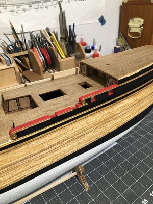
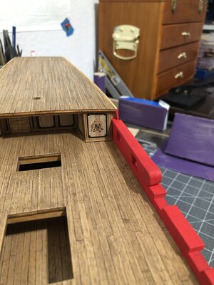
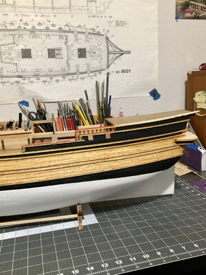
When I first saw the red I hoped it was an artifact of photography and lighting...
-

Win a Free Custom Engraved Brass Coin!!!
As a way to introduce our brass coins to the community, we will raffle off a free coin during the month of August. Follow link ABOVE for instructions for entering.
-

SUBSCRIBE TO SHIPS IN SCALE TODAY!
The beloved Ships in Scale Magazine is back and charting a new course for 2026!
Discover new skills, new techniques, and new inspirations in every issue.
NOTE THAT OUR NEXT ISSUE WILL BE MARCH/APRIL 2026
You are using an out of date browser. It may not display this or other websites correctly.
You should upgrade or use an alternative browser.
You should upgrade or use an alternative browser.
NORSKE LOVE - Billing Boats 1:75 scale
- Thread starter Dean62
- Start date
- Watchers 75
-
- Tags
- billing boats norske lowe
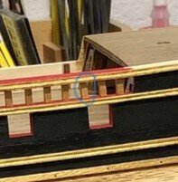
Only you Paul…When I first saw the red I hoped it was an artifact of photography and lighting...
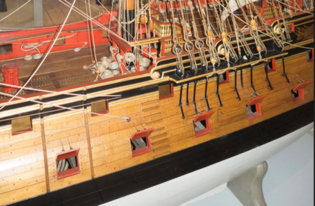
If you remember the ship picture from the Danish Norwegian museum that I showed for reference, that is how the ship was painted. I am merely following their color scheme. The question is the correct red to use. As bulwarks, cannon carriages, upper railings, and some deck furnishings are supposed to be red. In fact the galley window frames are red. The common theme is red, black and gold. All whom look good together IMO.
I wasn't disparaging the use of red (there will be red on my current ship as well) - I was disparaging the use of THAT (poppy) redOnly you Paul…
If you remember the ship picture from the Danish Norwegian museum that I showed for reference, that is how the ship was painted. I am merely following their color scheme. The question is the correct red to use. As bulwarks, cannon carriages, upper railings, and some deck furnishings are supposed to be red. In fact the galley window frames are red. The common theme is red, black and gold. All whom look good together IMO.
 . When I was a boy I had a black-light poster with that red on it...
Unfortunately, it is hard to get a true representation of color with a cell phone picture displayed on a computer monitor.I wasn't disparaging the use of red (there will be red on my current ship as well) - I was disparaging the use of THAT (poppy) red. When I was a boy I had a black-light poster with that red on it...
I have repainted it a darker red...see above post. Once again in the photos it looks lighter...sigh! But I feel it is an improvement!
Just nice, elegant, accurate and clean, Dean.Quick update…making the upper railing…
View attachment 360139
Regards, Peter
Thank you Peter. There is one more railing above that one for the upper deck, and then another railing with vertical post above the lower left railing. That one will have a scroll at the end.Just nice, elegant, accurate and clean, Dean.
Regards, Peter
This is stunning Dean! The darker red is most definitely the better choice in my opinion. Mind you my interpretation of color is not to be trusted, having said that I still like the darker version.Quick update…making the upper railing…
View attachment 360139
Thank you Daniel! I appreciate that...us color blind folks like it!This is stunning Dean! The darker red is most definitely the better choice in my opinion. Mind you my interpretation of color is not to be trusted, having said that I still like the darker version.
I think it will all tie in well. I still have waterway boards, etc. ...those will be pearwood. That will transition the deck to the painted wall. There is so much more to go, but I already envision it all, it's just making it happen!
Thank you Heinrich! Perhaps you trust me more than I do...lol!You make the call Dean - you have proven your good taste in the past without any shadow of doubt, so there is no reason to not to trust you now. Of course, there is no pressure.
I suppose it's human nature to second guess ourselves.
Good question, it may not be? Very hard to keep them all vertical. They are tiny and keeping the ends completely square and flat is problematic. Will need to figure out a better way to ensure they are all plumb.Unless it is an optical illusion, one of the stations is not in line with the others... Am I correct, mia amigo?
View attachment 360244
However I noticed depending on the camera angle, they looked different. Only true way to tell, is to look straight at them from the side. I will check.
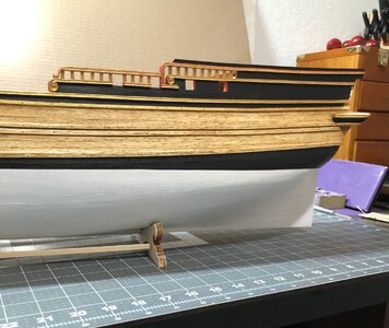
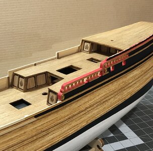
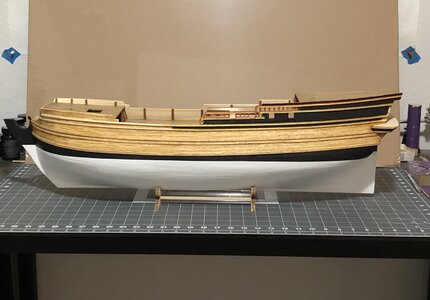
Good morning Dean. A beauty! Cheers GrantA little more progress…this is more painting than I anticipated!
View attachment 360268View attachment 360269View attachment 360271
A nice growing of this ‘multi-stage’ railing, Dean. More to come ……. as seen on you posted reference ….. But with nice personal details.A little more progress…this is more painting than I anticipated!
View attachment 360268View attachment 360269View attachment 360271
I think with each layer of that railing your satisfaction will also increase?
Regards, Peter
Thanks Grant!Good morning Dean. A beauty! Cheers Grant


