Soleil Royal by Heller - an Extensive Modification and Partial Scratch-Build by Hubac’s Historian

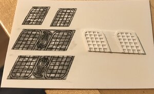
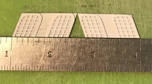
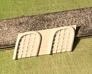
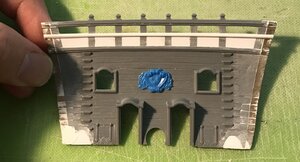
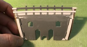
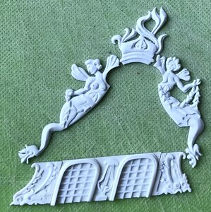
Well, this has been a banner week in my mobile shipyard. I’ve made up the false amortisement windows, and I have finished modifying and prepping to paint the beakhead bulkhead.

F77F7BDF-5F72-484F-A5C5-DD9B14FC93CF.jpeg
4662A00B-4D85-4E9A-B74F-87B5C061546B.jpeg
DCBEB3AD-87AC-49BF-BCFA-0513B5FDEAD0.jpeg
E2BF1F89-DB04-46A2-AC39-CAE902037870.jpeg
What’s missing is the lyre carving between the windows. I’ll re-draw that this weekend, and get busy making those next week.

Now, these windows would be fine, as is, but they’re a little two-dimensional, IMO. Adding just a little bit of moulding gives the windows a better sense of dimension:
37CE5D55-DCBB-4A6E-81CD-72D831A90722.jpeg
I will likely just paint them flat black with either white or yellow ocher mullions. I haven’t yet decided.

The Beakhead Bulkhead:

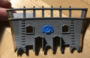
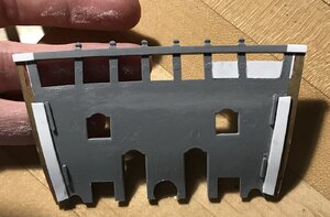
After grafting-on side extension pieces to make up the extra width of the hull, I decided to close what I find to be the exaggerated open timberhead space on the bulkhead. I will cut-in the cathead timbers, at deck level, when it comes time to install them.
DB1B7F95-B56D-46A3-B618-4540E37898A8.jpeg
BC51BEE2-6943-46FB-8E6F-46F36C5B7CF4.jpeg
DD2380B6-082B-490F-8DDD-9AF3C7ADD7FE.jpeg

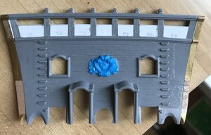
Once painted, this paneled effect will disappear. I added another band of moulding to delineate the space:
85BE4C9B-CF1D-4DEF-8B29-06F34E116A84.jpeg
4D0E9992-169E-460C-8DBD-FB2414C8D40B.jpeg
I decided to close the lower chase ports, as they won’t be armed, anyway. I also filled the concavities that would ordinarily accept the lower footing of the roundhouses; these were no longer necessary, as the bulkhead has been set back, by its thickness, so that the ship sides overlap it, as would be the case in actual practice.

As a side note - I have found that I really like the Tamiya white putty; it’s much finer than the squadron white, easier to apply and more durable.

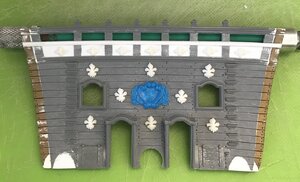
I, then, scraped away the raised grain; re-engraved the plank seams so that they extended all the way to the ship sides; sanded for texture with 50 grit paper, and drilled for the nailing. To finish up my modifications, I decided to add a field of fleurs, as was often done at this time. I also decided to make use of my foliate diamond ornaments for the band I created when filling-in the timberheads.
BC3F4A99-58AC-484D-B730-C8FD43548150.jpeg
Next, I’ll prime, paint and install the bulkhead.

As always - thank you for the likes and looking in!
 
Well, with the harps made, the windows are now complete, and I’m about 60% of the way, done, with the amortisement.

Final assembly will take some finessing, but here is what we have so far:
439A57DA-6D00-42F7-83C7-337F66D843DA.jpeg
Next up, I will tackle the semi-structural elements above the windows.

Thanks for the likes and for looking in!
 
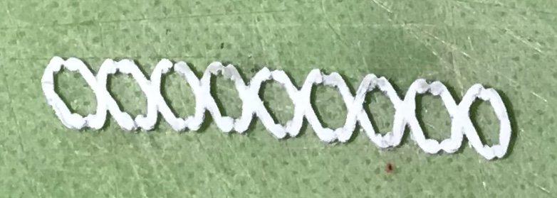
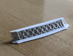
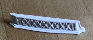
I made this - I’m not sure what to call it - Xs ornament for the starboard side. Even more so than the trailboard, this thing is terribly small and impossibly fragile.
EF57AAAB-421D-4930-82EC-68148B3D9529.jpeg
This turned out okay. The first effort was a disaster and had to be scrapped; a lighter touch and a pointier blade produced much better results. Still, though, the extensions of the Xs don’t have the neatly uniform rounding I was hoping for.

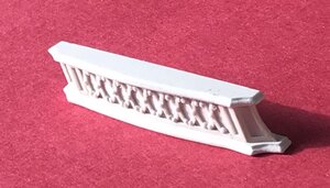
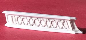
I decided to add tiny domed slices of styrene rod to dress it up a bit, and give the whole thing some dimension:
968739E6-68F3-407E-96D0-0B8381D662A8.jpeg
I think this helps. Once it is straightened out and secured to its backing it will look plenty good enough. The port side should turn out better, now that I know what I am doing.

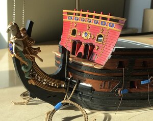
The beakhead bulkhead is painting up really nicely, and it will provide an exciting (for those who get excited about these things) glimpse into the eventual coloration of the stern. More on that to follow.

Enjoy your weekend, everyone!
 
Thank you, Victor - Little by little, we are getting there!

I made this - I’m not sure what to call it - Xs ornament for the starboard side. Even more so than the trailboard, this thing is terribly small and impossibly fragile.
C46DE25B-3203-46AC-A34A-2613DF5568C7.jpeg.531dd89bddc6428c5c34ef58724f25f3.jpeg
This turned out okay. The first effort was a disaster and had to be scrapped; a lighter touch and a pointier blade produced much better results. Still, though, the extensions of the Xs don’t have the neatly uniform rounding I was hoping for.

I decided to add tiny domed slices of styrene rod to dress it up a bit, and give the whole thing some dimension:
83CD54C6-4C76-43C7-BA0D-7BAB78C2B6EE.jpeg.8bfda4111822d306b9ebe3ae97848820.jpeg
I think this helps. Once it is straightened out and secured to its backing it will look plenty good enough. The port side should turn out better, now that I know what I am doing.

The beakhead bulkhead is painting up really nicely, and it will provide anexciting (for those who get excited about these things) glimpse into the eventual coloration of the stern. More on that to follow.

Enjoy your weekend, everyone!
 
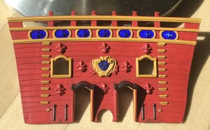
The beakhead bulkhead is painted, now, and ready for installation. Before I do so, though, I will do a little addition to increase the glue surface area, backing the bulkhead.

I decided at the last minute to add panel framing around the foliate diamond ornaments. It echos, if not exactly, panel framing around the lowest tier of fleurs on the upper bulwarks.
3D6BED4D-8642-4AC7-97B9-73E2ED12A524.jpeg
I didn’t really have the necessary space to copy this, so I simplified the paneling. In fact, I originally wanted to use fleurs, but I couldn’t reduce them enough to make it work. Even the smaller fleurs that I made for the stern counter were too big.

So, here’s the paint work bright and clean, as on the first day of her re-launching in 1689/90:
4B0DA3AC-1E70-4076-8402-0A094B949DCD.jpeg
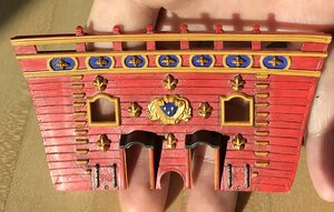
And here is two years of sea grime and paint oxidation, as just before the battle of Barfleur:
C892B78A-1C7E-4D16-BC01-20BE3F40731E.jpeg
The blue, here, is really a cobalt blue, but it deepens to the ultra-marine with a very light wash of walnut ink.

The first red acrylic I applied was a proprietary mix for BLICK art supply. The color was lovely, but I soon discovered that the paint would wash away when wetted. I’m not sure why that is; perhaps, in thinning the paint with regular tap water, I altered its curing properties.

Anyway, I washed away the paint with soap and water and then applied ModelMaster’s Insignia Red acrylic, which is the red I’ve been using everywhere else. I can successfully thin this formulation with tap water. It turns into a pleasing red ocher, once the walnut ink is applied.

The other decision I had to make was whether to paint the top sheer of drift rails gold or yellow ocher. I decided, ultimately, to go with the yellow ocher, and to save gold for the ornaments, themselves.
2EABCD9D-CCBB-4AFE-8DFA-B8720A7C1CA3.jpeg
Thanks for the likes, comments and looking in!
 
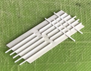
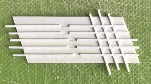
This next level of the amortisement is fun to make because, while it seems simple, it is actually a pretty complex form. Without having drawn a top plan view, I have to wing-it, a little, when it comes to establishing depth and taper.

The first step was to make up a styrene billet. The canopy is 1/4” in height, between the top and bottom mouldings. I made my billet stock a little wider, in order to file in the top and bottom taper necessitated by the tumblehome of the ship’s sides (see pic below).
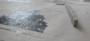
94C9F731-D69D-44A6-8F3B-C43351DD06AA.jpeg
Once I had billet stock, I could lay out all of the paneling and the outer parameters of the canopy:
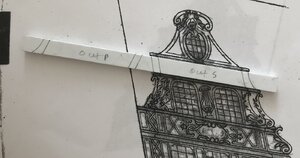
A18892D1-A3C0-4CB5-A7A2-F79DD477F2B2.jpeg
The tricky thing about this aspect of the project is that there does need to be some depth to the canopy - which will be further overhung by the top and bottom mouldings - because the upper-most section of the amortisement has at least some depth, at its center, which tapers out to the sides (where they abut the pixies). Considering that, the canopy must also diminish, slightly, in depth, from top to bottom. And, on top of all of that - there are a series of reverse curves that define the bombastic form of the canopy.

In layout, and looking at it from the top view, that all looks like this (excepting for the reverse curves, at the ends, which I did not draw-in):
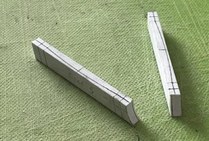
DB23325B-BE08-47C4-9214-86C853E68E02.jpeg
With the layout pencilled-in, top and bottom, and on the outer face, I could then make a series of shoulder cuts, with a fine back saw. After hogging out the bulk of waste, at the ends, this is what that looks like:
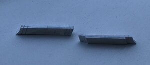
F8999711-A749-402E-A301-D3CBFEF804F0.jpeg
Once all of the shoulders were neatlydefined, I could set-to shaping the subtly curves ends and middle:
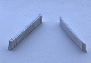
1368C46B-E754-4A5F-9D99-2D227C2B1A25.jpeg
The end scallops are set-down about 1/32” lower than their adjacent short flats, so that when I apply the panel framing details, in the next step, there will remain a stepped demarcation between the ends and middle section.

As I had hoped, the second Xs moulding came out much more cleanly than the first. These decorations are springy enough to accommodate the tapering surface, without appearing to become distorted. Once, I have the port-side canopy made and both canopies paneled, I can use them to pattern the exact top and bottom overhang of the mouldings.

More to follow...
 
Alright, so I’m pretty psyched with how this all came together:
1830EEF4-D412-4853-A225-EABB333742AD.jpeg
B10DAE2E-4130-4FD4-8582-39856C05EA3F.jpeg
8021E3F2-3937-4033-80B0-ED9E98C5E5E8.jpeg
19F7969F-C406-46A0-9710-98CB3147283E.jpeg
4832E365-E343-4239-8E9F-2AF00C5BD3A4.jpeg
Before glueing on the top and bottom moulding plates, I faired the canopy to the curvature of the upper bulwarks. Now I can simply sand the plates down to match.

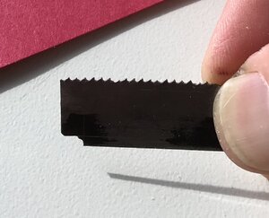
For this profile scraper, I decided that attempting to scrape the full reverse curve was likely to chatter and dig into the plastic - particularly, along the bottom return. So, I simply ground the top portion of the reverse curve, and then rounded the underside by hand.
5E9FD486-A628-4BD1-88AE-C3BE341785FE.jpeg
Now, I can move-on to the upper finishing of the amortisement. That should be a fun little bit of trompe-l’oeil, as I attempt to create a sense of depth in what is now a very shallow platform.
 
Thank you, Maarten and Stephen. This is the first model that I’ve gone all-in on modifications and scratch components. I have discovered what a joy plastic is to carve and manipulate. Wood is much less forgiving. That being said, that is the next step in my progression - to transition to wooden scratch-modeling. I appreciate the likes and kind words, guys!
 
I think that I / we should thank you for sharing your wonderful work with us.
I can imagine that carving the pieces that you carve would be easier in plastic a material with no grain than trying to carve the same items in wood would require an incredibly fine grained wood.
I think with your skills working in wood won't be too much of a stretch.
Personally I am happy working with plastic, metal or wood although wood for me has something special it has a different feel to metal or plastic.
Cheers,
Stephen.
 
Stephen, even if you were the only person watching the build, I would still be thrilled that someone, other than me, has taken such a strong interest in the project. Believe me - I understand just how polarizing the Heller model is. People either love the kit, or refuse to take it seriously.

Whatever side of the fence, my goal here is simply to show people what is possible. I enjoy the project, personally, because the reverse-engineering of the thing is quite challenging.

It will be interesting to see how the apple wood I am going to use, to make up the basic shape of the lower portion of the quarter galleries, behaves.

The grain is extremely fine, and the wood doesn’t seem overly dense, so it should be good. Time will tell!
 
Hi Marc,
I guess what interests me is your dedication and skill. I don't really have an opinion on the Heller kit and wasn't aware that the kit was polarizing, there are big gaps in my knowledge of those sort of things.

And I would thank you again for your post. Isn't the challenges that keep model makers pushing forward.

I hope the Apple wood works as hoped. I don't know what sort of they use but some Netsuke is incredibly fine.

Cheers,
Stephen.
 
Back
Top