
Thank you, Mr. Shanks! Eighteen - 20 hours, approximately.

-
SUBSCRIBE TO SHIPS IN SCALE TODAY!
The beloved Ships in Scale Magazine is back and charting a new course for 2026!
Discover new skills, new techniques, and new inspirations in every issue.
NOTE THAT OUR NEXT ISSUE WILL BE July/August 2026 -

Win a Free Custom Engraved Brass Coin!!!
As a way to introduce our brass coins to the community, we will raffle off a free coin during the month of August. Follow link ABOVE for instructions for entering.
You are using an out of date browser. It may not display this or other websites correctly.
You should upgrade or use an alternative browser.
You should upgrade or use an alternative browser.
Soleil Royal by Heller - an Extensive Modification and Partial Scratch-Build by Hubac’s Historian
- Thread starter Hubac’s Historian
- Start date
- Watchers 85
-
- Tags
- 1689 heller hubac refit soleil royal
@janos this is very interesting for everyone to understand... Hubac's Historian has spent 18 - 20 hours so far expertly sculpting 2 very nice figures in Post #157 of this thread. And, he is not yet done. I am curious, what is your estimate of how many hours it would take to model these same type figures in the computer in 3D with something like SolidWorks. The reason I ask is so that people can see the comparison of manhours it takes on a computer versus by hand.Eighteen - 20 hours, approximately.
Mike,
A few things here. First of all Solidworks is not really meant to handle free shapes so it would be very tedious to do something like this. Obviously it would be easier for a person who has experience in these things but I am not such a person. SW allows to bring in a copy of the required shape into the background (and I am talking here only about the 2D shape) but the sketch, what SW uses as the circumference for the extrusion, has to be built up from primitives like circles, arcs, lines, etc. Not easy, but it can be done with patience and lots of swearing. I could not even gestimate any timeframe for it. But even having done this the next step would be to create a simple 'square' extrusion. And SW knows only filleting as means of creating a somewhat 3D appearance. SW might be used to create scrolls and similar items but definitely not these free shapes the combination of which would result in a human figure. For this programs like Zbrush come in mind.
János
Nearly forgot. HH's carving in that putty is simply beautiful. I might not be able to reach the same perfectness by carving in timber (and not only because of the grains...) But it would take me about an hour each to carve them in timber.
My observation here.... although not a golden rule, it would appear that creating a 3D human type sculpture in the computer may take as many OR MORE hours to accomplish than actually doing it in wood or putty. The other side of this coin is - once the form is in the computer it can be reproduced perfectly over and over by a CNC machine or 3D printer where the hand carving is a one-time object. As a further observation, the reproduction done by computer/CNC/3D printer is good for people who do not have carving skills nor time for such activities. But, the hand carved object has more intrinsic value.
I apologize for interrupting your build log Hubac. I thought your carving was a great opportunity to share with others the differences we have been discussing on another thread.
Sail on.
I apologize for interrupting your build log Hubac. I thought your carving was a great opportunity to share with others the differences we have been discussing on another thread.
Sail on.
It is a fascinating discussion, Mr. Shanks, so by all means - keep it going.
For clarification, though, I’m not actually sculpting putty or clay for these figures. All my carved work for this model is carved from styrene sheet.
I have attempted to make sculptures from modeling clay, like Doris does, but that is a skill set that I do not yet posses. It is much more difficult than it seems in her skilled hands.
Also, it is not strictly necessary to spend that much time on these sculptures, but I am committed to attempting to capture all of the subtle detail of the original drawing; the sweep and swag of the hemline, on the first pair of figures, for example. To render those small details well and convincingly just takes time. Particularly so, because these figures are quite small: 1 5/8” from tail to wingtip. There may be very little material to remove, but there is correspondingly little margin for error.
Last edited:
One last consideration - I do what I do with a small array of four knives and the Dremel for wasting. Additional knives of varying profiles and sweeps would speed up the process, but make the prospect of taking the work with me more cumbersome; I don’t want to be carrying around a bunch of knives everywhere I go.
Some people have amazing finesse with a Dremel-type rotary tool. Again, though, the work is so small that one small, inadvertent jerk or slip of your hand can ruin a carving just like that.
Lastly, even when it is well done, rotary carved work is always evident for the process, unless one takes the extra time to scrape/blend/smooth surfaces, afterward.
So, to my mind - it is all a matter of what degree or standard one is trying to achieve. Cleaner, more nuanced work takes time.
While I wait for my deck to cure, I thought it would be a good time to start constructing the head.
Now, I knew that I would have to adjust the knees of the head to accommodate the increased width, at the bow, but I naively believed that it would be a simple matter of scribing them to fit. Well, that’s not going to work out so neatly, after all:


I think the only way around this is to cut off the knee extension pieces, scribe the loose ends to fit, and the rejoin the cutwater with a styrene filler piece that can be shaped and moulded to match. It seems iffy, but I think I can pull it off.
Assuming this works out, and I can use these parts, I would like to introduce a taper to the leading surface of the cutwater. The plastic is thick enough that I can represent the taper without compromising the part.
Since doing so will eliminate most of the timber structure and graining, I will go-ahead and re-engrave a more likely timber structure than what Heller has provided for.
Both of the figureheads I have are somewhat warped, but one is a better fit than the other; its irregularities can be finessed and minimized.
Today, I finished the Pixies. I wish that I were better at carving faces, but this was the best that I can do, for the time being:

Next, I’ll make the crown ornaments that the Pixies are supporting. By the time those are done, I should be ready to pattern and carve the trailboard that fills the space between the head knees.
Now, I knew that I would have to adjust the knees of the head to accommodate the increased width, at the bow, but I naively believed that it would be a simple matter of scribing them to fit. Well, that’s not going to work out so neatly, after all:
I think the only way around this is to cut off the knee extension pieces, scribe the loose ends to fit, and the rejoin the cutwater with a styrene filler piece that can be shaped and moulded to match. It seems iffy, but I think I can pull it off.
Assuming this works out, and I can use these parts, I would like to introduce a taper to the leading surface of the cutwater. The plastic is thick enough that I can represent the taper without compromising the part.
Since doing so will eliminate most of the timber structure and graining, I will go-ahead and re-engrave a more likely timber structure than what Heller has provided for.
Both of the figureheads I have are somewhat warped, but one is a better fit than the other; its irregularities can be finessed and minimized.
Today, I finished the Pixies. I wish that I were better at carving faces, but this was the best that I can do, for the time being:
Next, I’ll make the crown ornaments that the Pixies are supporting. By the time those are done, I should be ready to pattern and carve the trailboard that fills the space between the head knees.
I’m trying a different copy/paste method from MSW. Please let me know whether pics are not visible.
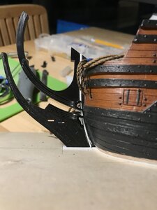
With the ears of the knees temporarily removed, I can now get a better idea of the relationship between the upper stem knee and the cutwater. The upper stem knee mates nicely with the angle of the kit’s stock sprit mast, and the cutwater requires some scribing to fit up nicely to the stem:


If I place an ear back into position, I can see that it won’t take much scribing and filling to blend the whole assembly back together seamlessly:

However, before I can make any final adjustments to fit, I really need to see what the trailboard space looks like along it’s entire length. To see that, requires fitting and attaching the figurehead.
For a stock assembly of this kit, one always ends up with a tapered opening where the trailboard should be. I can scribe the cutwater so that this opening is parallel, but doing so also has an impact on the kit’s stock headrails, which, like the figurehead, are really nice. I am hoping to be able to use them in the build despite the increased width of the hull, which has a shortening effect on the headrails. More on that later.
Before attaching the figurehead to the cutwater, I wanted to make some modifications to the cutwater. First, I wanted to file-in a slight, and graduated taper to its leading edge, as marked out here:

You can see that the plastic is plenty thick enough to reduce it by half it’s thickness, at the base of the cutwater. In the end, the difference is subtle, but noticeable if you are looking for it.
The other big problem with Heller’s representation of this massive and fundamental structure is that the timbering, with its butt joints and sandwich laminations bears zero resemblance to the interlocking structure of a ship’s cutwater:

Above, the laminations cross the gammoning holes in ways that no shipwright would ever allow.
On better representations of this cutwater structure, the gammoning holes are often angled to follow the run of the timbering. For inspiration, I looked to the St. Philippe monograph:

This is good because the timbering is not overly complicated, and it doesn’t interfere with the gammoning; never-mind, for a moment, that the SP gammoning is drawn below the water line - that is its own issue.
The main thing that I don’t like about this SP timber layout is that the joinery is all straight lines. In reality, these timbers would have been carefully selected for natural grain that pretty closely follows the shape of the stem, thus dramatically increasing the strength of the structure. Strength is critically important when you consider the massive weight of structure that the cutwater is supporting (figurehead, headrails, et al), as well as the dynamic ocean forces playing upon it at all times.
So, with that in mind, I looked to what Marc Yeu chose to do for his SR:

(photo, courtesy of Marc Yeu)
Note that the trailboard opening is parallel. I believe that Marc adopted Frolich’s timbering for L’Ambiteaux. To me, this is a much more natural looking structure, so I chose to adapt it to the Heller stem.
I considered filling the gammoning holes and re-orienting them, but decided against it, after I had arrived at a layout with minimal, and dare I say plausible, interference:

Above, after much careful fitting, the figurehead is secured, and I have filled the hole for the fore-course tack lines. Instead, I will be making a block for these that attaches to the leading edge of the stem. I will probably also represent the through-bolting of the stem, on its leading edge. It’s a simple thing to do and adds a nice touch of realism to the model.
So, as I consider the coloration of the head, the figurehead offers me an opportunity to experiment with an idea I have about coloration of all the really large statuary - most especially, the four continental figures of the stern.
Just about everyone who builds this model paints all of these figures solid gold. It is hard to argue with that choice, as that is how Peter Vary represents her in his coloration of the Berain design:

 The issue I have with this is that I find that much gold to be overwhelming, and the effect it has is to diminish the impact and beauty of the ornamental design; everything seems to get lost in a sea of gold!
I have an extra figurehead to experiment with. I would like to see what the horse would look like painted white, with a light grey wash to give it some depth and shading. I would pick out the main, the reins, the riding pixies, the acanthus leaves along the horse’s belly, and the horse’s tail in gold. meanwhile, the moulding of the knees would be painted yellow ocher, instead of gold, as will be the fretwork of the trailboard; only the fleurs and bellflowers of the trailboard will be picked out in gold. If I really like this, I will apply it to all similar figures.
Although things may have been different in 1670 (Hyatt’s description of the RL being EXHIBIT A), by 1688 - in the midst of a horrendously expensive re-build of SR - it only seems sensible that the ship would NOT be completely covered in gold leaf and lapis-based ultra-marine. These are stylized choices I would be making, but I think they are appropriately representative of the period.
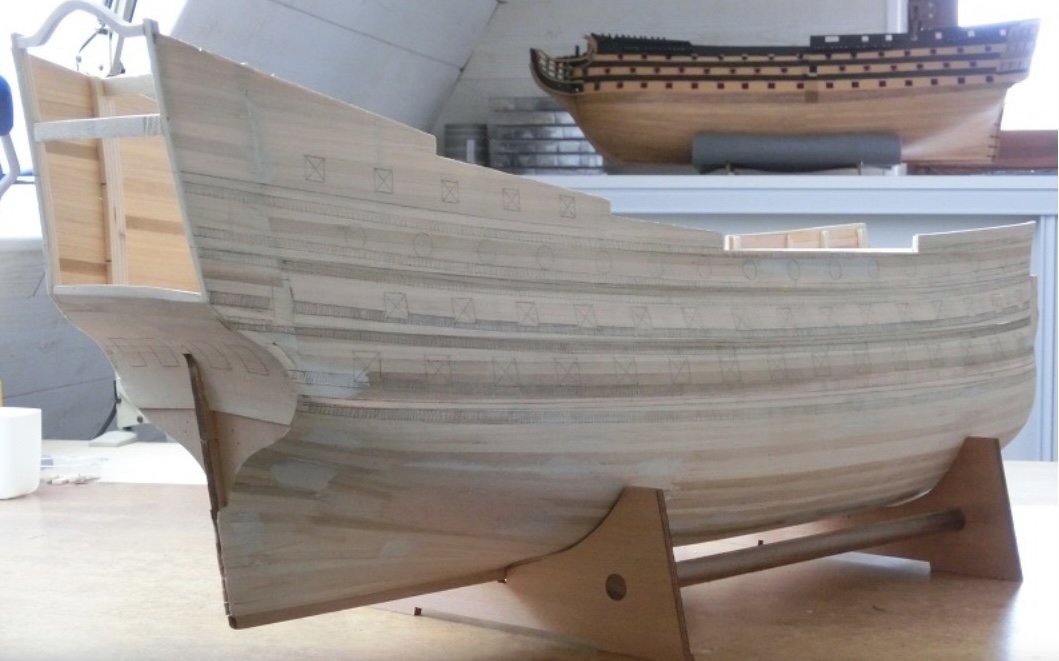
The deck gratings are painted now, and I will soon be gluing-in the main deck:

To get a sense for how effective the walnut ink is, take a look at the contrast, where I haven’t yet applied it:


In the first picture, above, I have modulated the effect a bit, to tone it down - super easy with a dampened brush. It’s probably still a bit over done, but I like the grubbiness of the effect.
Thank you for the likes and looking in!
With the ears of the knees temporarily removed, I can now get a better idea of the relationship between the upper stem knee and the cutwater. The upper stem knee mates nicely with the angle of the kit’s stock sprit mast, and the cutwater requires some scribing to fit up nicely to the stem:
If I place an ear back into position, I can see that it won’t take much scribing and filling to blend the whole assembly back together seamlessly:
However, before I can make any final adjustments to fit, I really need to see what the trailboard space looks like along it’s entire length. To see that, requires fitting and attaching the figurehead.
For a stock assembly of this kit, one always ends up with a tapered opening where the trailboard should be. I can scribe the cutwater so that this opening is parallel, but doing so also has an impact on the kit’s stock headrails, which, like the figurehead, are really nice. I am hoping to be able to use them in the build despite the increased width of the hull, which has a shortening effect on the headrails. More on that later.
Before attaching the figurehead to the cutwater, I wanted to make some modifications to the cutwater. First, I wanted to file-in a slight, and graduated taper to its leading edge, as marked out here:
You can see that the plastic is plenty thick enough to reduce it by half it’s thickness, at the base of the cutwater. In the end, the difference is subtle, but noticeable if you are looking for it.
The other big problem with Heller’s representation of this massive and fundamental structure is that the timbering, with its butt joints and sandwich laminations bears zero resemblance to the interlocking structure of a ship’s cutwater:
Above, the laminations cross the gammoning holes in ways that no shipwright would ever allow.
On better representations of this cutwater structure, the gammoning holes are often angled to follow the run of the timbering. For inspiration, I looked to the St. Philippe monograph:
This is good because the timbering is not overly complicated, and it doesn’t interfere with the gammoning; never-mind, for a moment, that the SP gammoning is drawn below the water line - that is its own issue.
The main thing that I don’t like about this SP timber layout is that the joinery is all straight lines. In reality, these timbers would have been carefully selected for natural grain that pretty closely follows the shape of the stem, thus dramatically increasing the strength of the structure. Strength is critically important when you consider the massive weight of structure that the cutwater is supporting (figurehead, headrails, et al), as well as the dynamic ocean forces playing upon it at all times.
So, with that in mind, I looked to what Marc Yeu chose to do for his SR:
(photo, courtesy of Marc Yeu)
Note that the trailboard opening is parallel. I believe that Marc adopted Frolich’s timbering for L’Ambiteaux. To me, this is a much more natural looking structure, so I chose to adapt it to the Heller stem.
I considered filling the gammoning holes and re-orienting them, but decided against it, after I had arrived at a layout with minimal, and dare I say plausible, interference:
Above, after much careful fitting, the figurehead is secured, and I have filled the hole for the fore-course tack lines. Instead, I will be making a block for these that attaches to the leading edge of the stem. I will probably also represent the through-bolting of the stem, on its leading edge. It’s a simple thing to do and adds a nice touch of realism to the model.
So, as I consider the coloration of the head, the figurehead offers me an opportunity to experiment with an idea I have about coloration of all the really large statuary - most especially, the four continental figures of the stern.
Just about everyone who builds this model paints all of these figures solid gold. It is hard to argue with that choice, as that is how Peter Vary represents her in his coloration of the Berain design:
The issue I have with this is that I find that much gold to be overwhelming, and the effect it has is to diminish the impact and beauty of the ornamental design; everything seems to get lost in a sea of gold!I have an extra figurehead to experiment with. I would like to see what the horse would look like painted white, with a light grey wash to give it some depth and shading. I would pick out the main, the reins, the riding pixies, the acanthus leaves along the horse’s belly, and the horse’s tail in gold. meanwhile, the moulding of the knees would be painted yellow ocher, instead of gold, as will be the fretwork of the trailboard; only the fleurs and bellflowers of the trailboard will be picked out in gold. If I really like this, I will apply it to all similar figures.
Although things may have been different in 1670 (Hyatt’s description of the RL being EXHIBIT A), by 1688 - in the midst of a horrendously expensive re-build of SR - it only seems sensible that the ship would NOT be completely covered in gold leaf and lapis-based ultra-marine. These are stylized choices I would be making, but I think they are appropriately representative of the period.
The deck gratings are painted now, and I will soon be gluing-in the main deck:
To get a sense for how effective the walnut ink is, take a look at the contrast, where I haven’t yet applied it:
In the first picture, above, I have modulated the effect a bit, to tone it down - super easy with a dampened brush. It’s probably still a bit over done, but I like the grubbiness of the effect.
Thank you for the likes and looking in!
Attachments
Last edited:
This isn’t my best paint work, and I haven’t completed the starboard side gold work, but I am looking for some feedback on this approach to the figurehead. Does this seem 17th C. French to you guys, or something else?


Last edited:
I was being a little lazy and hoping for a shortcut because some posts have more pics than others. No problem - tomorrow I will update the post, and then add today’s post from MSW.
In this post, I’m combining two MSW posts for the sake of convenience.
Henry, I was probably using the wrong term, “block,” but this is what I had in mind for the tack fairleads:

You can see the styrene shim, at the base, which was necessary in order to get a close scribe to the stem and plinth base.
I added the through-bolting of the cutwater, which are actually two pieces - a diamond shaped washer and a tiny domed projection of styrene rod, on top:

I have a tight scribe of the trailboard blank to the cutwater and stem. I won’t be able to scribe it to the upper head knee until after the cutwater is fixed in place:

Once I have an exact size for the blank, I’ll re-draw the trailboard filigree. Ideally, the fleur-de-lis should align with the head timber supports.
Realistically, though, this may need to be an area of compromise. I would rather have a good looking trailboard layout, than one that seems cramped to fit within and around the parameters of the gammoning. I have not decided yet, Dan, whether I will fill and move the gammoning holes.
I was at my buddy’s house this weekend, and so I took a few head shots of my first Soleil Royal, as a reminder of the stock spacing of the whole assembly:


Ideally, one of the fleurs should be centered between the gammoning.
Because my headrails are now a good 1/8” short of where they need to land behind the figurehead, I do not think that I will be able to use them. I will try to heat-stretch them, because I have an extra set, but I am not optimistic about that outcome.
It’s just a super complicated area. Once I can work out a trailboard layout that accommodates the current arrangement of the gammoning, I can begin patterning new headrails in cardboard, with headrail timbers that are interspersed around the gammoning. If no good layouts are possible with the gammoning where it is, then I will have to move the gammoning.
EJ, I’ve been thinking about your comments on color, and I am inclined to agree. Then, it dawned on me that the color gouache Vary portrait has what I think can be taken as a literal guide for this sort of period stylized/naturalistic coloring. All of the cues are in the border of the portrait:


There is also this coloration of the Berain drawing of L’Agreable’s stern, which I think is a useful guide to colors:

So, what I will do on the starboard half of my spare figurehead is to darken the grey wash that I first applied to the horse, but I will do it in a graduated scale that gets darker as you approach the tail. Then I will apply the same translucent green wash that I use to simulate ver-de-gris on the guns. This, too, will be applied from light to dark.
I will basecoat the Pixie’s face, arms and legs with random tan. A very light walnut ink wash will pick out some of the facial detail, while modulating the skin tone. Finally, I have a translucent red wash that, if applied very lightly, should round out the skin tone. I’ll finish by picking out the same details in gold.
I have cleaned to the outline of the amortisement crowns, and they are now ready to carve:

And so, we’ll see what all of that looks like. Thank you for your likes, your comments and for looking in.
________
Alright, so this settles it for me. Super simple, and this two-color application produces a nice transitional effect.
I applied the grey in a dabbing manner for a mottled appearance:

Once this enamel wash was dry, I applied a thinned-down coat of the ver-de-gris, blow-dried the surface, and then applied a few successively heavier coats, drying in between. The body gradually becomes a deeper green, towards the tail. As long as I could still see the grey mottling beneath, then the effect would work:


I finished painting the rest of the figure, and now this looks like the thing I was after:


EJ, I can’t thank you enough for steering me in the right direction. I’m going to prime the actual figurehead and I’ll get busy painting it. I had thought I could paint after installation, but it is exponentially easier to paint before, and touch up later. I’ll have to touch up, anyway, when I re-attach the knee extensions.
Henry, I was probably using the wrong term, “block,” but this is what I had in mind for the tack fairleads:
You can see the styrene shim, at the base, which was necessary in order to get a close scribe to the stem and plinth base.
I added the through-bolting of the cutwater, which are actually two pieces - a diamond shaped washer and a tiny domed projection of styrene rod, on top:
I have a tight scribe of the trailboard blank to the cutwater and stem. I won’t be able to scribe it to the upper head knee until after the cutwater is fixed in place:
Once I have an exact size for the blank, I’ll re-draw the trailboard filigree. Ideally, the fleur-de-lis should align with the head timber supports.
Realistically, though, this may need to be an area of compromise. I would rather have a good looking trailboard layout, than one that seems cramped to fit within and around the parameters of the gammoning. I have not decided yet, Dan, whether I will fill and move the gammoning holes.
I was at my buddy’s house this weekend, and so I took a few head shots of my first Soleil Royal, as a reminder of the stock spacing of the whole assembly:
Ideally, one of the fleurs should be centered between the gammoning.
Because my headrails are now a good 1/8” short of where they need to land behind the figurehead, I do not think that I will be able to use them. I will try to heat-stretch them, because I have an extra set, but I am not optimistic about that outcome.
It’s just a super complicated area. Once I can work out a trailboard layout that accommodates the current arrangement of the gammoning, I can begin patterning new headrails in cardboard, with headrail timbers that are interspersed around the gammoning. If no good layouts are possible with the gammoning where it is, then I will have to move the gammoning.
EJ, I’ve been thinking about your comments on color, and I am inclined to agree. Then, it dawned on me that the color gouache Vary portrait has what I think can be taken as a literal guide for this sort of period stylized/naturalistic coloring. All of the cues are in the border of the portrait:
There is also this coloration of the Berain drawing of L’Agreable’s stern, which I think is a useful guide to colors:
So, what I will do on the starboard half of my spare figurehead is to darken the grey wash that I first applied to the horse, but I will do it in a graduated scale that gets darker as you approach the tail. Then I will apply the same translucent green wash that I use to simulate ver-de-gris on the guns. This, too, will be applied from light to dark.
I will basecoat the Pixie’s face, arms and legs with random tan. A very light walnut ink wash will pick out some of the facial detail, while modulating the skin tone. Finally, I have a translucent red wash that, if applied very lightly, should round out the skin tone. I’ll finish by picking out the same details in gold.
I have cleaned to the outline of the amortisement crowns, and they are now ready to carve:
And so, we’ll see what all of that looks like. Thank you for your likes, your comments and for looking in.
________
Alright, so this settles it for me. Super simple, and this two-color application produces a nice transitional effect.
I applied the grey in a dabbing manner for a mottled appearance:

Once this enamel wash was dry, I applied a thinned-down coat of the ver-de-gris, blow-dried the surface, and then applied a few successively heavier coats, drying in between. The body gradually becomes a deeper green, towards the tail. As long as I could still see the grey mottling beneath, then the effect would work:
I finished painting the rest of the figure, and now this looks like the thing I was after:
EJ, I can’t thank you enough for steering me in the right direction. I’m going to prime the actual figurehead and I’ll get busy painting it. I had thought I could paint after installation, but it is exponentially easier to paint before, and touch up later. I’ll have to touch up, anyway, when I re-attach the knee extensions.
Last edited:

This is going to be one gorgeous model. Thanks for sharing your vast talents.
Thank you, Mr. Shanks, and thank you Jim! With the success of the figurehead, I can now see many more opportunities to incorporate naturalistic color into the model. It won’t be nearly as involved as the re-creation of Vasa’s scheme, but I am aiming for something that is quite vivid, and that highlights all of the work going into the decor. I appreciate very much, your interest in the project.
I’m enjoying a very pleasant and relaxing family vacation in Dennis Port, Cape Cod. I was close to finishing up the amortisment crowns, so I brought them with me.

I had to simplify the design a little bit; the fleur-de-lis are really tiny, so while the design calls for three, I found I could only really make a good relief for the central one.
I’m also attempting to layout the trailboard, but it is difficult to reliably draw something so complicated onto styrene - the pencil skates across the surface. Even if I don’t come up with a polished design, I can at least work out the rough parameters, while I am away.
Once I get home, I can layout the final onto vellum, photocopy it and then transfer the design to the part.
The layout hinges upon the aft-most fleur, which is centered between the gammoning. You can appreciate, now, how the scale of the fleurs increases, as you move forward - this, owing to the tapered space between the knees of the head. Although, I would prefer to have three fleurs, I think that I will be hard-pressed to make that look good, in such a small space. I feel that a better impression of the original design, in this case, supersedes absolute fidelity.
I can eventually align one headrail supporting timber with the aft fleur, but I won’t upset myself if the forward fleur does not neatly align with a headrail supporting timber. The Berain/Vary portraits show the headrail supports in-line with the shells, but that arrangement would mean that the fleurs are mostly hiding behind the gammoning. As a symbolic decorative element, it seems to me that the fleurs should be the most visible, and so, I have chosen to reverse that arrangement.
As is sometimes the case with this modification project - the mere inclusion of missing details (trailboard, headrail supports) is an upgrade, even if they can’t be realistically rendered as a unified whole, where everything is in its proper place.
The stem and figurehead in place:


This is the trailboard layout that I have arrived at:

I find that it is much easier to neatly draw something on vellum because you can mark-out reliable reference lines, and the paper has tooth. You can also erase easily and forever on vellum which, in the case of something like this, is extremely helpful.
My layout of the Berain design was going very well until the foremost section, in front of the big fleur. The essential problem is that Heller threw a wrench into the design with the way that the tail of the figurehead resolves.
In Berain’s drawing, the tail resolves between the knees of the head, and fully forward of the trailboard lattice:

Perhaps because Tanneron did not address the figurehead or the trailboard, Heller took some creative license. The Heller tail resolves mostly below the trailboard, but the upper lobe of the tail intrudes into the trailboard space in a very inconvenient way.
This small semi-circular intrusion is a design disrupter! Rather than attempt to continue the lattice in an unsatisfactorily asymmetrical way, I chose to take a little creative license, myself.
To my mind, leaving the space open and unsupported would not make any structural sense. I considered adding one larger shell to this forward space, but there was no way to do that without it looking grafted on - an afterthought.
Ultimately, I chose a year marker for the rebuild - not because it is plausible historic convention, but because it adds something of historic relevance and context to this particular depiction of Soleil Royal. I employed a similar rationale for the inclusion of the motto banner on the lower transom.
The statement, however imperfectly, that I am trying to make with this model is that these Berain/Vary portraits represent her refit appearance in 1689. And so, this will be my time-stamp signature in the trailboard. Also, numbers have a wonderful malleability for filling odd spaces.
This is the trailboard layout that I have arrived at:
I find that it is much easier to neatly draw something on vellum because you can mark-out reliable reference lines, and the paper has tooth. You can also erase easily and forever on vellum which, in the case of something like this, is extremely helpful.
My layout of the Berain design was going very well until the foremost section, in front of the big fleur. The essential problem is that Heller threw a wrench into the design with the way that the tail of the figurehead resolves.
In Berain’s drawing, the tail resolves between the knees of the head, and fully forward of the trailboard lattice:
Perhaps because Tanneron did not address the figurehead or the trailboard, Heller took some creative license. The Heller tail resolves mostly below the trailboard, but the upper lobe of the tail intrudes into the trailboard space in a very inconvenient way.
This small semi-circular intrusion is a design disrupter! Rather than attempt to continue the lattice in an unsatisfactorily asymmetrical way, I chose to take a little creative license, myself.
To my mind, leaving the space open and unsupported would not make any structural sense. I considered adding one larger shell to this forward space, but there was no way to do that without it looking grafted on - an afterthought.
Ultimately, I chose a year marker for the rebuild - not because it is plausible historic convention, but because it adds something of historic relevance and context to this particular depiction of Soleil Royal. I employed a similar rationale for the inclusion of the motto banner on the lower transom.
The statement, however imperfectly, that I am trying to make with this model is that these Berain/Vary portraits represent her refit appearance in 1689. And so, this will be my time-stamp signature in the trailboard. Also, numbers have a wonderful malleability for filling odd spaces.

Hallo @Hubac’s HistorianHello, Ships of Scale!
My name is Marc LaGuardia, and for the past three years, I have been extensively bashing the Heller kit in an effort to transform it into what I believe is her re-fit appearance of 1689.
The project exists in its entirely, here at Model Ship World:
The log is quite lengthy, and includes protracted discussions of contemporary sketches and portraiture that are all interesting and relevant to my re-construction. That would all be incredibly tedious to re-create, here, though. Instead, I will open with a photo-montage that brings us up to the current stage of the project.
As I write new posts for MSW, I will also post that same content here.
So, to begin - the project was born of the idea that I could make the Heller kit broader and longer, so that I could increase the number of stern lights from five to six, and create the new quarter galleries that are the focal point of my revised model.
To that end, I cut away the lower hull, and added 5/8” of extensions to either side of the stem (thanks to Henry in Boston for donating his defective hull), and 3/8” extensions to the aft edges of the lower hull and upper bulwarks. I also cut the sheer down, a bit, at the poop-royal because the Heller kit is just a bit too tall to be plausible, IMO; this is partly due to the fact that the height between all decks is exaggerated.
Along the way, I have discovered myriad ways to upgrade the kit and add missing detail. I have made a particular point of representing the iron that holds the dead-works together.
To be clear, my intent here is to produce a mostly impressionistic model that is historically accurate to the degree that it can be, but also accepting of certain flaws, inherent in the kit, which are too onerous to overcome.
The project seemed to languish in the planning/drawing phase for quite a long time, but has really started to come together in the past year.
I have received an incredible amount of help from people all over the world, and remain indebted to their research, their insight, and quite often - their spare parts!
And without further ado, I present Soleil Royal as she may have appeared after her refit in 1689. The montage will begin with the next post.
Thank you for looking in, and happy modeling!
- HH

we wish you all the BEST and a HAPPY BIRTHDAY

Thank you, Uwek! It has been a very pleasant introductory day to my 47th year. I really appreciate the thought!
Hi Hubac,
Happy birthday as well, hoping you have a great day and year ahead.
Wonderful work beautifully done, amazing!!
Cheers,
Stephen.
Happy birthday as well, hoping you have a great day and year ahead.
Wonderful work beautifully done, amazing!!
Cheers,
Stephen.