Precisely, yes, UWEK.
-
Win a Free Custom Engraved Brass Coin!!!
As a way to introduce our brass coins to the community, we will raffle off a free coin during the month of August. Follow link ABOVE for instructions for entering.
-

SUBSCRIBE TO SHIPS IN SCALE TODAY!
The beloved Ships in Scale Magazine is back and charting a new course for 2026!
Discover new skills, new techniques, and new inspirations in every issue.
NOTE THAT OUR NEXT ISSUE WILL BE MARCH/APRIL 2026
You are using an out of date browser. It may not display this or other websites correctly.
You should upgrade or use an alternative browser.
You should upgrade or use an alternative browser.
Soleil Royal by Heller - an Extensive Modification and Partial Scratch-Build by Hubac’s Historian
- Thread starter Hubac’s Historian
- Start date
- Watchers 82
-
- Tags
- 1689 heller hubac refit soleil royal
There are still distress washes to apply and some touch-up to do, but things are progressing.
The upper stern balcony is finally rounding into form:
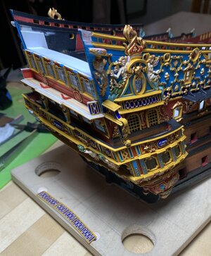
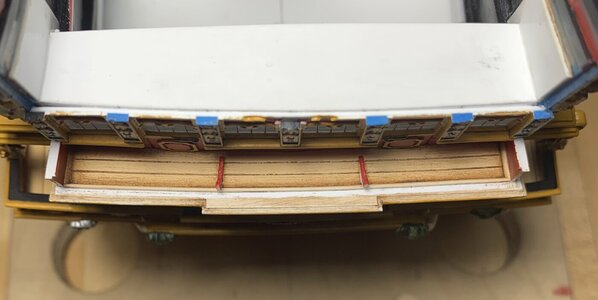
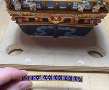
The balcony rail completes my circumference around the ship with a band of ultra-marine. Maybe I will get to fixing this part in-place tonight.
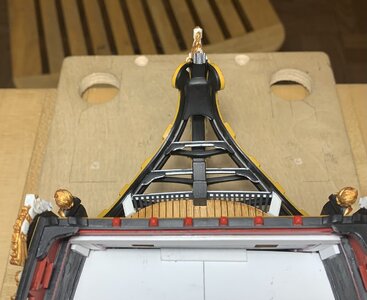
There is still quite a lot of work to do with the head and the head grating, itself, but it is all finally coming together. Yesterday, I made a new pair of seats-of-ease, which are sized according to the space available to them, and reflect the imperfect geometry of my custom head structures:
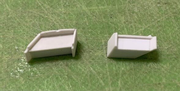
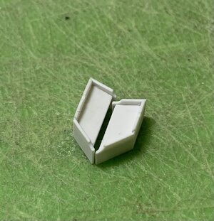
I have subsequently drilled the waste holes in these, but I wanted to tweak their fit to the model before I did so. Here they are in their places:
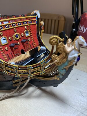
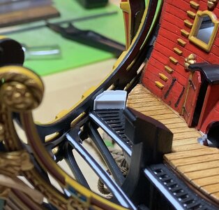
Here is the forward grating terminus in-place and re-touched:
Can anyone spot my homage to modern seamanship and navigation, from starboard:
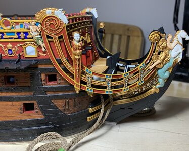
to port:
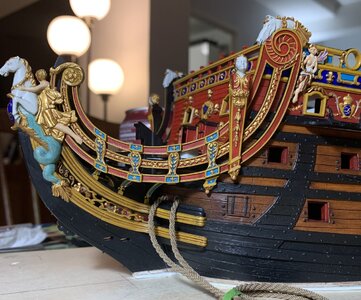
It’s a little subtle on this side, but don’t overthink it
My greatest satisfaction rests in the fact that I created enough space below the headrails to craft reasonable headrail supports:
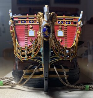
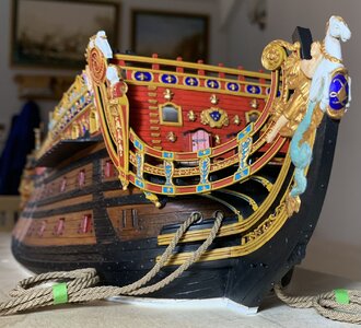
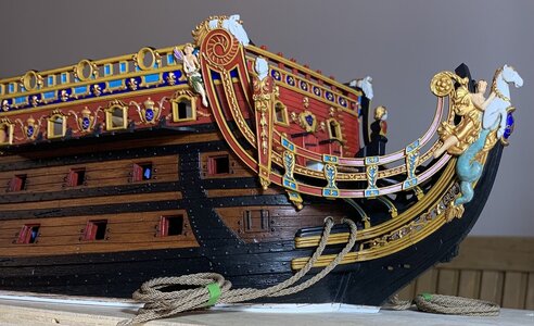
As I often say, this is all something of an imperfect approximation, but it is a significant upgrade over the stock kit.
Now, build-logs occasionally can surprise us with the completely unexpected. Some months ago, a new poster began commenting on my MSW log, with specific interest in the ship and her appearance. He would sometimes comment that he was planning his own modest kitbash of the Heller kit.
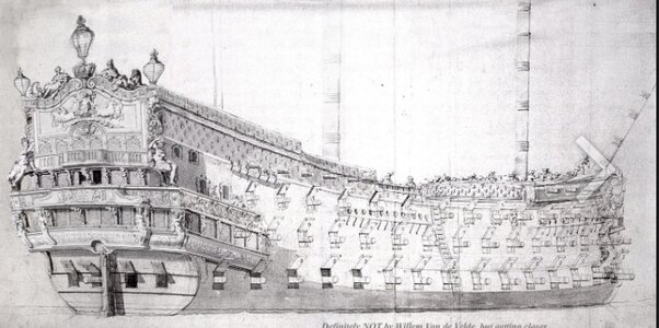
Well, last week, this poster began to post things that really caught my attention. John Ott is a professional graphic artist and illustrator from California. All following pictures are courtesy of John Ott. One day, for fun, he posted the following super-imposition of Berain’s stern decor onto VdV’s La Reyne:
And for comparison’s sake:
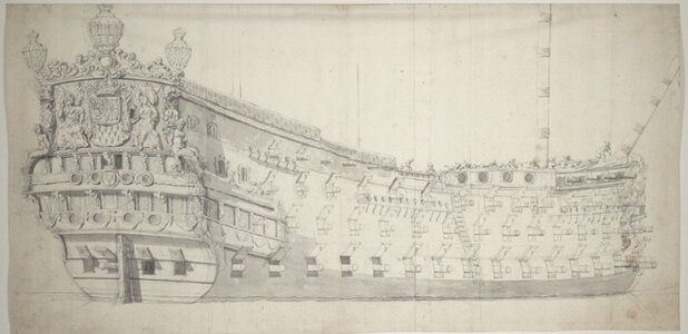
The skill it takes to turn a barely two-dimensional drawing into a passable 3-D perspective drawing is just beyond me! Now, there were limits to how much time and energy John was willing to invest in this exercise, and so there are various aspects of the original drawing that he did not bother to modify. He just wanted to get a sense what the decor would look like on her near sister ship.
But, that is not the model John is building. He’s building the 1693 replacement SR, and he is designing the build on Photoshop:

WOW!, I thought to myself. This is just a beautiful color palate and a very thoughtful delineation of the ornamental program through high-contrast. Ultimately, the model will employ more period-correct colors (than what I’m doing) and will also incorporate a combination of faux-gold techniques with bright gold “leaf.”
But, then I wondered just how well he could pull this off. Well, as Nigel commented to me privately - never underestimate a train modeler! Here is the current status of the actual model:
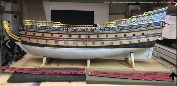
I am in love with all of this, and as is often the case - I am thoroughly blown away by the talent and creativity of others in this world.
As an added bonus, John has put together a highly informative info-graphic on the statuary and colors of the stern:
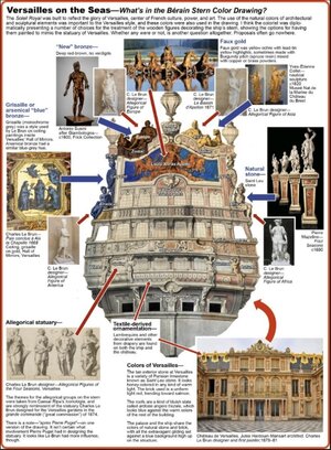
Given his professional background it is, perhaps, not surprising that John has spent quite a lot of
time studying color, and this model certainly reflects that. Thank you, John, for sharing this amazing project!
As always, thank you all for your interest, your comments and likes, and for stopping by.
More to follow!
The upper stern balcony is finally rounding into form:


The balcony rail completes my circumference around the ship with a band of ultra-marine. Maybe I will get to fixing this part in-place tonight.
There is still quite a lot of work to do with the head and the head grating, itself, but it is all finally coming together. Yesterday, I made a new pair of seats-of-ease, which are sized according to the space available to them, and reflect the imperfect geometry of my custom head structures:


I have subsequently drilled the waste holes in these, but I wanted to tweak their fit to the model before I did so. Here they are in their places:


Here is the forward grating terminus in-place and re-touched:

Can anyone spot my homage to modern seamanship and navigation, from starboard:

to port:

It’s a little subtle on this side, but don’t overthink it
My greatest satisfaction rests in the fact that I created enough space below the headrails to craft reasonable headrail supports:


As I often say, this is all something of an imperfect approximation, but it is a significant upgrade over the stock kit.
Now, build-logs occasionally can surprise us with the completely unexpected. Some months ago, a new poster began commenting on my MSW log, with specific interest in the ship and her appearance. He would sometimes comment that he was planning his own modest kitbash of the Heller kit.
Well, last week, this poster began to post things that really caught my attention. John Ott is a professional graphic artist and illustrator from California. All following pictures are courtesy of John Ott. One day, for fun, he posted the following super-imposition of Berain’s stern decor onto VdV’s La Reyne:

And for comparison’s sake:

The skill it takes to turn a barely two-dimensional drawing into a passable 3-D perspective drawing is just beyond me! Now, there were limits to how much time and energy John was willing to invest in this exercise, and so there are various aspects of the original drawing that he did not bother to modify. He just wanted to get a sense what the decor would look like on her near sister ship.
But, that is not the model John is building. He’s building the 1693 replacement SR, and he is designing the build on Photoshop:

WOW!, I thought to myself. This is just a beautiful color palate and a very thoughtful delineation of the ornamental program through high-contrast. Ultimately, the model will employ more period-correct colors (than what I’m doing) and will also incorporate a combination of faux-gold techniques with bright gold “leaf.”
But, then I wondered just how well he could pull this off. Well, as Nigel commented to me privately - never underestimate a train modeler! Here is the current status of the actual model:

I am in love with all of this, and as is often the case - I am thoroughly blown away by the talent and creativity of others in this world.
As an added bonus, John has put together a highly informative info-graphic on the statuary and colors of the stern:

Given his professional background it is, perhaps, not surprising that John has spent quite a lot of
time studying color, and this model certainly reflects that. Thank you, John, for sharing this amazing project!
As always, thank you all for your interest, your comments and likes, and for stopping by.
More to follow!
Last edited:
Fabulous work Marc and you already know my feelings on John's work
I think it is great fun when there is several of us coming up with our own take on the same ship. We are spread out globally and across two forums, some in wood, some in styrene, but you know we are all asking the same questions, sometimes coming up with very similar answers other times taking our own path.
Twenty five years ago when I was messing with Sergal's kit, no-one seemed to be bothered with this vessel
This is the season for building Soleil Royal, very much on point at the moment


Kind Regards
Nigel
I think it is great fun when there is several of us coming up with our own take on the same ship. We are spread out globally and across two forums, some in wood, some in styrene, but you know we are all asking the same questions, sometimes coming up with very similar answers other times taking our own path.
Twenty five years ago when I was messing with Sergal's kit, no-one seemed to be bothered with this vessel

This is the season for building Soleil Royal, very much on point at the moment


Kind Regards
Nigel
Oh and I may be wrong but do I see Red and Green on your Angels?
That is absolutely correct, Nigel: port and starboard signaling!
I also agree with your comments about general interest in the ship and information sharing. Michel Saunier really paved the way for this to happen.
I also agree with your comments about general interest in the ship and information sharing. Michel Saunier really paved the way for this to happen.
The subject of period colors often comes up on this forum and, fortunately, John has an info-graphic for that as well.
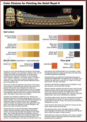
And some additional insight:
WHITE—I think they mostly used lead white for mixing hull paint. Guy says "calcium oxide," quicklime, which, along with calcium carbonate (chalk), made whitewash. I know they used whitewash sometimes in ship's interiors, but I don't think it's sturdy enough for exposure to wind and waves. Also doesn't cover as well. Lead was a superior mixing pigment, dried fast, was cheap, opaque, and was permanent as hell.
BLACK—lampblack. Lampblack was also known as "vine black" because the French had to do something with all those old grapevines. Burnt them to ash and made dry pigment out of them.
RED—red ochre, basically red clay. Vermilion (mercury sulfide) was made from cinnabar. It could only be synthesized in small quantities and was very expensive. Almost in league with ultramarine.
YELLOW—yellow ochre. More clay. Lead-tin yellow (lead-tin oxide) was the lightest and brightest yellow. Orpiment (arsenic sulfide) was up there with it. Naples yellow (lead antimonate) wasn't common in the middle 1600s because it hadn't been synthesized yet. A natural form of Naples yellow was dug from the side of Mt. Vesuvius, but as you can imagine, it wasn't common.
FAUX GOLD—was yellow ochre with painted-on lead-tin highlights and red ochre in the shadows and undersides. Sometimes they painted over it with Burgundy pitch (spruce resin) and brass or copper powders to give it a metallic lustre.
BLUE—this is the big one. Guy says it was "copper carbonate mixed with sulfur." Partially right. In all your posts and in all the other discussions about the blue used on 17th-century ships, I haven't seen anyone mention blue verditer. Blue verditer was the synthesized version of azurite (copper calcium carbonate—which had been the most important blue paint pigment in the middle ages). Blue verditer was made by some alchemical mixing of chalk with copper nitrate. You can watch YouTube videos about hobbyists making it with their home chemistry sets. The synthetic pigment was manufactured in France and the Low Countries, and cheap and common enough in the 1600s that it was used as wall paint.
Verditer comes from verd de terre, because natural azurite was to some degree mixed with malachite (copper carbonate hydroxide) which was green. The natural pigment was more or less greenish blue, but the less malachite in the mix, the more blue it got.

It's not used much any more because the pigment reacts chemically with the low pH in linseed oil and turns dull green or black. Works best with non-oil binders. (I used to have a Winsor-Newton tube of blue verditer watercolor.) It also greened or blackened with age, but ship paint obviously never lasted that long. Interestingly, it also turned black with exposure to sulfur or hydrogen sulfide.
Somehow—I don't know how, chemically—but it was often mixed with lead white and somehow that made it compatible with oil paint. (Lead is pH neutral, maybe that buffered the acidity of the oil.) That's why there's all the light blues in Versailles. It was also mixed with lampblack to darken it. When I decided on the light and dark blue hues for my ship, I started with verditer.

And some additional insight:
WHITE—I think they mostly used lead white for mixing hull paint. Guy says "calcium oxide," quicklime, which, along with calcium carbonate (chalk), made whitewash. I know they used whitewash sometimes in ship's interiors, but I don't think it's sturdy enough for exposure to wind and waves. Also doesn't cover as well. Lead was a superior mixing pigment, dried fast, was cheap, opaque, and was permanent as hell.
BLACK—lampblack. Lampblack was also known as "vine black" because the French had to do something with all those old grapevines. Burnt them to ash and made dry pigment out of them.
RED—red ochre, basically red clay. Vermilion (mercury sulfide) was made from cinnabar. It could only be synthesized in small quantities and was very expensive. Almost in league with ultramarine.
YELLOW—yellow ochre. More clay. Lead-tin yellow (lead-tin oxide) was the lightest and brightest yellow. Orpiment (arsenic sulfide) was up there with it. Naples yellow (lead antimonate) wasn't common in the middle 1600s because it hadn't been synthesized yet. A natural form of Naples yellow was dug from the side of Mt. Vesuvius, but as you can imagine, it wasn't common.
FAUX GOLD—was yellow ochre with painted-on lead-tin highlights and red ochre in the shadows and undersides. Sometimes they painted over it with Burgundy pitch (spruce resin) and brass or copper powders to give it a metallic lustre.
BLUE—this is the big one. Guy says it was "copper carbonate mixed with sulfur." Partially right. In all your posts and in all the other discussions about the blue used on 17th-century ships, I haven't seen anyone mention blue verditer. Blue verditer was the synthesized version of azurite (copper calcium carbonate—which had been the most important blue paint pigment in the middle ages). Blue verditer was made by some alchemical mixing of chalk with copper nitrate. You can watch YouTube videos about hobbyists making it with their home chemistry sets. The synthetic pigment was manufactured in France and the Low Countries, and cheap and common enough in the 1600s that it was used as wall paint.
Verditer comes from verd de terre, because natural azurite was to some degree mixed with malachite (copper carbonate hydroxide) which was green. The natural pigment was more or less greenish blue, but the less malachite in the mix, the more blue it got.

It's not used much any more because the pigment reacts chemically with the low pH in linseed oil and turns dull green or black. Works best with non-oil binders. (I used to have a Winsor-Newton tube of blue verditer watercolor.) It also greened or blackened with age, but ship paint obviously never lasted that long. Interestingly, it also turned black with exposure to sulfur or hydrogen sulfide.
Somehow—I don't know how, chemically—but it was often mixed with lead white and somehow that made it compatible with oil paint. (Lead is pH neutral, maybe that buffered the acidity of the oil.) That's why there's all the light blues in Versailles. It was also mixed with lampblack to darken it. When I decided on the light and dark blue hues for my ship, I started with verditer.
Very interesting Marc,
I know next to nothing about these things however I would assume that there may have been fairly big differences in the colors, maybe even batch to batch, this may give quite a bit of lee way as far as models are concerned.
All that lead, great stuff bit like asbestos great material but not so good for your health then there is the arsenic...
Cheers,
Stephen.
Me neither, Stephen. Fortunately John Ott has emerged to share all of this knowledge. It makes perfect sense to me that there would be significant disparities in the mix of colors from one shipyard arsenal to the next, and from one painting of a ship to its next repainting.
Last edited:
- Joined
- Oct 25, 2022
- Messages
- 294
- Points
- 128

Hello, it's been a while since I checked your progress and I still find it verry good.
After what has been a very busy time with many competing interests, I’ve been trying to restore some momentum for the project.
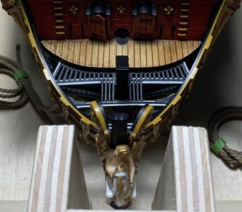
I’ve been working steadily, albeit at a snail’s pace, on the bow and stern. This pile of crooked pick-up sticks will eventually become my cambered head grating:
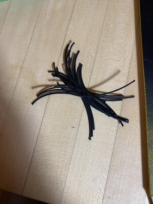
Each slat section is hand-fit and placed by eye. It will not be possible to neatly align these next three tiers of fore and aft slats with the splayed set immediately aft. This is an imperfect compromise that I can live with. In the end, after the grating surface has been sanded smooth and re-painted flat black, these small discrepancies will hardly matter. It looks like it is going to work out just fine:
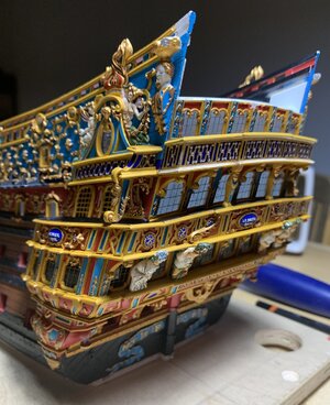
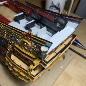
There’s a significant amount of paint re-touching that has to happen - which I have not been in the mood for - but the upper balcony rail is in-place now; again, imperfect in multiple ways, but I am happy with it:
When I really have the focus and determination to, I will re-visit the paint.
What has excited me, lately, is that I have finally reached the stage that the entire ornamental program has been inching towards for years - the coronation of the stern!
These past couple of days, I’ve been making up and fitting the two primary layers that make up the tafferal:

It will take a combination of subtraction and addition, but I am feeling pretty confident that the stock sculptures for Europe and Asia can be re-worked to fit my new cornice shape:

Unlike the stock kit, which has an interior backing plate that extends above the reverse-cyma curves of the tafferal, I will make it so that the tafferal shape is continuous to the poop deck.
I took some care to scribe-in plank lines for the tafferal backing boards:
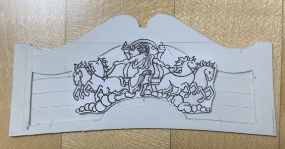
I am happy that I increased the camber of the middle and upper window tiers because it lends an appropriate sense of lift for the big carving. The extremities of the clouds will be slightly modified so that they sit lower against the frame.
The national coat of arms now fits within the dome:
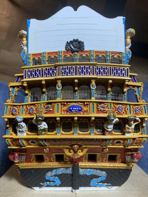
While these arms are centered on the central window pilaster, they won’t be perfectly centered within that dome shape. I checked the dimensions of the tafferal framing, and that dome shape is perfectly centered. This discrepancy has likely to do with cumulative error stemming from some aspect of the layout for my lowest or maybe the middle window tier.
At this stage, there’s no fixing it, and like all of these discrepancies they will kind of fade to the peripheries of consciousness when the completed stern is considered in its entirety. For the most part, the important details look more right than they do wrong. Most especially, I think I have nailed the correct shape for the big carving panel and the shape of the cornice:
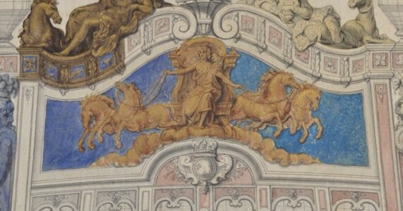
There is very much work and layering of detail to come, but I am pleased with where it is all going.
Thank you all for your interest!
I’ve been working steadily, albeit at a snail’s pace, on the bow and stern. This pile of crooked pick-up sticks will eventually become my cambered head grating:

Each slat section is hand-fit and placed by eye. It will not be possible to neatly align these next three tiers of fore and aft slats with the splayed set immediately aft. This is an imperfect compromise that I can live with. In the end, after the grating surface has been sanded smooth and re-painted flat black, these small discrepancies will hardly matter. It looks like it is going to work out just fine:

There’s a significant amount of paint re-touching that has to happen - which I have not been in the mood for - but the upper balcony rail is in-place now; again, imperfect in multiple ways, but I am happy with it:


When I really have the focus and determination to, I will re-visit the paint.
What has excited me, lately, is that I have finally reached the stage that the entire ornamental program has been inching towards for years - the coronation of the stern!
These past couple of days, I’ve been making up and fitting the two primary layers that make up the tafferal:

It will take a combination of subtraction and addition, but I am feeling pretty confident that the stock sculptures for Europe and Asia can be re-worked to fit my new cornice shape:

Unlike the stock kit, which has an interior backing plate that extends above the reverse-cyma curves of the tafferal, I will make it so that the tafferal shape is continuous to the poop deck.
I took some care to scribe-in plank lines for the tafferal backing boards:

I am happy that I increased the camber of the middle and upper window tiers because it lends an appropriate sense of lift for the big carving. The extremities of the clouds will be slightly modified so that they sit lower against the frame.
The national coat of arms now fits within the dome:

While these arms are centered on the central window pilaster, they won’t be perfectly centered within that dome shape. I checked the dimensions of the tafferal framing, and that dome shape is perfectly centered. This discrepancy has likely to do with cumulative error stemming from some aspect of the layout for my lowest or maybe the middle window tier.
At this stage, there’s no fixing it, and like all of these discrepancies they will kind of fade to the peripheries of consciousness when the completed stern is considered in its entirety. For the most part, the important details look more right than they do wrong. Most especially, I think I have nailed the correct shape for the big carving panel and the shape of the cornice:

There is very much work and layering of detail to come, but I am pleased with where it is all going.
Thank you all for your interest!
- Joined
- Oct 25, 2022
- Messages
- 294
- Points
- 128

Neat! On mine, I still have to determine how much I'm going to add to the stern façade, but I'm not a 100% sure how to do it and if we know the width differences between the 1669 and 1689 soleil royal on each deck. A thing I like to do is watching youtube vidéos while working on it, especially on parts like the gun carriages (I did the same for my 1/35 meng T90A tracks when I was working on them)
Excellent work Marc.Your discrepancies will only be noticeable when you view the stern square on which is an angle it will seldom be viewed from.
Just to throw you a curved ball.Do you thing the backdrop for the main carving may look better with a stippled finish rather than scribed planking?
Kind Regards
Nigel
Just to throw you a curved ball.Do you thing the backdrop for the main carving may look better with a stippled finish rather than scribed planking?
Kind Regards
Nigel
Thank you, Nigel! I think you are referencing the technique that Tanneron applied to the ground of his big carving:
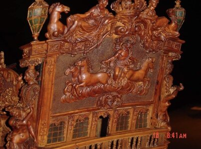
photo courtesy of Yoann Guillemenet
This is an old carver’s trick for making the ground appear more level than perhaps it is. It also serves as a nice contrast to the sculpted carving.
It would be a nice effect, but it won’t work for what I have planned. The backdrop to Apollo’s chariot will be cerulean blue that fades into the darker ultra-marine. There will be a burst of stylized gold and silver sun rays springing forth in all directions from behind the chariot. The clouds will be white with grey wash. The entire big carving will be done in gold, with a darker under-color and bright golden highlights.
Hi Marc,
I think a good portion of your problem centering the Bourbon crest on the lunette is caused by the Heller casting not being symmetrical. The port acanthus (or whatever) leaf could be filed down a bit. Or the starboard side beefed up. I took your image and did a Photoshop flop to show.
Same problem when adding a resin casting of the crest to my own SR's forecastle. I filed mine down.
John O
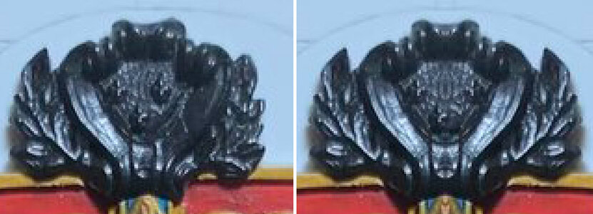

You are right on-time with that observation, John! Nice to see you here, BTW.
Last night, I was measuring once again, and the center pilaster is only a 1/64” to port, which is visually insignificant, so your observation is right-on. I will do as you suggest, and pare down the laurel leaves on the port side.
I’ve been making the moulding that defines the lower boundary of the big carving. On Berain’s drawing the shadows indicate an architectural moulding of some significant weight:

I experimented with making a coved profile scraper from a hacksaw blade, however, the arched center section of the moulding would be difficult to scrape if the scraper tracked along both outside edges of the moulding stock; there’d be a lot of chatter in the profile. Instead, I tried to make a scraper that would only track along the bottom edge of the moulding, cutting the low shoulder and coved profile only. This wasn’t working well, either, on my straight stock.
I decided the best course was to carve the moulding by hand with a gouge:
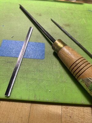
I first blacked the main face and small shoulder side with a Sharpie. I then scribed two razor reference lines, so that I’d know what the boundaries of the coved profile should be.
I started with the straight stock:
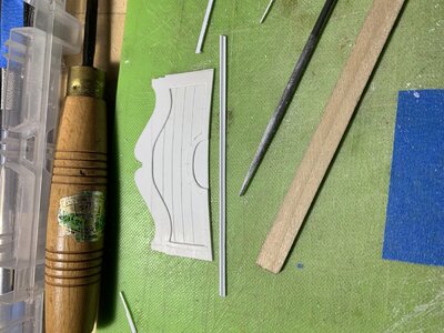
After carving the cove, I used a round file to smooth out any irregularities in the surface. Lastly, I used a sanding stick to round over the top profile.
Feeling confident now, I applied the same procedure to the coved section of moulding:
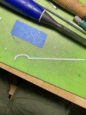
I cut a test miter just to see how the two profiles mated. It’ll require a little finessing of the profiles, at the final fitting, but this is not a big deal.
I spent a little time this morning perfecting the fit of the tafferal plate. This enabled me to position the arched moulding which, as it turns out, had to shift a solid 1/32” to port so that it centered perfectly over the 3rd and 5th pilaster. This helped my coat of arms situation a little bit:
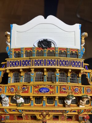
Now, with John’s insight in-mind, I can file down the port side a little bit and then add a little material to the starboard leaves. These adjustments should bring me pretty darn near to center. Once that is corrected, I can inlet the coat of arms into the arched moulding.
Thank you, John Ott!
Last night, I was measuring once again, and the center pilaster is only a 1/64” to port, which is visually insignificant, so your observation is right-on. I will do as you suggest, and pare down the laurel leaves on the port side.
I’ve been making the moulding that defines the lower boundary of the big carving. On Berain’s drawing the shadows indicate an architectural moulding of some significant weight:

I experimented with making a coved profile scraper from a hacksaw blade, however, the arched center section of the moulding would be difficult to scrape if the scraper tracked along both outside edges of the moulding stock; there’d be a lot of chatter in the profile. Instead, I tried to make a scraper that would only track along the bottom edge of the moulding, cutting the low shoulder and coved profile only. This wasn’t working well, either, on my straight stock.
I decided the best course was to carve the moulding by hand with a gouge:

I first blacked the main face and small shoulder side with a Sharpie. I then scribed two razor reference lines, so that I’d know what the boundaries of the coved profile should be.
I started with the straight stock:

After carving the cove, I used a round file to smooth out any irregularities in the surface. Lastly, I used a sanding stick to round over the top profile.
Feeling confident now, I applied the same procedure to the coved section of moulding:

I cut a test miter just to see how the two profiles mated. It’ll require a little finessing of the profiles, at the final fitting, but this is not a big deal.
I spent a little time this morning perfecting the fit of the tafferal plate. This enabled me to position the arched moulding which, as it turns out, had to shift a solid 1/32” to port so that it centered perfectly over the 3rd and 5th pilaster. This helped my coat of arms situation a little bit:

Now, with John’s insight in-mind, I can file down the port side a little bit and then add a little material to the starboard leaves. These adjustments should bring me pretty darn near to center. Once that is corrected, I can inlet the coat of arms into the arched moulding.
Thank you, John Ott!
- Joined
- Oct 25, 2022
- Messages
- 294
- Points
- 128

On mine, I simply intend to widden the pediment (if necessary depending of the width of the model) and plan to keep what heller did there. On removing the LL on my SR sides, I'm using tamiya sandpaper (I do that while watching videos, I might postpics of what I did tomerrow).
This has been a satisfying week spent detailing the tafferal plate. First task was to complete the architectural moulding and to shape the top mouldings and scrolls:
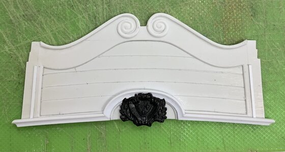
I have taken a somewhat different tack with my adaptation than what Tanneron/Heller show. I have decided to run this large architectural moulding all the way out to the ship sides. The reason for this is that I chose to use the between window pilasters to bracket the outermost windows on all three levels. These window pilasters are notably more narrow than the long rectangular panels on the outside edges of the tafferal plate, so this architectural moulding caps the lower window pilasters and provides a visual transition to what is happening above. The rectangular panels need to be wider in order to accommodate the long bellflower ornaments.
The next step was to skeletonize the extra stock stern plates I have for these decorative elements that would otherwise be extremely difficult to carve or sculpt from scratch, in this scale:
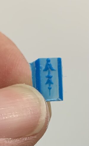
I use the Dremel grinding disc to excise the relevant sections and then sanding drums to waste away material from the backside. Once I can begin to see light through the plastic, I manually sand the parts with finger pressure against a coarse sanding stick. I frequently check to see that the light is coming through evenly as a gauge of how evenly I’m removing the ground material. It doesn’t take long before the desired elements only need the very tip of a sharp EXACTO to separate them from the ground.
I was able to extract the Zodiac symbols in this same manner:

But, the shortened height of these recessed panels is such that they no longer will fit in those spaces:
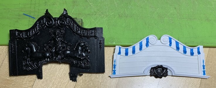
That’s okay - I will simply paint them-in with a very fine brush a little later in the process. Above, you get a clear sense of how dramatically I’ve reduced the height of the backboard and the shape of the cornice.
The lower cornice moulding had to be pieced-in segment by segment. I think the result is good:
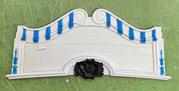
The national coat of arms is still not perfectly centered, but I am happy enough with it’s placement. To this point, here’s how the plate looks on the model:
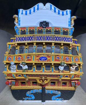
Next, was the challenge of adapting the figures of Europe and Asia. I first had to re-shape the backing to sit snugly on top of the new cornice profile:
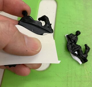
The tricky bit is the bevel that must be incised along this mating surface so that it matches the return bevel of the cornice top. Hopefully, this picture will make what I am trying to say clear:

Next, I had to in-fill the back of these figures where the stock kit would have an interior planking plate above the poop royal deck. Out of the box, this plate really serves as the glue surface for these figures.
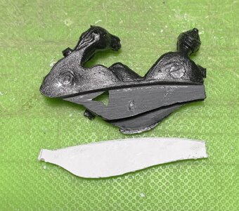
On my version, I want the reverse curves of the cornice moulding to be visible, inboard, so my figures will glue directly to the cornice cap rail. Here, Asia has been faired and filed smooth:

As I was going through all of this I began to be concerned that the apparent height of the figures was no longer in-scale with my shortened back board. However, I began to feel better about this after trimming back the lower swag of the figures’ robes, so that the cornice moulding would be visible. Here is trimmed Asia to compare against un-trimmed Europe:
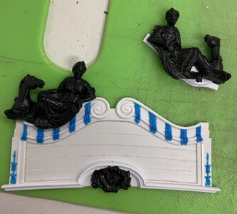
And, after trimming and final fitting both:
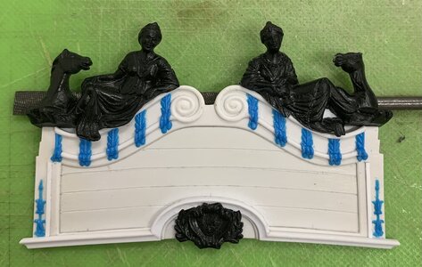
Berain’s drawing does show a little swag dipping below the upper cornice moulding, and I think this is a reasonable facsimile.
On the model:
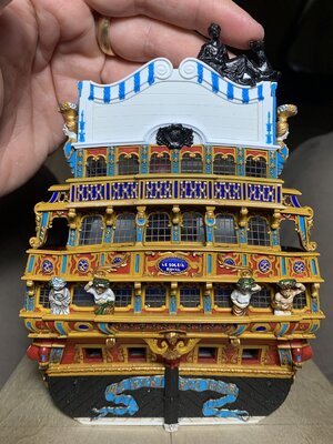
I may yet decapitate and then re-capitate the horse and camel heads in an effort to shorten their necks a little bit. I have some time to decide on that.
In the meantime, I can modify the big carving drawing a bit, so that I can begin making that. I can also begin painting the backboard. which is obviously much easier to do off the model - particularly those Zodiac symbols.
Thank you all for your interest, your comments and for checking-in. Enjoy the holiday weekend!

I have taken a somewhat different tack with my adaptation than what Tanneron/Heller show. I have decided to run this large architectural moulding all the way out to the ship sides. The reason for this is that I chose to use the between window pilasters to bracket the outermost windows on all three levels. These window pilasters are notably more narrow than the long rectangular panels on the outside edges of the tafferal plate, so this architectural moulding caps the lower window pilasters and provides a visual transition to what is happening above. The rectangular panels need to be wider in order to accommodate the long bellflower ornaments.
The next step was to skeletonize the extra stock stern plates I have for these decorative elements that would otherwise be extremely difficult to carve or sculpt from scratch, in this scale:

I use the Dremel grinding disc to excise the relevant sections and then sanding drums to waste away material from the backside. Once I can begin to see light through the plastic, I manually sand the parts with finger pressure against a coarse sanding stick. I frequently check to see that the light is coming through evenly as a gauge of how evenly I’m removing the ground material. It doesn’t take long before the desired elements only need the very tip of a sharp EXACTO to separate them from the ground.
I was able to extract the Zodiac symbols in this same manner:

But, the shortened height of these recessed panels is such that they no longer will fit in those spaces:

That’s okay - I will simply paint them-in with a very fine brush a little later in the process. Above, you get a clear sense of how dramatically I’ve reduced the height of the backboard and the shape of the cornice.
The lower cornice moulding had to be pieced-in segment by segment. I think the result is good:

The national coat of arms is still not perfectly centered, but I am happy enough with it’s placement. To this point, here’s how the plate looks on the model:

Next, was the challenge of adapting the figures of Europe and Asia. I first had to re-shape the backing to sit snugly on top of the new cornice profile:

The tricky bit is the bevel that must be incised along this mating surface so that it matches the return bevel of the cornice top. Hopefully, this picture will make what I am trying to say clear:

Next, I had to in-fill the back of these figures where the stock kit would have an interior planking plate above the poop royal deck. Out of the box, this plate really serves as the glue surface for these figures.

On my version, I want the reverse curves of the cornice moulding to be visible, inboard, so my figures will glue directly to the cornice cap rail. Here, Asia has been faired and filed smooth:

As I was going through all of this I began to be concerned that the apparent height of the figures was no longer in-scale with my shortened back board. However, I began to feel better about this after trimming back the lower swag of the figures’ robes, so that the cornice moulding would be visible. Here is trimmed Asia to compare against un-trimmed Europe:

And, after trimming and final fitting both:

Berain’s drawing does show a little swag dipping below the upper cornice moulding, and I think this is a reasonable facsimile.
On the model:

I may yet decapitate and then re-capitate the horse and camel heads in an effort to shorten their necks a little bit. I have some time to decide on that.
In the meantime, I can modify the big carving drawing a bit, so that I can begin making that. I can also begin painting the backboard. which is obviously much easier to do off the model - particularly those Zodiac symbols.
Thank you all for your interest, your comments and for checking-in. Enjoy the holiday weekend!
- Joined
- Apr 20, 2020
- Messages
- 6,328
- Points
- 738

amazing work, well done!This has been a satisfying week spent detailing the tafferal plate. First task was to complete the architectural moulding and to shape the top mouldings and scrolls:
View attachment 376355
I have taken a somewhat different tack with my adaptation than what Tanneron/Heller show. I have decided to run this large architectural moulding all the way out to the ship sides. The reason for this is that I chose to use the between window pilasters to bracket the outermost windows on all three levels. These window pilasters are notably more narrow than the long rectangular panels on the outside edges of the tafferal plate, so this architectural moulding caps the lower window pilasters and provides a visual transition to what is happening above. The rectangular panels need to be wider in order to accommodate the long bellflower ornaments.
The next step was to skeletonize the extra stock stern plates I have for these decorative elements that would otherwise be extremely difficult to carve or sculpt from scratch, in this scale:
View attachment 376358
I use the Dremel grinding disc to excise the relevant sections and then sanding drums to waste away material from the backside. Once I can begin to see light through the plastic, I manually sand the parts with finger pressure against a coarse sanding stick. I frequently check to see that the light is coming through evenly as a gauge of how evenly I’m removing the ground material. It doesn’t take long before the desired elements only need the very tip of a sharp EXACTO to separate them from the ground.
I was able to extract the Zodiac symbols in this same manner:
View attachment 376354
But, the shortened height of these recessed panels is such that they no longer will fit in those spaces:
View attachment 376351
That’s okay - I will simply paint them-in with a very fine brush a little later in the process. Above, you get a clear sense of how dramatically I’ve reduced the height of the backboard and the shape of the cornice.
The lower cornice moulding had to be pieced-in segment by segment. I think the result is good:
View attachment 376350
The national coat of arms is still not perfectly centered, but I am happy enough with it’s placement. To this point, here’s how the plate looks on the model:
View attachment 376346
Next, was the challenge of adapting the figures of Europe and Asia. I first had to re-shape the backing to sit snugly on top of the new cornice profile:
View attachment 376349
The tricky bit is the bevel that must be incised along this mating surface so that it matches the return bevel of the cornice top. Hopefully, this picture will make what I am trying to say clear:
View attachment 376348
Next, I had to in-fill the back of these figures where the stock kit would have an interior planking plate above the poop royal deck. Out of the box, this plate really serves as the glue surface for these figures.
View attachment 376357
On my version, I want the reverse curves of the cornice moulding to be visible, inboard, so my figures will glue directly to the cornice cap rail. Here, Asia has been faired and filed smooth:
View attachment 376343
As I was going through all of this I began to be concerned that the apparent height of the figures was no longer in-scale with my shortened back board. However, I began to feel better about this after trimming back the lower swag of the figures’ robes, so that the cornice moulding would be visible. Here is trimmed Asia to compare against un-trimmed Europe:
View attachment 376347
And, after trimming and final fitting both:
View attachment 376345
Berain’s drawing does show a little swag dipping below the upper cornice moulding, and I think this is a reasonable facsimile.
On the model:
View attachment 376344
I may yet decapitate and then re-capitate the horse and camel heads in an effort to shorten their necks a little bit. I have some time to decide on that.
In the meantime, I can modify the big carving drawing a bit, so that I can begin making that. I can also begin painting the backboard. which is obviously much easier to do off the model - particularly those Zodiac symbols.
Thank you all for your interest, your comments and for checking-in. Enjoy the holiday weekend!
Thank you, Shota!
Honestly, this all looks to be a really fun part of the build. And while I'm sure none of it is easy - it is so masterfully accomplished in your hands that it causes me to wonder if there is a plastic model in my future one day - and how that would turn out compared to your museum piece. I'd have loads to learn but if I never have to sand another piece of boxwood I would consider that a blessing right now.


