Soleil Royal by Heller - an Extensive Modification and Partial Scratch-Build by Hubac’s Historian

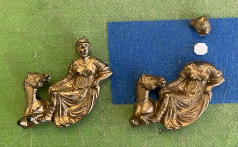
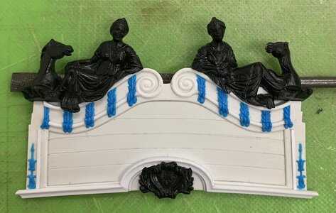
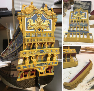
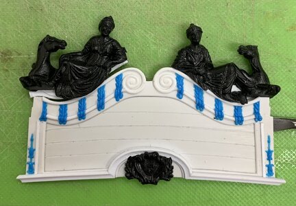
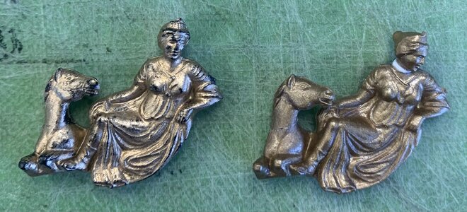
I’ve been debating, for a little while, whether I can improve the scale of the Europe and Asia figures to better complement the shortened height of the stern. After the initial round of fitting and back-fill, the figures look like this:
IMG_4361.jpeg

The problem I’m having with this is that these figures were designed to sit atop a taller backboard, and now the horse and camel necks seem a bit too long to me.

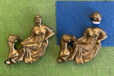
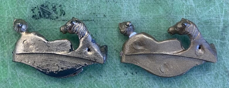
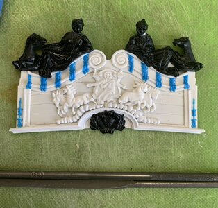
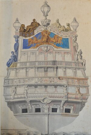
Fortunately, I have a number of spare parts with which I can experiment. I had an idea that if you cut the animal heads at the right angle, the kerf loss and clean-up would reduce their head height just enough, and the rejoin could be easily faired. I also, while I’m at it, wanted to see whether I could decapitate the continental figures, themselves, in order to correct the angle of their gaze; they should not be staring out blandly at Soleil Royal’s wake, but instead be lovingly focused on the carving of Apollo, below:
IMG_1670.jpeg

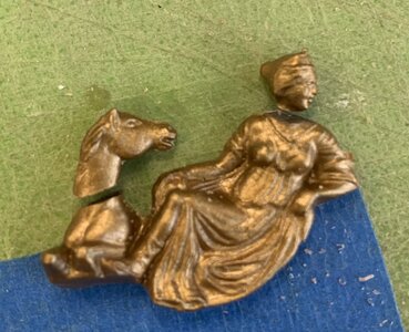
And, so, I put on my surgical gloves and got to work:
IMG_4506.jpeg
IMG_4507.jpeg

The horsehead is rejoined

IMG_4508.jpeg

And after filing an angle into her neck insert, so that her chin drops:
IMG_4514.jpeg
IMG_4513.jpeg

The differences are subtle, but the modifications are not difficult to make. Now that I’ve seen that it can work, it doesn’t seem so risky to modify the figures that I’ve already invested a ton of work into.

I’m still cobbling together the head grating, in the evening. That is all looking very promising.
 
I’ve been debating, for a little while, whether I can improve the scale of the Europe and Asia figures to better complement the shortened height of the stern.
When I read this my first thought was (now that I'm an expert at working in plastics :rolleyes:): what's the big deal - just cut the heads off. And then that's what you did ROTF! Anyway, I was amused...
 
Thank you, Gentlemen, for the kind words and the likes. I hope I will not alienate too many of you with my next foray into the unconventional.

I have always liked the painting of the backboards on the Dutch ships. A few stellar examples of Herbert Thomesan’s work:

IMG_4559.jpeg
IMG_4560.jpeg
IMG_4561.jpeg
IMG_4562.jpeg
IMG_4563.jpeg

I pulled these images from my Pinterest board Navies of Other Euro Nations. Herbert is a master of color, texture and shade. I take much inspiration from his use of vivid, complementary colors, and naturalistic painting of ornaments and the backboard paintings that illuminate the ship’s namesake.

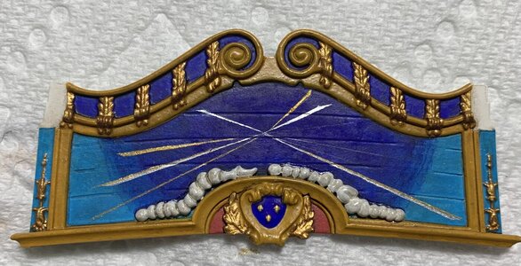
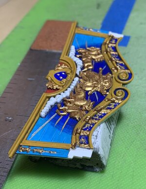
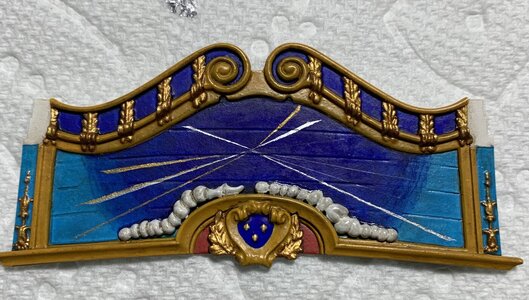
I have started painting my backboard. I want Apollo and his four horses to appear as though they are coasting just on the periphery of our atmospheric realm. Key to this effect is a softly diffuse transition from our earthly cerulean sky to the deep blue of the cosmos.

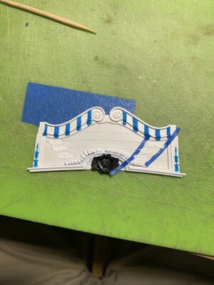
It occurred to me, though, that the plank seams that I scribed into the backboard would make this effect near-impossible to achieve because the successively thin layers of ultra-marine would want to bleed along the seams. My solution was to putty-in transitional arcs to both sides:

IMG_4529.jpeg

The horse carvings will distract the eye from these small areas where it is visible that the plank seams disappear.

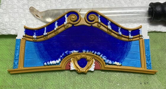
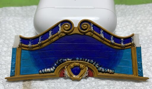
A base coat of cerulean blue went down first, over the entire field. I then applied successively thinner coats of ultra-marine from the top center, feathering out to the sides. This was just a patient process of application (maybe 10-12 thin coats) and adjustment with a wet brush. I got the diffuse effect I was after:

IMG_4553.jpeg

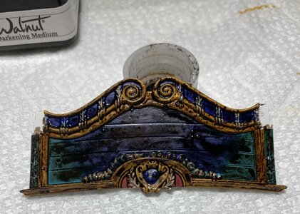
Now, to tone-down the brightness - a thorough slathering in walnut ink:

IMG_4554.jpeg

Once this dries, I take a wet brush and begin pulling away most of the color until I’m left with just enough patina to make it interesting:

IMG_4555.jpeg

There is still adjustment to be made with the weathering, but that will be a blending process after the backboard is attached to the model.

Next, I can sketch-in the Zodiac symbols. I bought a fine-line acrylic paint pen to make that easier. The clouds will be painted white and washed with grey. The ornament will get the usual two-tone gold, except for the three fleurs on the coat of arms, which will be bright gold.

My plan is to also mask for fine shards of sun light, in gold and silver gilt, to be emanating from behind Apollo and his horses. This will be difficult to achieve without overdoing it, or otherwise ruining the blue backdrop.

Thank you for your continued interest. More to follow..
 
Hi Marc, it's Michael AKA 72Nova, what are you washing the ink away with, water, alcohol?, I just might try it out when I start the Revell Viking ship.

Looking good as always and with the stern just about complete hopefully you'll start the rigging next year?

Michael D.
 
Hi Michael - Thank you! Yes, the walnut ink is water soluble, which is its greatest advantage. Before I had started building up the stern and upper bulwarks, I had clear-coated the lower hull in a matte varnish. I was going to do the same with the upper works, once they are complete, but then I wasn’t enthusiastic about spraying over the acetate windows, which I would like to remain reflective. On the other hand, the varnish goes a very long way to toughening up the acrylic paint and fixing the weather effects.

After I finish the stern, including carving Africa and the Americas from scratch, I will focus on the deadeyes and chains, and then I will turn my attention back to the main deck and mapping out all of the rigging. John Ott has worked up his own belay plan, which I have not yet parsed through, but it looks promising.

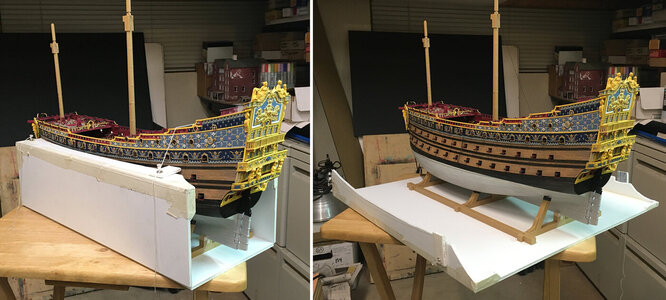
Then, I can run leads for sheets and tacks and build up all of the decks. I plan for the upper masts and spars to be my portable travel project. The goal is to get as much pre-rigging and rigging prep done off the model, so that once I go vertical, I can hopefully complete the model within a year. I’ll have to build some kind of temporary enclosure out of foam board to house the model while all of that is happening.

I just found out that my friend bought a resin printer, so maybe I can design my lanterns and have him print them.

So, the Revell Viking Ship - I can’t wait to see what you do with that!
 
Marc, a temporary enclosure is a very worthwhile suggestion. I twice knocked loose a lower-deck gun, with all the attendant frustration fishing them out and regluing them from outside, before I realized I needed to make a "dry dock." Foam core, masking tape, contact cement, pushpins, and string. Best twenty minutes on the project I spent.

John OIMG_4593.JPG
 
Marc, a temporary enclosure is a very worthwhile suggestion. I twice knocked loose a lower-deck gun, with all the attendant frustration fishing them out and regluing them from outside, before I realized I needed to make a "dry dock." Foam core, masking tape, contact cement, pushpins, and string. Best twenty minutes on the project I spent.

John OView attachment 383257
Oh, I’d wager you had a number of highly productive 20-minute stretches on your model. Now, C’mon John - give us a good look at that stern!
 
Oh, all right. This is Bud Light compared to your craft beer. Still very much a WIP. A lot just tacked on for fit.

Untitled-57.jpg

The most significant mod to the kit is cutting back the stern galleries to 3' (2-1/2' for the lower false gallery). More in line with the surviving drawing.

John O
 
It is all just simply FABULOUS! You have done a number of things that are really appealing to me. First of all, your placement of the rudder "jaumiere" ornament, a little higher on the lower balcony, is more consistent with the Berain drawing. This is a nice workaround for anyone who wants to incorporate this detail.

Also, I really like that you reduced the depth of the stern balconies - particularly the lower balcony. This is an astute move that will very much improve the scale impression of the stern. The crossed-L's on the port lids are a really nice touch; will you alternate the broadside lids with other motifs?

One of my favorite details on your model is the wrapping band of lambrequin's along the upper main wale. Continuing this across the beakhead and stern is a nice touch. I wish I had seen this earlier in my process, because I would definitely have included this detail on my ship.

Also really nice is the continuation of the frieze detail at the quarter deck level. Sure, one has to look inside the balconies to see these things, but they add so much to the impression of the thing.

Finally, of course, the color palate is just awesome. This shade of pale blue pretty perfectly captures what that color is supposed to look like. Again, if I were to do it over, I would probably swap out my cerulean blue for this color.

Thank you for sharing, John!
 
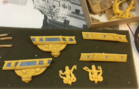
The tritons look incredible, and clearly you have a lot of work invested in them. I think, though, that it would be difficult to make that work, plausibly, if they are fully extending into the panel space above.
 
Oh, all right. This is Bud Light compared to your craft beer. Still very much a WIP. A lot just tacked on for fit.

View attachment 383437

The most significant mod to the kit is cutting back the stern galleries to 3' (2-1/2' for the lower false gallery). More in line with the surviving drawing.

John O
Hallo John,
it would be great to see your work also in an own building log - I would like to follow your progress also
 
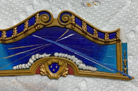
Painting the shards of sunlight, emanating from behind the Apollo carving, is tricky because the field is so small; the available space doesn’t really allow for masking both sides of the line.

My solution was to first draw pencil guidelines for each sun ray. Port to starboard symmetry should be avoided for a detail like this. I wanted lines of varying length and tapering thickness to extend beyond the horse and chariot carvings, from a variety of angles.

The idea was to lay a strip of tape as an additional guide to the pencil line; this way, I could run my brush over the tape side of the sun ray and nudge the wet edge carefully to the pencil side of the ray. It was important to remove the tape while the paint was still soft, otherwise the tape would likely lift the finer sections of the painted ray.

As I have throughout the ship, I wanted to incorporate silver gilt with the gold. As Eberhardt (if I remember correctly) once pointed out, this would have been unlikely on the real ship, but as an artistic choice it adds to the visual impact of the thing. In the photo sequence below, I am adding a thin gold line to the previously painted silver line of a single ray:

IMG_4614.jpeg

On the starboard side, you can still see my faint pencil (6H) layout for the remaining rays to be painted.

IMG_4615.jpeg
IMG_4616.jpeg

It was occasionally necessary to go over sections of these ray lines with a wet brush, when the tape did lift small flakes of paint. As fine as these lines are, these repairs are manageable over short sections because most of the line remains as a visual guide.

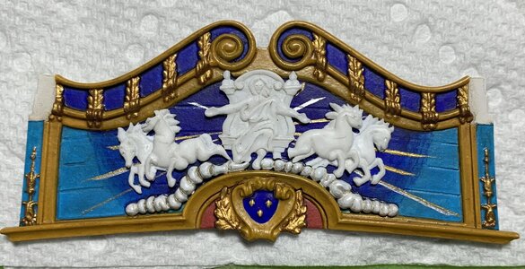
After painting the clouds and applying a grey wash, I placed the carvings to get a sense for the whole composition:

IMG_4618.jpeg

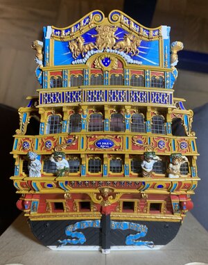
In my estimation, this is just enough radiant sun to convey the idea. After gilding the carvings off the model, and carefully scraping paint away to fix them in-place, here is a preliminary view of what the backboard looks like on the model (not glued yet):

IMG_4629.jpeg
IMG_4630.jpeg

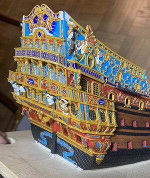
There are still a few mouldings to be fixed in-place, and I have not yet painted the side lantern brackets. From the side view, this impression of depth is what I was hoping for:

IMG_4627.jpeg

You can see the tiny Zodiac symbols that I painted into the cornice top. The acrylic paint pen wasn’t quite fine enough to do this, practically, so I simply sketched a basic approximation of each symbol in its opening with a hard pencil. I then carefully painted over the pencil lines with my finest sable brush. Considering the scale, they are little changed from the moulded versions on the stock stern plate.

At the present moment, I am considering how I will paint the two Continental figures of Europe and Asia that sit atop the cornice. Their clothing will definitely be painted in a more naturalistic fashion, like the Four Seasons figures. I think I have the colors figured out. Gold will be used sparingly. The main thing is that their faces and any other exposed skin will be painted grey-washed white. I’ve done this for the quarter pieces, the cathead supports and most notably the figurehead; there is something about this approach that is reminiscent of classical statuary, which were the original inspiration for these carved works in the first place. In any case, this approach avoids the thorny issue of representing different regions of the world in different skin tones.

More to follow - thanks for stopping by!
 
Thank you, Nigel! As for AL, as you are well-aware, they left quite a lot out from the ornamental program. I’ve had the realization recently, though, that some things are perfectly acceptable to be painted on. I mean, it’d be nice to have a low relief for these symbols, but at the end of the day - it’s a represented detail that kind of fades into the totality of the thing.
 
Back
Top