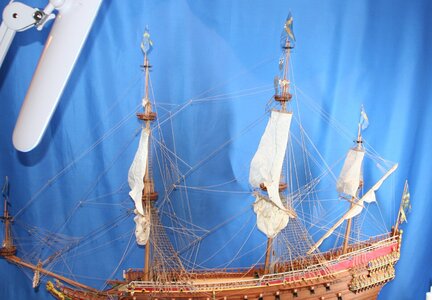
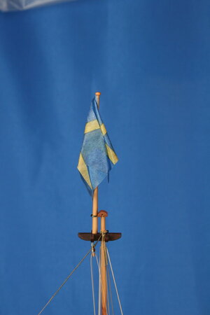
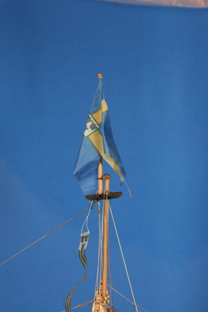
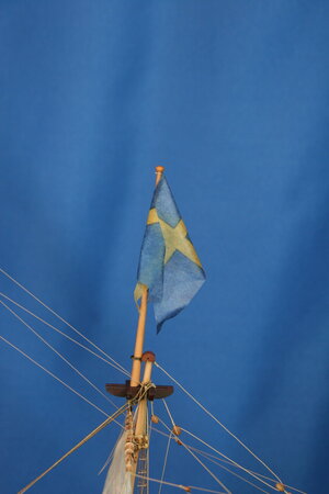
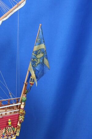
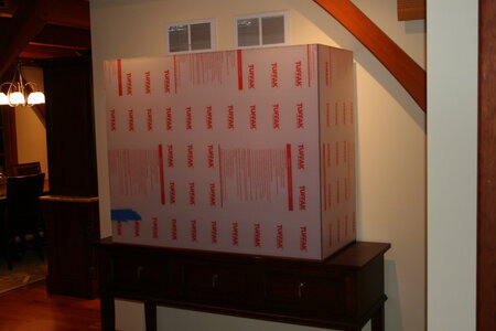
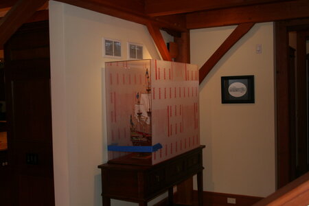
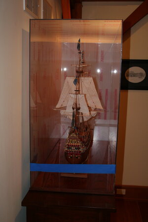
Vasa - 1:65 DeAgostini [COMPLETED BUILD]

Hello Paul,
Yes the ink is pretty much consistent on both sides. I have discovered that there are several factors that cause variation, most important I think is the quality of the ink, if you use bog standard ink jet inks there is a big risk of bleeding when you apply the pva., particularly reds, see white ensign. Secondly the type of pva., I hadn't thought about this because I have always used an exterior quality Evo-stik but thinking about it applying steam to an ordinary pva. might 'wash it out' of the fabric so the more the water resistant pva. the better. Next the silk fabric, there are at least three different weave qualities I have come across, the customs flag below was printed on the most open weave and this lets the ink through the easiest but the flag is a bit transparent, (personally I don't think that a problem but others might). On the tighter weaves I found you have to set the ink-jet to its highest quality settings i.e. very slow printing, see Dutch flag. I would still like to use this weave but I cant find it over here any more. Mind you on the highest quality setting, using indelible ink applied to the finest silk it starts to get expensive. The other oblivious factor is the quality of the original flag you want to copy.

View attachment 342270View attachment 342272View attachment 342273View attachment 342274View attachment 342275
The 'bleed' on the white ensign is not really noticeable with the naked eye. I lifted the fabric from the backing paper on the customs flag to show the ink transfer, normally I would coat the flag with pva then let it dry then peel and cut to size and shape. The texture looks quite open but the pva fills it a bit, although too much pva and the flag becomes too shiny. I thin the pva until it just drops of my spatula. The Dutch flag is printed on the finest weave at the highest setting. Hope this helps but when all is said and done you just have to play around until you find what you like. Cheers JJ..
Thank you kindly, Jack! Excellent post!
 
Last edited:
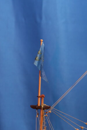
Congratulations Paul! I like the flags and I really like their subdued colors. In many cases, the flags are just too brightly colored and too large to be convincing, but with yours, it is not the case at all.
I love em Paul. Like Heinrich said the colors are subdued but at the same time very rich in appearance. That could not have been easy.
Keenly observed gentlemen. This ship doesn't need more bling - neither did I want to draw much attention to the flags. While others might prefer a more vibrant presentation - this moderated aspect of the flags was exactly what I was shooting for. I learned a lot on this flag making adventure and I suspect I could do them better the next time around. But these will work.

Looking back, I think taking the pictures against a vibrant blue background doesn't present the flags at their best. They look pretty convincing in real life...

Anyway, hopefully my posts (along with some of the other hints from fellow modelers) will be helpful to others.
 
Grabbed my chair - good choice.
When I was working I had occasion to spend lot's of time in Stockholm. Visited the Vasa Museum - an entry door into the 1600s that is unparalleled in any museum IMO. Some of my working peers had no interest, but pushed some of them to go - they, to the last one, were so glad that I "forced" the issue haha.
And what is also so perfect about Vasa is that there are 1000's of images and source files available as well.

This builder is considered one of the best: here is a link to his project. http://www.wasadream.com/modeles/Clayton/wasaclaytonenglish.html
as well as to some of his research for that project http://www.wasadream.com/Index/indexenglish.html

Looking forward to your log - great intro indeed.
I too was 'gobsmacked' - for want of a better word - the first time I laid eyes on her in '97. I visited again in 2002 she still had the same affect!
 
Here's the final result on the flags. Not quite what I envisioned starting out - but this mini-project has taken long enough.

View attachment 342448

And now working from the front to the back...

View attachment 342443

View attachment 342444

View attachment 342445

View attachment 342446

View attachment 342447

On the docket for today: staining trim pieces for the case...and maybe some work on the support boat...
Your fully rigged Vasa needed those flags, Paul. And you made some nice ones. It’s looking good.
Regards, Peter
 
Absolutely wonderful results Paul. And thanks to Maarten sharing his experiences to help. It is very encouraging that this technique may find other applications within the hobby.

I can attest, you CAN use an inkjet printer. I've done so transferring a photograph of my late Brother-In-Law to finished wood as a memorial to his family. The results were literally a photograph on wood. I was hoping to post an image, but still looking for it.

I've not seen it done with color with such great results until now. Thanks for another great revelation! I'm hoping to use this technique again on my own project.
 
Last edited:
With the blue background it's a bit hard to see how good (or how bad :cool:) they look, but I truly enjoyed your extensive explanation and the other tutorials and advice being given.
 
You know what just struck me? The amazing popularity of a ship that never sailed.
Still, a remarkable build, the TLC that went into it is clearly visible.
 
Back
Top