Kingfisher 1770 1:48 POF

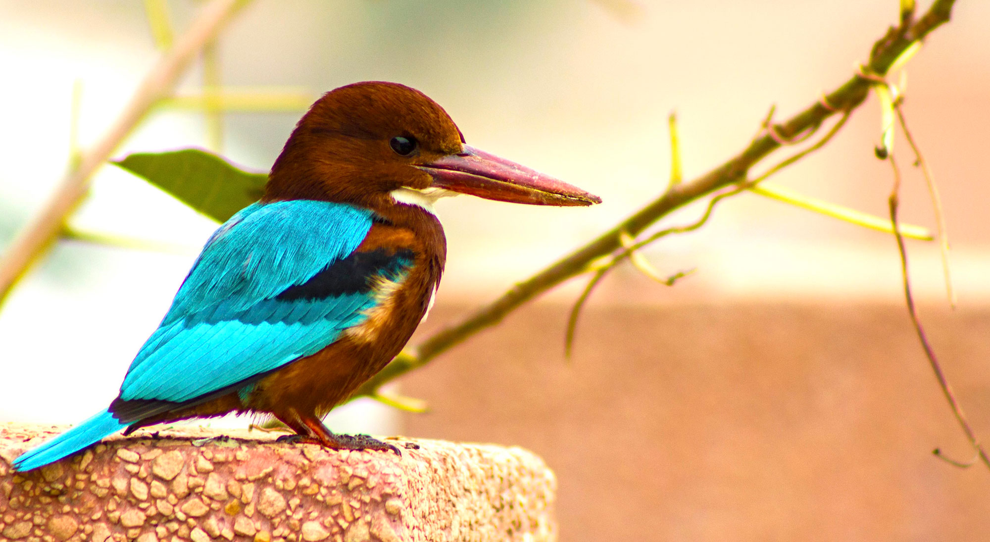
Just in case you decide to go Technicolor, the brown head is Europe's version of a Kingfisher. The more beautiful one here in the U.S. is my favorite bird and I think the better looking of the two. Notice the very long, stout, and pointed beak.

These birds have a very distinctive call as they fly a quite low and bouncy trajectory along stream courses.

Roy
Hello. I'm afraid I have to disappoint you. The kingfisher you find more beautiful is the European kingfisher. Here's the link to the report.
I checked your link, yep you are correct, this is the US version I grew up with on the creek". I have to agree with you, that aqua colored head on the European version is a bit more dignified than the US punk hair (feather) cut bird.
Thanks for getting me straightened out.
Take it outside, boys . ROTF
It seems I have carved a duck rather than a kingfisher!!!
 
One becomes so accustomed to the sharpness of your carpentry that the softer organic shapes of the duck and drapery stand out rather. Perhaps it runs against the grain of your profession to carve sharp ridges and valleys, like an old geezer’s teeth. ;)

However, I still think it’s very classy and will probably look brilliant under paint. Thinking about the figureheads on display at Portsmouth Museum, eighteenth century British naval carving was much cruder than the north German work I’ve seen in cathedrals. You know, the wonderful arty stuff that a craftsman worked on for years. I bet the real kingfisher was chipped out in a week.

I believe your work here is already at least as fine as the real thing.
Welcome back Smithy! Thanks for the substantive post!
 
You went deeper in the bird's wings and flowers too. Nice...
And your curtains look good too. You're quick learner.


Yep. "True story" would Grant say. Watch your neck too, like Herman said. I use the winebox to get the work piece higher and close to the eyes. Pause your work to keep concentrated. More I can't say about that point.

Is it not a lot of fun to do?
Yes, I did conjure up the courage to add more depth. Thanks for pointing that out. It's rather surprising what you can get out of a 1 mm thick piece of wood.

Ergonomics is a big deal in dentistry, so I am very aware of my posture while I am working. How are you lighting your workpiece? I am using a ring light magnifier and it washes out the depth because there are no shadows.

TOO MUCH FUN!
 
How are you lighting your workpiece?
I use a Ikea lamp. 2 in total

tertial-bureaulamp-lichtblauw__0957570_pe822320_s5.jpg

Warmwhite bulb in it.
You indeed need the shadows. So a led ring or strip is useless. Best is sunlight if you have that.
Also sometime a magnifier/loupe is useless, because it kills the depth sightseeing. Beter is to use glasses with magnifier to keep the depth. I have a simple one to clip on my reading glasses. Works perfect.
 
Yes, I did conjure up the courage to add more depth. Thanks for pointing that out. It's rather surprising what you can get out of a 1 mm thick piece of wood.

Ergonomics is a big deal in dentistry, so I am very aware of my posture while I am working. How are you lighting your workpiece? I am using a ring light magnifier and it washes out the depth because there are no shadows.

TOO MUCH FUN!
... may I suggest a dental light? It does light the spot instead of the entire place, it is also portable and can be attached to magnifying glasses... Ouch, I forgot who I explaining to...;)

1742046585050.png
 
Thanks, Brad. As I'm still in 'figuring it out' mode I can't yet speak to technique. I have a full set of Pferd jewelers file - is there a more 'micro' set out there?
Correction: the higher number, the smoother the cut. They make a 4cut. I got the smallest (4" length), so they "cut" small angles, grooves, swirls, dots, etc.
 
Last edited:
Peter G, Stephan, Russ, Peter V, Ron, Tobias, Grant, Daniel, Dean, and Miguel - I thank you all for the nice posts - and to all the others for the likes.

I have continued to work on the lower tafferel decoration (and have now added some curtains to the upper portion of the tafferel).

BEFORE:

View attachment 507281

AFTER:

View attachment 507278

View attachment 507279

Improving...but still...

This wood carving is exhausting business. The smallest lapse of concentration ruins the piece...
Those curtains are legit my friend! You are clearly sprinting up this particular learning curve. Well done!
Blessings.
Chuck
 
A rare Monday posting...

I'm not sure if this is an interim result or the final result. Every time I step away and come back I find things that need to be improved. But at my current skill level the rate of return has been getting pretty small.

I have found these human forms and faces to be extraordinarily challenging. We KNOW what a face looks like and carving something realistic at this scale (and as a relief carving) is elusive.

First image is just taken with my phone for scale:

IMG_0895a.jpg

A few more looks:

IMG_0888.JPG

IMG_0895.JPG

IMG_0894.JPG

My utmost respect to those people gifted and experienced who excel in this artform.
 
One thing I remember from art class many, many years ago was that in human faces, the eyes are located almost exactly halfway between the bottom of the chin and the top of the head. It seems counterintuitive, because most people's hair covers enough of their forehead that it looks like their eyes are higher up. When you rough-sketch your faces, start by putting the eyes right in the center. Your center figure looks the most realistic, followed by the one on the right. The eyes on the left one are pretty high.

All that said, your ability to carve the detail so smoothly is wonderful. Once you get the proportions worked out, they'll be second to none!
Agreed...and he's already good at making boobs! ROTF
On a more serious note, you can add veins on the leaves with an xacto knife, also add definition to the hair using a knife as well. And you could add feathers to the wings that way too. It all depends how detailed you want the carving to be.
 
You have to imagine the form in your head before carving. A face/head is very difficult. But the boobs look indeed good, I agree with Dean. It's easy to think about them ROTF

For the face I use the Loomis method. Works the best for me to positioning the eyes, noose, ears and mouth.
Post in thread 'An easy introduction to making wood ornaments by Stephan Kertész (Steef66)' https://shipsofscale.com/sosforums/...-by-stephan-kertész-steef66.16094/post-420069
Also watching carving video's of carving a head/face helps to see how to form the face in depth.


Don't give up, I think that you finally will achieve a good result that meets your expectations, because I see that your learning curve is very steep.
It’s looking great, you just started with this part of the hobby.
 
Back
Top